5 Areal data
Areal or lattice data arise when a fixed domain is partitioned into a finite number of subregions at which outcomes are aggregated. Examples of areal data are the number of cancer cases in counties, the number of road accidents in provinces, and the proportion of people living in poverty in census tracts. Often, disease risk models aim to obtain disease risk estimates within the same areas where data are available. A simple measure of disease risk in areas is the standardized incidence ratio (SIR) which is defined as the ratio of the observed to the expected counts. However, in many situations small areas may present extreme SIRs due to low population sizes or small samples. In these situations, SIRs may be misleading and insufficiently reliable for reporting, and it is preferred to estimate disease risk by using Bayesian hierarchical models that enable to borrow information from neighboring areas and incorporate covariates information resulting in the smoothing or shrinking of extreme values.
A popular spatial model is the Besag-York-Mollié (BYM) model (Besag, York, and Mollié 1991) which takes into account that data may be spatially correlated and observations in neighboring areas may be more similar than observations in areas that are farther away. This model includes a spatial random effect that smoothes the data according to a neighborhood structure, and an unstructured exchangeable component that models uncorrelated noise . In spatio-temporal settings where disease counts are observed over time, spatio-temporal models that account not only for spatial structure but also for temporal correlations and spatio-temporal interactions are used.
This chapter shows how to compute neighborhood matrices, expected counts, and SIRs. Then it shows how fit spatial and spatio-temporal disease risk models using the R-INLA package (Havard Rue, Lindgren, and Teixeira Krainski 2023). The examples in this chapter use data of lung cancer in Pennsylvania counties, USA, obtained from the SpatialEpi package (Kim, Wakefield, and Moise 2023), and show results with maps created with the ggplot2 package (Wickham, Chang, et al. 2023). At the end of the chapter, areal data issues are discussed including the Misaligned Data Problem (MIDP) which occurs when spatial data are analyzed at a scale different from that at which they were originally collected, and the Modifiable Areal Unit Problem (MAUP) and the ecological fallacy whereby conclusions may change if one aggregates the same underlying data to a new level of spatial aggregation.
5.1 Spatial neighborhood matrices
The concept of spatial neighborhood or proximity matrix is useful in the exploration of areal data. The \((i, j)\)th element of a spatial neighborhood matrix \(W\), denoted by \(w_{ij}\), spatially connects areas \(i\) and \(j\) in some fashion, \(i, j \in \{1, \ldots n\}\). \(W\) defines a neighborhood structure over the entire study region, and its elements can be viewed as weights. More weight is associated with \(j\)’s closer to \(i\) than those farther away from \(i\). The simplest neighborhood definition is provided by the binary matrix where \(w_{ij} = 1\) if regions \(i\) and \(j\) share some common boundary, perhaps a vertex, and \(w_{ij} = 0\) otherwise. Customarily, \(w_{ii}\) is set to 0 for \(i = 1, \ldots, n\). Note that this choice of neighborhood definition results in a symmetric spatial neighborhood matrix.
The code below shows how to compute the neighbors of several counties in the map of Pennsylvania, USA, using a neighborhood definition based on counties with common boundaries. The map of Pennsylvania counties is obtained from the SpatialEpi package as follows (Figure 5.1):
library(SpatialEpi)
map <- pennLC$spatial.polygon
plot(map)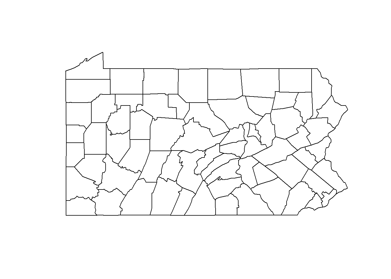
FIGURE 5.1: Map of Pennsylvania counties.
We can type class(map) to see map is a SpatialPolygons object.
class(map)## [1] "SpatialPolygons"
## attr(,"package")
## [1] "sp"We can obtain the neighbors of each county of the map by using the poly2nb() function of the spdep package (Bivand 2023).
This function returns a neighbors list nb based on counties with contiguous boundaries.
Each element of the list nb represents one county and contains the indices of its neighbors.
For example, nb[[2]] contains the neighbors of county 2.
## [[1]]
## [1] 21 28 67
##
## [[2]]
## [1]  3  4 10 63 65
##
## [[3]]
## [1]  2 10 16 32 33 65
##
## [[4]]
## [1]  2 10 37 63
##
## [[5]]
## [1]  7 11 29 31 56
##
## [[6]]
## [1] 15 36 38 39 46 54
We can show the neighbors of specific counties of Pennsylvania using a map.
For example, we can show the neighbors of counties 2, 44 and 58.
First, we create a SpatialPolygonsDataFrame object with the map of Pennsylvania, and data that contains a variable called county with the county names, and a dummy variable called neigh that indicates the neighbors of counties 2, 44 and 58. neigh is equal to 1 for counties that are neighbors of counties 2, 44 and 58, and 0 otherwise.
d <- data.frame(county = names(map), neigh = rep(0, length(map)))
rownames(d) <- names(map)
map <- SpatialPolygonsDataFrame(map, d, match.ID = TRUE)
map$neigh[nb[[2]]] <- 1
map$neigh[nb[[44]]] <- 1
map$neigh[nb[[58]]] <- 1
Then, we add variables called long and lat with the coordinates of each county, and a variable ID with the id of the counties.
coord <- coordinates(map)
map$long <- coord[, 1]
map$lat <- coord[, 2]
map$ID <- 1:dim(map@data)[1]
We create the map with the ggplot() function of ggplot2.
First, we convert the map which is a spatial object of class SpatialPolygonsDataFrame to a simple feature object of class sf with the st_as_sf() function of the sf package (Pebesma 2023).
Finally, we create a map showing the variable neigh, and adding labels with the area ids (Figure 5.2).
library(ggplot2)
ggplot(mapsf) + geom_sf(aes(fill = as.factor(neigh))) +
  geom_text(aes(long, lat, label = ID), color = "white") +
  theme_bw() + guides(fill = FALSE)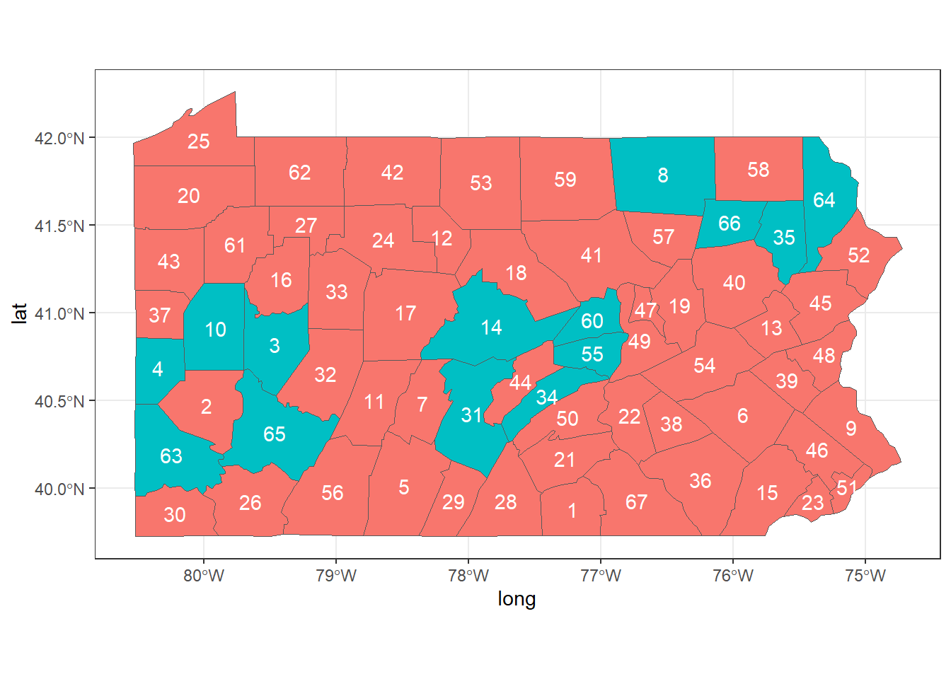
FIGURE 5.2: Neighbors of areas 2, 44 and 58 of Pennsylvania.
Many other possibilities of spatial neighborhood definitions can be considered. For instance, we may expand the idea of neighborhood to include areas that are close, but not necessarily adjacent. Thus, we could use \(w_{ij} = 1\) for all \(i\) and \(j\) within a specified distance, or, for a given \(i\), \(w_{ij}\) = 1 if \(j\) is one of the \(m\) nearest neighbors of \(i\). The weight \(w_{ij}\) can also be defined as the inverse distance between areas. Alternatively, we may want to adjust for the total number of neighbors in each area and use a standardized matrix with entries \(w_{std,i,j} = \frac{w_{ij}}{\sum_{j=1}^n w_{ij}}\). Note that this matrix is not symmetric in most situations where the areas are irregularly shaped.
5.2 Standardized incidence ratio
Sometimes we wish to provide disease risk estimates in each of the areas that form a partition of the study region (Moraga 2018a). One simple measure of disease risk is the standardized incidence ratio (SIR). For each area \(i\), \(i=1,\ldots,n\), the SIR is defined as the ratio of observed counts to the expected counts
\[\mbox{SIR}_i=Y_i/E_i.\] The expected counts \(E_i\) represent the total number of cases that one would expect if the population of area \(i\) behaved the way the standard (or regional) population behaves. \(E_i\) can be calculated using indirect standardization as
\[E_i=\sum_{j=1}^m r_j^{(s)} n_j^{(i)},\] where \(r_j^{(s)}\) is the rate (number of cases divided by population) in stratum \(j\) in the standard population, and \(n_j^{(i)}\) is the population in stratum \(j\) of area \(i\). In applications where strata information is not available, we can easily compute the expected counts as
\[E_i= r^{(s)} n^{(i)},\] where \(r^{(s)}\) is the rate in the standard population (total number of cases divided by total population in all areas), and \(n^{(i)}\) is the population of area \(i\). \(\mbox{SIR}_i\) indicates whether area \(i\) has higher (\(\mbox{SIR}_i > 1\)), equal (\(\mbox{SIR}_i = 1\)) or lower (\(\mbox{SIR}_i < 1\)) risk than expected from the standard population. When applied to mortality data, the ratio is known as the standardized mortality ratio (SMR).
Below we show an example where we calculate the SIRs of lung cancer in Pennsylvania in 2002 using the data frame pennLC$data from the SpatialEpi package.
pennLC$data contains the number of lung cancer cases and the population of Pennsylvania at county level,
stratified on race (white and non-white), gender (female and male) and age (under 40, 40-59, 60-69 and 70+).
We obtain the number of cases for all the strata together in each county, Y, by aggregating the rows of pennLC$data by county and adding up the number of cases.
We can do this using the functions group_by() and summarize() of the dplyr package (Wickham, François, et al. 2023).
## # A tibble: 6 × 2
##   county        Y
##   <fct>     <int>
## 1 adams        55
## 2 allegheny  1275
## 3 armstrong    49
## 4 beaver      172
## 5 bedford      37
## 6 berks       308
An alternative to dplyr to calculate the number of cases in each county is to use the aggregate() function. aggregate() accepts the three following arguments:
-
x: data frame with the data, -
by: list of grouping elements (each element needs to have the same length as the variables in data framex), -
FUN: function to compute the summary statistics to be applied to all data subsets.
We can use aggregate() with x equal to the vector of cases, by equal to a list with the counties, and FUN equal to sum.
Then, we set the names of the columns of the data frame obtained equal to county and Y.
d <- aggregate(
  x = pennLC$data$cases,
  by = list(county = pennLC$data$county),
  FUN = sum
)
names(d) <- c("county", "Y")
We can also calculate the expected number of cases in each county using indirect standardization.
The expected counts in each county represent the total number of disease cases one would expect if the population in the county behaved the way the population of Pennsylvania behaves.
We can do this by using the expected() function of SpatialEpi.
This function has three arguments, namely,
-
population: vector of population counts for each strata in each area, -
cases: vector with the number of cases for each strata in each area, -
n.strata: number of strata.
Vectors population and cases need to be sorted by area first and then, within each area, the counts for all strata need to be listed in the same order. All strata need to be included in the vectors, including strata with 0 cases.
Here, in order to obtain the expected counts, we first sort the data using the order() function where we specify the order as county, race, gender and, finally, age.
pennLC$data <- pennLC$data[order(
  pennLC$data$county,
  pennLC$data$race,
  pennLC$data$gender,
  pennLC$data$age
), ]
Then, we obtain the expected counts E in each county
by calling the expected() function where we set population equal to pennLC$data$population and cases equal to pennLC$data$cases.
There are 2 races, 2 genders and 4 age groups for each county, so number of strata is set to 2 x 2 x 4 = 16.
E <- expected(
  population = pennLC$data$population,
  cases = pennLC$data$cases, n.strata = 16
)
Now we add the vector E to the data frame d which contains the counties ids (county) and the observed counts (Y)
making sure the E elements correspond to the counties in d$county in the same order.
To do that, we use match() to calculate the vector of the positions that match d$county in unique(pennLC$data$county) which are the corresponding counties of E.
Then we rearrange E using that vector.
## # A tibble: 6 × 3
##   county        Y      E
##   <fct>     <int>  <dbl>
## 1 adams        55   69.6
## 2 allegheny  1275 1182.
## 3 armstrong    49   67.6
## 4 beaver      172  173.
## 5 bedford      37   44.2
## 6 berks       308  301.
Finally, we compute the SIR values as the ratio of the observed to the expected counts, and add it to the data frame d.
d$SIR <- d$Y / d$EThe final data frame d contains, for each of the Pennsylvania counties, the observed number of cases, the expected cases, and the SIRs.
head(d)## # A tibble: 6 × 4
## county Y E SIR
## <fct> <int> <dbl> <dbl>
## 1 adams 55 69.6 0.790
## 2 allegheny 1275 1182. 1.08
## 3 armstrong 49 67.6 0.725
## 4 beaver 172 173. 0.997
## 5 bedford 37 44.2 0.837
## 6 berks 308 301. 1.02To map the lung cancer SIRs in Pennsylvania, we need to add the data frame d which contains the SIRs to the map map.
We do this by merging map and d by the common column county.
map <- merge(map, d)Then we need to create an sf object with the map by converting the spatial object map to simple feature object mapsf with the st_as_sf() function.
mapsf <- st_as_sf(map)Finally, we create the map with ggplot().
To better identify areas with SIRs lower and greater than 1, we use scale_fill_gradient2() to fill counties with SIRs less than 1 with colors in the gradient blue-white,
and fill counties with SIRs greater than 1 with colors in the gradient white-red.
ggplot(mapsf) + geom_sf(aes(fill = SIR)) +
  scale_fill_gradient2(
    midpoint = 1, low = "blue", mid = "white", high = "red"
  ) +
  theme_bw()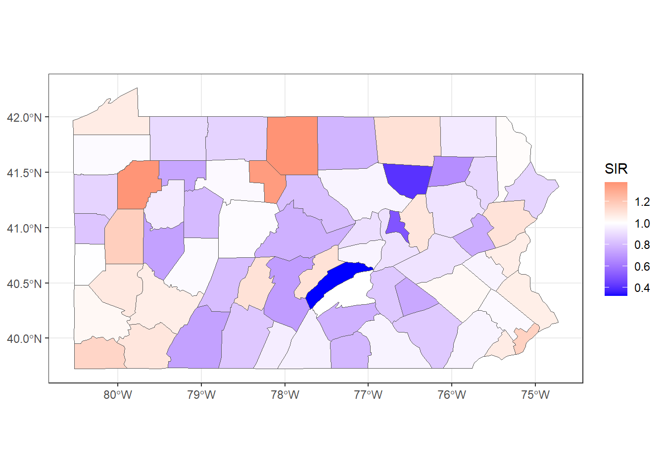
FIGURE 5.3: SIR of lung cancer in Pennsylvania counties.
Figure 5.3 shows the lung cancer SIRs in Pennsylvania. In counties with SIR = 1 (color white) the number of lung cancer cases observed is the same as the number of expected cases. In counties where SIR > 1 (color red), the number of lung cancer cases observed is higher than the expected cases. Counties where SIR < 1 (color blue) have fewer lung cancer cases observed than expected.
5.3 Spatial small area disease risk estimation
Although SIRs can be useful in some settings, in regions with small populations or rare diseases the expected counts may be very low and SIRs may be misleading and insufficiently reliable for reporting. Therefore, it is preferred to estimate disease risk by using models that enable to borrow information from neighboring areas, and incorporate covariates information resulting in the smoothing or shrinking of extreme values based on small sample sizes (Gelfand et al. 2010; Lawson 2009).
Usually, observed counts \(Y_i\) in area \(i\), are modeled using a Poisson distribution with mean \(E_i \theta_i\), where \(E_i\) is the expected counts and \(\theta_i\) is the relative risk in area \(i\). The logarithm of the relative risk \(\theta_i\) is expressed as the sum of an intercept that models the overall disease risk level, and random effects to account for extra-Poisson variability. The relative risk \(\theta_i\) quantifies whether area \(i\) has higher (\(\theta_i > 1\)) or lower (\(\theta_i < 1\)) risk than the average risk in the standard population. For example, if \(\theta_i=2\), this means that the risk of area \(i\) is two times the average risk in the standard population.
The general model for spatial data is expressed as follows:
\[Y_i \sim Po(E_i \theta_i),\ i=1,\ldots,n,\]
\[\log(\theta_i)= \alpha + u_i + v_i.\] Here, \(\alpha\) represents the overall risk in the region of study, \(u_i\) is a random effect specific to area \(i\) to model spatial dependence between the relative risks, and \(v_i\) is an unstructured exchangeable component that models uncorrelated noise , \(v_i \sim N(0, \sigma_v^2)\). It is also common to include covariates to quantify risk factors and other random effects to deal with other sources of variability. For example, \(\log(\theta_i)\) can be expressed as
\[\log(\theta_i)= \boldsymbol{d}_i \boldsymbol{\beta} + u_i + v_i,\]
where \(\boldsymbol{d}_i = (1, d_{i1}, \ldots, d_{ip})\) is the vector of the intercept and \(p\) covariates corresponding to area \(i\), and \(\boldsymbol{\beta} = (\beta_0, \beta_1, \ldots, \beta_p)'\) is the coefficient vector. In this setting, for a one-unit increase in covariate \(d_j\), \(j=1, \ldots,p\), the relative risk increases by a factor of \(exp(\beta_j)\), holding all other covariates constant.
A popular spatial model in disease mapping applications is the Besag-York-Mollié (BYM) model (Besag, York, and Mollié 1991). In this model, the spatial random effect \(u_i\) is assigned a Conditional Autoregressive (CAR) distribution which smoothes the data according to a certain neighborhood structure that specifies that two areas are neighbors if they share a common boundary. Specifically,
\[u_i| \boldsymbol{u_{-i}} \sim N\left(\bar u_{\delta_i}, \frac{\sigma^2_u}{n_{\delta_i}}\right),\] where \(\bar u_{\delta_i}= n_{\delta_i}^{-1} \sum_{j \in \delta_i} u_j\), \(\delta_i\) and \(n_{\delta_i}\) represent, respectively, the set of neighbors and the number of neighbors of area \(i\). The unstructured component \(v_i\) is modeled as independent and identically distributed normal variables with zero mean and variance \(\sigma_v^2\).
In R-INLA, the formula of the BYM model is specified as follows:
formula <- Y ~
  f(idareau, model = "besag", graph = g, scale.model = TRUE) +
  f(idareav, model = "iid")
The formula includes the response in the left-hand side, and the fixed and random effects in the right-hand side.
By default, the formula includes an intercept.
Random effects are set using f() with parameters equal to the name of the index variable, the model, and other options.
The BYM formula includes a spatially structured component with index variable with name idareau and equal to c(1, 2, ..., I),
and model "besag" with a CAR distribution and with neighborhood structure given by the graph g.
The option scale.model = TRUE is used to make the precision parameter of models with different CAR priors comparable (Freni-Sterrantino, Ventrucci, and Rue 2018).
The formula also includes an unstructured component with
index variable with name idareav and equal to c(1, 2, ..., I),
and model "iid". This is an independent and identically distributed zero-mean normally distributed random effect.
Note that both the variables idareau and idareav are vectors with the indices of the areas.
These two variables are identical; however, they still need to be specified as two different objects since R-INLA
does not allow to include two effects with f() that use the same index variable.
The BYM model can also be specified with the model "bym" which defines both the spatially structured and unstructured components \(u_i\) and \(v_i\).
Simpson et al. (2017) proposed a new parametrization of the BYM model called BYM2 which makes parameters interpretable and facilitates the assignment of meaningful Penalized Complexity (PC) priors. The BYM2 model uses a scaled spatially structured component \(\boldsymbol{u_*}\) and an unstructured component \(\boldsymbol{v_*}\)
\[\boldsymbol{b} = \frac{1}{\sqrt{\tau_b}}(\sqrt{1-\phi}\boldsymbol{v_*} + \sqrt{\phi}\boldsymbol{u_*}).\]
Here, the precision parameter \(\tau_b>0\) controls the marginal variance contribution of the weighted sum of \(\boldsymbol{u_*}\) and \(\boldsymbol{v_*}\). The mixing parameter \(0 \leq \phi \leq 1\) measures the proportion of the marginal variance explained by the structured effect \(\boldsymbol{u_*}\). Thus, the BYM2 model is equal to an only spatial model when \(\phi=1\), and an only unstructured spatial noise when \(\phi=0\) (Riebler et al. 2016). In R-INLA we specify the BYM2 model as follows:
formula <- Y ~ f(idarea, model = "bym2", graph = g)where idarea is the index variable that denotes the areas c(1, 2, ..., I), and g is the graph with the neighborhood structure.
PC priors penalize the model complexity in terms of deviation from the flexible model to the base model which has a constant relative risk over all areas.
To define the prior for the marginal precision \(\tau_b\) we use the probability statement \(P((1/\sqrt{\tau_b})>U) = \alpha\).
A prior for \(\phi\) is defined using \(P(\phi < U) = \alpha\).
5.3.1 Spatial modeling of lung cancer in Pennsylvania
Here we show an example on how to use the BYM2 model to calculate the relative risks of lung cancer in the Pennsylvania counties. Moraga (2018a) analyzes the same data by using a BYM model that includes a covariate related to the proportion of smokers. Chapter 6 shows another example on how to fit a spatial model to obtain the relative risks of lip cancer in Scotland, UK.
First we define the formula that includes the response variable Y on the left and the random effect "bym2" on the right.
Note that we do not need to include an intercept as it is included by default.
In the random effect, we specify the index variable idarea with the indices of the random effect.
This variable is equal to c(1, 2, ..., I) where I is the number of counties (67).
The number of counties can be obtained with the number of rows of the data (nrow(map@data)).
map$idarea <- 1:nrow(map@data)We define a PC prior for the marginal precision \(\tau_b\) by using \(P((1/\sqrt{\tau_b})> U) = a\). If we consider a marginal standard deviation of approximately 0.5 is a reasonable upper bound, we can use the rule of thumb described by Simpson et al. (2017) and set \(U=0.5/0.31\) and \(a=0.01\). The prior for \(\tau_b\) is then expressed as \(P((1/\sqrt{\tau_b})> (0.5/0.31)) = 0.01\). We define the prior for the mixing parameter \(\phi\) as \(P(\phi < 0.5) = 2/3\). This is a conservative choice that assumes that the unstructured random effect accounts for more of the variability than the spatially structured effect.
prior <- list(
  prec = list(
    prior = "pc.prec",
    param = c(0.5 / 0.31, 0.01)),
  phi = list(
    prior = "pc",
    param = c(0.5, 2 / 3))
  )
We also need to compute an object g with the neighborhood matrix that will be used in the spatially structured effect.
To compute g we calculate a neighbors list nb with poly2nb().
Then, we use nb2INLA() to convert the list nb into a file with the representation of the neighborhood matrix as required by R-INLA. Then we read the file using the inla.read.graph() function of R-INLA, and store it in the object g.
## [[1]]
## [1] 21 28 67
##
## [[2]]
## [1]  3  4 10 63 65
##
## [[3]]
## [1]  2 10 16 32 33 65
##
## [[4]]
## [1]  2 10 37 63
##
## [[5]]
## [1]  7 11 29 31 56
##
## [[6]]
## [1] 15 36 38 39 46 54
nb2INLA("map.adj", nb)
g <- inla.read.graph(filename = "map.adj")
The formula is specified as follows:
formula <- Y ~ f(idarea, model = "bym2", graph = g, hyper = prior)Then, we fit the model by calling the inla() function. The arguments of this function are the formula, the family ("poisson"), the data, and the expected counts (E). We also set control.predictor equal to list(compute = TRUE) to compute the posteriors of the predictions.
res <- inla(formula,
  family = "poisson", data = map@data,
  E = E, control.predictor = list(compute = TRUE)
)
The object res contains the results of the model. We can obtain a summary with summary(res).
summary(res)##
## Call:
## c("inla.core(formula = formula, family = family,
## contrasts = contrasts, ", " data = data,
## quantiles = quantiles, E = E, offset = offset,
## ", " scale = scale, weights = weights, Ntrials =
## Ntrials, strata = strata, ", " lp.scale =
## lp.scale, link.covariates = link.covariates,
## verbose = verbose, ", " lincomb = lincomb,
## selection = selection, control.compute =
## control.compute, ", " control.predictor =
## control.predictor, control.family =
## control.family, ", " control.inla =
## control.inla, control.fixed = control.fixed, ",
## " control.mode = control.mode, control.expert =
## control.expert, ", " control.hazard =
## control.hazard, control.lincomb =
## control.lincomb, ", " control.update =
## control.update, control.lp.scale =
## control.lp.scale, ", " control.pardiso =
## control.pardiso, only.hyperparam =
## only.hyperparam, ", " inla.call = inla.call,
## inla.arg = inla.arg, num.threads = num.threads,
## ", " keep = keep, working.directory =
## working.directory, silent = silent, ", "
## inla.mode = inla.mode, safe = FALSE, debug =
## debug, .parent.frame = .parent.frame)" )
## Time used:
## Pre = 17.4, Running = 0.624, Post = 0.0787, Total = 18.1
## Fixed effects:
## mean sd 0.025quant 0.5quant
## (Intercept) -0.051 0.017 -0.085 -0.051
## 0.975quant mode kld
## (Intercept) -0.018 -0.051 0
##
## Random effects:
## Name Model
## idarea BYM2 model
##
## Model hyperparameters:
## mean sd 0.025quant
## Precision for idarea 129.255 53.630 55.258
## Phi for idarea 0.479 0.242 0.071
## 0.5quant 0.975quant mode
## Precision for idarea 119.156 262.417 101.378
## Phi for idarea 0.473 0.913 0.386
##
## Marginal log-Likelihood: -225.11
## is computed
## Posterior summaries for the linear predictor and the fitted values are computed
## (Posterior marginals needs also 'control.compute=list(return.marginals.predictor=TRUE)')Object res$summary.fitted.values contains summaries of the relative risks including the
mean posterior and the lower and upper limits of 95% credible intervals of the relative risks.
Specifically, column mean is the mean posterior and 0.025quant and 0.975quant are the 2.5 and 97.5 percentiles, respectively.
head(res$summary.fitted.values)## mean sd 0.025quant 0.5quant
## fitted.Predictor.01 0.8671 0.06818 0.7376 0.8655
## fitted.Predictor.02 1.0679 0.02864 1.0130 1.0675
## fitted.Predictor.03 0.9116 0.06860 0.7750 0.9125
## fitted.Predictor.04 0.9979 0.05794 0.8881 0.9964
## fitted.Predictor.05 0.9092 0.07064 0.7749 0.9075
## fitted.Predictor.06 0.9954 0.04744 0.9070 0.9937
## 0.975quant mode
## fitted.Predictor.01 1.006 0.8629
## fitted.Predictor.02 1.125 1.0666
## fitted.Predictor.03 1.044 0.9152
## fitted.Predictor.04 1.116 0.9938
## fitted.Predictor.05 1.054 0.9050
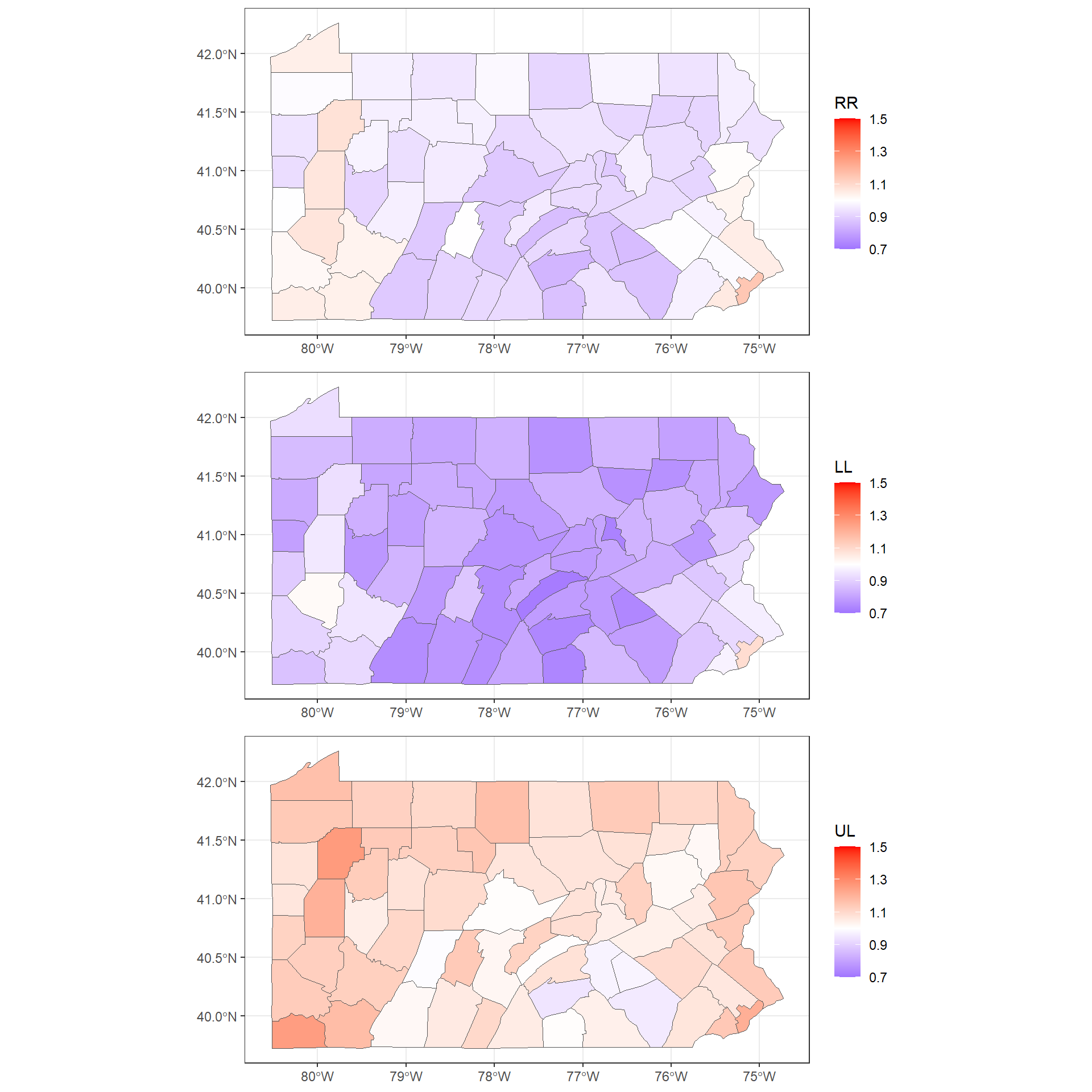
## fitted.Predictor.06 1.093 0.9903To make maps of these variables, we first add the columns mean, 0.025quant and 0.975quantto the map.
We assign mean to the relative risk, and 0.025quant and 0.975quant to the lower and upper limits of 95% credible intervals of the relative risks.
map$RR <- res$summary.fitted.values[, "mean"]
map$LL <- res$summary.fitted.values[, "0.025quant"]
map$UL <- res$summary.fitted.values[, "0.975quant"]

summary(map@data[, c("RR", "LL", "UL")])
## RR LL UL
## Min. :0.841 Min. :0.717 Min. :0.945
## 1st Qu.:0.914 1st Qu.:0.781 1st Qu.:1.048
## Median :0.945 Median :0.820 Median :1.083
## Mean :0.955 Mean :0.833 Mean :1.088
## 3rd Qu.:0.991 3rd Qu.:0.879 3rd Qu.:1.132
## Max. :1.147 Max. :1.090 Max. :1.258We use the the ggplot() function to make maps with the relative risks and lower and upper limits of 95% credible intervals.
We use the same scale for the three maps by adding an argument limits in scale_fill_gradient2()
with the minimum and maximum values for the scale.
mapsf <- st_as_sf(map)

gRR <- ggplot(mapsf) + geom_sf(aes(fill = RR)) +
  scale_fill_gradient2(
    midpoint = 1, low = "blue", mid = "white", high = "red",
    limits = c(0.7, 1.5)
  ) +
  theme_bw()
gLL <- ggplot(mapsf) + geom_sf(aes(fill = LL)) +
  scale_fill_gradient2(
    midpoint = 1, low = "blue", mid = "white", high = "red",
    limits = c(0.7, 1.5)
  ) +
  theme_bw()
gUL <- ggplot(mapsf) + geom_sf(aes(fill = UL)) +
  scale_fill_gradient2(
    midpoint = 1, low = "blue", mid = "white", high = "red",
    limits = c(0.7, 1.5)
  ) +
  theme_bw()
We can plot the maps side-by-side on a grid by using the plot_grid() function of the cowplot package (Wilke 2020).
To do this, we need to call plot_grid() passing the plots to be arranged into the grid. We can also specify the number of rows (nrow) or columns (ncol) (Figure ??).
Note that instead of creating three separate plots and putting them together in the same grid with plot_grid(),
we could have created a single plot with ggplot() and facet_grid() or facet_wrap().
This splits up the data by the specified variables and plot the data subsets together.
An example of the use of ggplot() and facet_wrap() can be seen in Chapter 7.
A data frame with the summary of the BYM2 random effects is in res$summary.random$idarea. This has the number of rows equal to 2 times the number of areas (2 * 67) where the first \(67\) rows correspond to \(\boldsymbol{b} = \frac{1}{\sqrt{\tau_b}}(\sqrt{1-\phi}\boldsymbol{v_*} + \sqrt{\phi}\boldsymbol{u_*})\), and the last \(67\) to \(\boldsymbol{u_*}\).
head(res$summary.random$idarea)## ID mean sd 0.025quant 0.5quant 0.975quant
## 1 1 -0.09470 0.07747 -0.25022 -0.09364 0.05518
## 2 2 0.11621 0.03119 0.05567 0.11599 0.17804
## 3 3 -0.04527 0.07498 -0.20358 -0.04127 0.09133
## 4 4 0.04694 0.05865 -0.06847 0.04694 0.16235
## 5 5 -0.04728 0.07593 -0.19982 -0.04642 0.10088
## 6 6 0.04522 0.04945 -0.04947 0.04435 0.14465
## mode kld
## 1 -0.09358 6.410e-08
## 2 0.11599 1.332e-08
## 3 -0.02966 4.873e-07
## 4 0.04695 1.644e-08
## 5 -0.04635 8.893e-08
## 6 0.04430 6.656e-08To make a map of the posterior mean of the BYM2 random effect \(\boldsymbol{b}\), we need to use res$summary.random$idarea[1:67, "mean"] (Figure 5.4).
mapsf$re <- res$summary.random$idarea[1:67, "mean"]

ggplot(mapsf) + geom_sf(aes(fill = re)) +
  scale_fill_gradient2(
    midpoint = 0, low = "blue", mid = "white", high = "red"
  ) +
  theme_bw()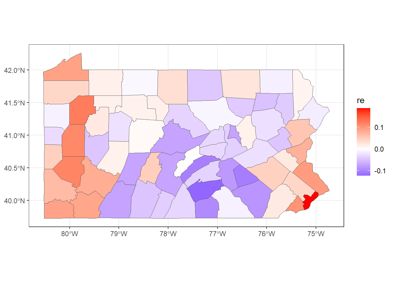
FIGURE 5.4: Posterior mean of the BYM2 random effect.
5.4 Spatio-temporal small area disease risk estimation
In spatio-temporal settings where disease counts are observed over time, we can use spatio-temporal models that account not only for spatial structure but also for temporal correlations and spatio-temporal interactions (Martínez-Beneito, López-Quílez, and Botella-Rocamora 2008; Ugarte et al. 2014). Specifically, counts \(Y_{ij}\) observed in area \(i\) and time \(j\) are modeled as
\[Y_{ij}\sim Po(E_{ij} \theta_{ij}),\ i=1,\ldots,I, \ j=1,\ldots,J,\] where \(\theta_{ij}\) is the relative risk and \(E_{ij}\) is the expected number of cases in area \(i\) and time \(j\). Then, \(\log(\theta_{ij})\) is expressed as a sum of several components including spatial and temporal structures to take into account that neighboring areas and consecutive times may have more similar risk. In addition, spatio-temporal interactions may also be included to take into account that different areas may have different time trends, but these may be more similar in neighboring areas.
For example, Bernardinelli et al. (1995) propose a spatio-temporal model with parametric time trends that expresses the logarithm of the relative risks as
\[\log(\theta_{ij})=\alpha + u_i + v_i + (\beta + \delta_i) \times t_j.\] Here, \(\alpha\) denotes the intercept, \(u_i+v_i\) is an area random effect, \(\beta\) is a global linear trend effect, and \(\delta_i\) is an interaction between space and time representing the difference between the global trend \(\beta\) and the area specific trend. \(u_i\) and \(\delta_i\) are modeled with a CAR distribution, and \(v_i\) are independent and identically distributed normal variables. This model allows each of the areas to have its own time trend with spatial intercept given by \(\alpha + u_i + v_i\) and slope given by \(\beta + \delta_i\). The effect \(\delta_i\) is called differential trend of the \(i\)th area, and denotes the amount by which the time trend of area \(i\) differs from the overall time trend \(\beta\). For example, a positive (negative) \(\delta_i\) indicates area \(i\) has a time trend with slope more (less) steep than the global time trend \(\beta\).
In R-INLA, the formula corresponding to this model can be written as
In the formula, idarea and idarea1 are indices for the areas equal to c(1, 2, ..., I),
idtime are indices for the times equal to c(1, 2, ..., J).
The formula includes an intercept by default.
f(idarea, model = "bym", graph = g) corresponds to the area random effect \(u_i+v_i\),
f(idarea1, idtime, model = "iid") is the differential time trend \(\delta_i \times t_j\),
and idtime denotes the global trend \(\beta \times t_j\).
The model proposed by Bernardinelli et al. (1995) assumes a linear time trend in each area. Alternative models that do not require linearity and assume a non-parametric model for the time trend have also been proposed (Schrödle and Held 2011). For example, Knorr-Held (2000) specify models that include spatial and temporal random effects, as well as an interaction between space and time as follows:
\[\log(\theta_{ij})=\alpha + u_i + v_i + \gamma_j + \phi_j + \delta_{ij},\]
Here \(\alpha\) is the intercept, and \(u_i + v_i\) is a spatial random effect defined as before, that is, \(u_i\) follows a CAR distribution and \(v_i\) is an independent and identically distributed normal variable. \(\gamma_j+\phi_j\) is a temporal random effect. \(\gamma_j\) can follow a random walk in time of first order (RW1)
\[\gamma_j | \gamma_{j-1} \sim ∼ N(\gamma_{j-1}, \sigma_\gamma^2),\] or a random walk in time of second order (RW2)
\[\gamma_j | \gamma_{j-1}, \gamma_{j-2} \sim ∼ N(2\gamma_{j-1}-\gamma_{j-2}, \sigma_\gamma^2).\]
\(\phi_j\) denotes an unstructured temporal effect that is modeled with an independent and identically distributed normal variable, \(\phi_j \sim N(0, \sigma_\phi^2)\). \(\delta_{ij}\) is an interaction between space and time that can be specified in different ways by combining the structures of the random effects which are interacting. Knorr-Held (2000) proposes four types of interactions, namely, interaction between the effects (\(u_i\), \(\gamma_j\)), (\(u_i\), \(\phi_j\)), (\(v_i\), \(\gamma_j\)), and (\(v_i\), \(\phi_j\)).
A model with interaction term \(\delta_{ij}\) defined as the interaction between \(v_i\) (i.i.d.) and \(\phi_j\) (i.i.d.) assumes no spatial or temporal structure on \(\delta_{ij}\). Therefore, the interaction term \(\delta_{ij}\) can be modeled as \(\delta_{ij} \sim N(0, \sigma^2_{\delta})\). The formula corresponding to this model can be specified as
formula <- Y ~ f(idarea, model = "bym", graph = g) +
  f(idtime, model = "rw2") +
  f(idtime1, model = "iid") +
  f(idareatime, model = "iid")
Here, idarea is the vector with the indices of the areas equal to c(1, 2, ..., I),
idtime and idtime1 are the indices of the times equal to c(1, 2, ..., J),
and idareatime is the vector for the interaction equal to c(1, 2, ..., M), where M is the number of observations.
Below we show how to specify the interaction term \(\delta_{ij}\) for each of the types of interactions.
We use idarea to denote the indices of the areas, and idtime to denote the indices of the times.
Note that different indices need to be used for each f()
and we would need to duplicate indices if they were used in other terms of the formula.
As seen before, an interaction term with interacting effects \(v_i\) (i.i.d.) and \(\phi_j\) (i.i.d.) assumes no spatial or temporal structure and is specified as
f(idareatime, model = "iid")An effect that assumes interaction between \(u_i\) (CAR) and \(\phi_j\) (i.i.d.) is specified as
This specifies a CAR distribution for the areas (group = idarea)
for each time independently from all the other times.
When the interaction is between \(v_i\) (i.i.d.) and \(\gamma_j\) (RW2) the effect is specified as
This assumes a random walk of order 2 across time (group = idtime)
for each area independently from all the other areas.
When the effects interacting are \(u_i\) (CAR) and \(\gamma_j\) (RW2), we use
This assumes a random walk of order 2 across time (group = idtime)
for each area that depends on the neighboring areas.
In Chapters 6 and 7 we will see
how to fit and interpret spatial and spatio-temporal areal models in different settings.
5.5 Issues with areal data
Spatial analyses of aggregated data are subject to the Misaligned Data Problem (MIDP) which occurs when the spatial data are analyzed at a scale different from that at which they were originally collected (Banerjee, Carlin, and Gelfand 2004). In some cases, the purpose might be merely to obtain the spatial distribution of one variable at a new level of spatial aggregation. For example, we may wish to make predictions at county level using data that were initially recorded at the postal code level. In other cases, we might wish to relate one variable to other variables that are available at different spatial scales. An example of this scenario is where we want to determine whether the risk of an adverse outcome provided at counties is related to exposure to an environmental pollutant measured at a network of stations, adjusting for population at risk and other demographic information which are available at postal codes.
The Modifiable Areal Unit Problem (MAUP) (Openshaw 1984) is a problem whereby conclusions may change if one aggregates the same underlying data to a new level of spatial aggregation. The MAUP consists of two interrelated effects. The first effect is the scale or aggregation effect. It concerns the different inferences obtained when the same data is grouped into increasingly larger areas. The second effect is the grouping or zoning effect. This effect considers the variability in results due to alternative formations of the areas leading to differences in area shape at the same or similar scales.
Ecological studies are characterized by being based on aggregated data (Robinson 1950). Such studies contain the potential for ecological fallacy which occurs when estimated associations obtained from analysis of variables measured at the aggregated level lead to conclusions different from analysis based on the same variables measured at the individual level. The ecological inference problem can be viewed as a special case of the MAUP. The resulting bias, called ecological bias, is comprised of two effects analogous to the aggregation and zoning effects in the MAUP. These are the aggregation bias due to the grouping of individuals, and the specification bias due to the differential distribution of confounding variables created by grouping (Gotway and Young 2002).