Building an interactive dashboard to visualize spatial data
Paula Moraga, KAUST
Materials based on the book Geospatial Health Data (2019, Chapman & Hall/CRC)
http://www.paulamoraga.com/book-geospatial
In this tutorial we show how to create an interactive dashboard to visualize the spatial patterns of areal variables. We use the R package flexdashboard to create the dashboard that includes several interactive and static visualizations such as a map produced with leaflet, a table created with DT, and a histogram created with ggplot2.
Here we visualize fine particulate air pollution (PM2.5) in each of the world countries in year 2016. PM2.5 refers to atmospheric particulate matter less than 2.5 micrometers in diameter. These particles are so tiny that can get deep into the lungs and cause serious health conditions. PM2.5 data are obtained from the World Bank using the wbstats package. The world shapefile is obtained from the rnaturalearth package.
1 The R package flexdashboard
The flexdashboard package permits to create interactive dashboards containing several related data visualizations. A flexdashboard can include a variety of components such as standard R graphics and interactive JavaScript visualizations created with htmlwidgets. Dashboards are tools for effective data visualization that help communicate information in an intuitive and insightful manner.
1.1 R Markdown
To create a flexdashboard we need to write an R Markdown file with the extension .Rmd. R Markdown allows easy work reproducibility by including R code that generate results and narrative text explaining the work. When the R Markdown file is compiled, the R code is executed and the results are appended to a report that can take a variety of formats including html and pdf documents.
An R Markdown file has three basic components, namely, YAML header, text, and R code. At the top of the R Markdown file we need to write the YAML header between a pair of three dashes ---. This header specifies several document options such as title, author, date and type of output file. To create a flexdashboard, we need to include the YAML header with the option output: flexdashboard::flex_dashboard. The text in a R Markdown file is written with Markdown syntax. For example, we can use asterisks for italic text (*text*) and double asterisks for bold text (**text**) . We can also add hyperlinks using the syntax [text](link), and write section headers using pound signs (#, ## and ### for first, second and third-level headers, respectively). The R code that we wish to execute needs to be specified inside an R code chunk. An R chunk starts with three backticks ```{r} and ends with three backticks ```. We can also write inline R code by writing it between `r and `.
1.2 Layout
The components of the dashboard are shown according to a layout that needs to be specified. Dashboards are divided into columns and rows. We can create layouts with multiple columns by using -------------- for each column. Components are included by using ###. The components include R chunks that contain the code needed to generate the visualizations written between ```{r} and ```. For example, the following code creates a layout with two columns with one and two components, respectively. The width of the columns is specified with the {data-width} attribute.
---
title: "Multiple Columns"
output: flexdashboard::flex_dashboard
---

Column {data-width=600}
-------------------------------------

### Component 1

```{r}

```

Column {data-width=400}
-------------------------------------

### Component 2

```{r}

```

### Component 3

```{r}

```
Layouts can also be specified row-wise rather than column-wise by adding in the YAML the orientation: rows option. Additional layout examples including tabs, multiple pages and sidebars are shown here.
1.3 Dashboard components
A flexdashboard can include a wide variety of components including:
- interactive JavaScript data visualizations based on
htmlwidgetssuch asleafletordygraphs, - charts created with standard R graphics,
- simple tables created with
knitr::kable()or interactive tables created withDT, - value boxes created with the
valueBox()function that display single values with a title and an icon, - gauges that display values on a meter within a specified range,
- text, images, and equations,
- a navigation bar with links to social services, source code, or other links related to the dashboard.
2 Interactive flexdashboard to visualize the world PM2.5 levels
Here we show how to build a flexdashboard to show the PM2.5 levels in each of the world countries in 2016. First we explain how to obtain the data and the world map. Then we show how to create the visualizations of the dashboard. Finally, we define the layout of the dashboard and add the visualizations.
2.1 Data
We obtain the world map using the rnaturalearth package. Specifically, we use the ne_countries() function to obtain a SpatialPolygonsDataFrame object called map with the world country polygons. map has a variable called name with the country names, and a variable called iso3c with the ISO standard country codes of 3 letters. We rename these variables with names NAME and ISO3, and they will be used later to join the map with the data.
library(rnaturalearth)
map <- ne_countries()
names(map)[names(map) == "iso_a3"] <- "ISO3"
names(map)[names(map) == "name"] <- "NAME"

library(sp)
plot(map)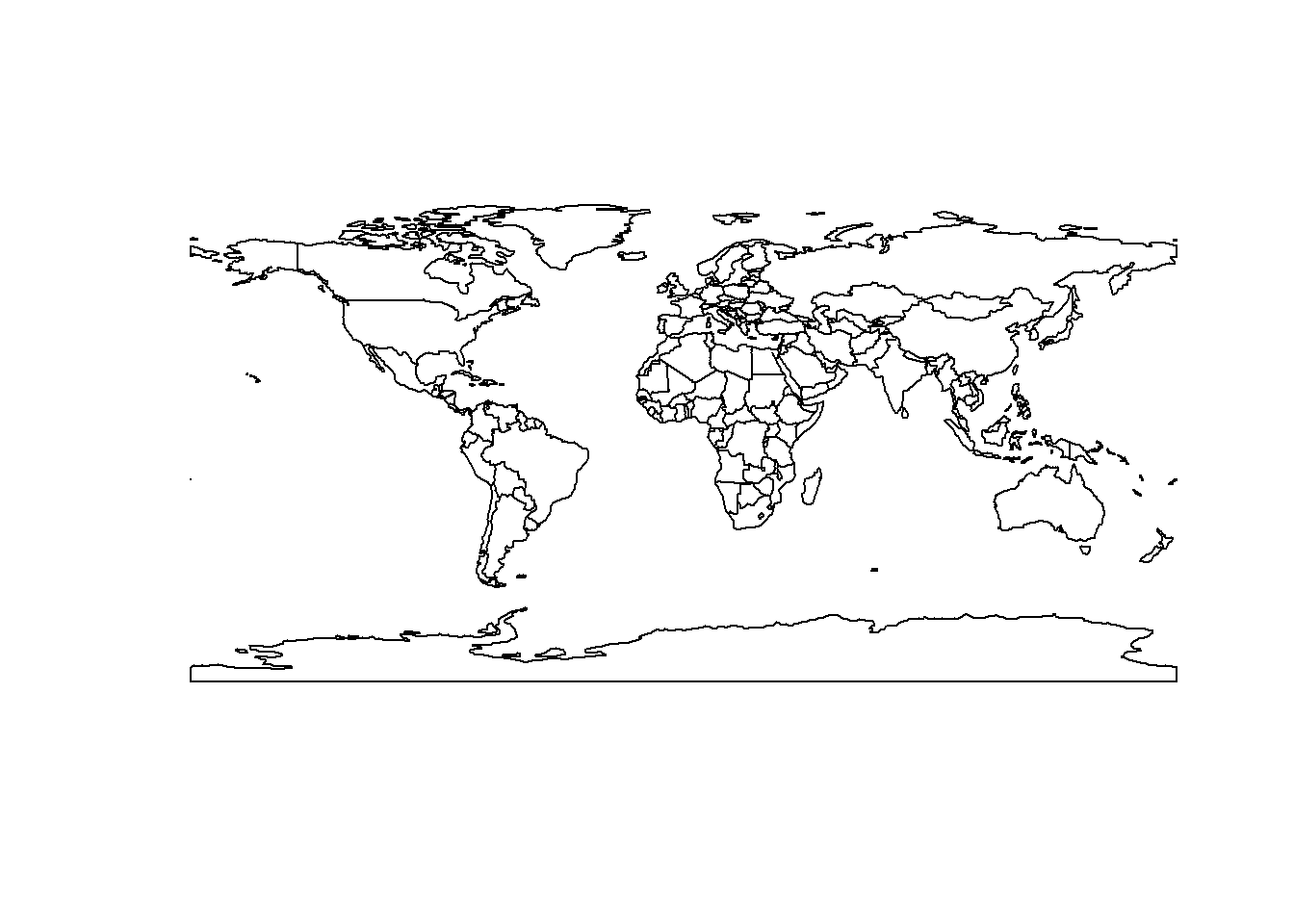
We obtain PM2.5 concentration levels using the wbstats package. This package permits to retrieve global indicators published by the World Bank. If we are interested in obtaining air pollution indicators, we can use the wbsearch() function setting pattern = "pollution". This function searchs all the indicators that match the specified pattern and returns a data frame with their IDs and names.
library(wbstats)
indicators <- wbsearch(pattern = "pollution")
print(indicators)
## indicatorID
## 5229 EE.BOD.CGLS.ZS
## 5230 EE.BOD.CHEM.ZS
## 5231 EE.BOD.FOOD.ZS
## 5232 EE.BOD.MTAL.ZS
## 5233 EE.BOD.OTHR.ZS
## 5234 EE.BOD.PAPR.ZS
## 5236 EE.BOD.TXTL.ZS
## 5237 EE.BOD.WOOD.ZS
## 5337 EN.ATM.PM10.MC.M3
## 5338 EN.ATM.PM25.MC.M3
## 5339 EN.ATM.PM25.MC.T1.ZS
## 5340 EN.ATM.PM25.MC.T2.ZS
## 5341 EN.ATM.PM25.MC.T3.ZS
## 5342 EN.ATM.PM25.MC.ZS
## 8394 IQ.CPA.ENVR.XQ
## 10114 NY.ADJ.DPEM.CD
## 10115 NY.ADJ.DPEM.GN.ZS
## 14940 SH.STA.AIRP.FE.P5
## 14941 SH.STA.AIRP.MA.P5
## 14942 SH.STA.AIRP.P5
## indicator
## 5229 Water pollution, clay and glass industry (% of total BOD emissions)
## 5230 Water pollution, chemical industry (% of total BOD emissions)
## 5231 Water pollution, food industry (% of total BOD emissions)
## 5232 Water pollution, metal industry (% of total BOD emissions)
## 5233 Water pollution, other industry (% of total BOD emissions)
## 5234 Water pollution, paper and pulp industry (% of total BOD emissions)
## 5236 Water pollution, textile industry (% of total BOD emissions)
## 5237 Water pollution, wood industry (% of total BOD emissions)
## 5337 PM10, country level (micrograms per cubic meter)
## 5338 PM2.5 air pollution, mean annual exposure (micrograms per cubic meter)
## 5339 PM2.5 pollution, population exposed to levels exceeding WHO Interim Target-1 value (% of total)
## 5340 PM2.5 pollution, population exposed to levels exceeding WHO Interim Target-2 value (% of total)
## 5341 PM2.5 pollution, population exposed to levels exceeding WHO Interim Target-3 value (% of total)
## 5342 PM2.5 air pollution, population exposed to levels exceeding WHO guideline value (% of total)
## 8394 CPIA policy and institutions for environmental sustainability rating (1=low to 6=high)
## 10114 Adjusted savings: particulate emission damage (current US$)
## 10115 Adjusted savings: particulate emission damage (% of GNI)
## 14940 Mortality rate attributed to household and ambient air pollution, age-standardized, female (per 100,000 female population)
## 14941 Mortality rate attributed to household and ambient air pollution, age-standardized, male (per 100,000 male population)
## 14942 Mortality rate attributed to household and ambient air pollution, age-standardized (per 100,000 population)We decide to plot the indicator PM2.5 air pollution, mean annual exposure (micrograms per cubic meter) (which has code EN.ATM.PM25.MC.M3) in year 2016. To download these data we use the wb() function providing the indicator code and the start and end dates.
d <- wb(indicator = "EN.ATM.PM25.MC.M3", startdate = 2016, enddate = 2016)
print(head(d))
## iso3c date value indicatorID
## 1 ARB 2016 58.76490 EN.ATM.PM25.MC.M3
## 2 CSS 2016 19.10237 EN.ATM.PM25.MC.M3
## 3 CEB 2016 17.64109 EN.ATM.PM25.MC.M3
## 4 EAR 2016 59.87879 EN.ATM.PM25.MC.M3
## 5 EAS 2016 39.52072 EN.ATM.PM25.MC.M3
## 6 EAP 2016 42.29951 EN.ATM.PM25.MC.M3
## indicator iso2c
## 1 PM2.5 air pollution, mean annual exposure (micrograms per cubic meter) 1A
## 2 PM2.5 air pollution, mean annual exposure (micrograms per cubic meter) S3
## 3 PM2.5 air pollution, mean annual exposure (micrograms per cubic meter) B8
## 4 PM2.5 air pollution, mean annual exposure (micrograms per cubic meter) V2
## 5 PM2.5 air pollution, mean annual exposure (micrograms per cubic meter) Z4
## 6 PM2.5 air pollution, mean annual exposure (micrograms per cubic meter) 4E
## country
## 1 Arab World
## 2 Caribbean small states
## 3 Central Europe and the Baltics
## 4 Early-demographic dividend
## 5 East Asia & Pacific
## 6 East Asia & Pacific (excluding high income)The returned data frame d has a variable called value with the PM2.5 values and a variable iso3c with the ISO standard country codes of 3 letters. In the map, we create a variable called PM2.5 with the PM2.5 values in the data (d$value). The order of the countries in the map and in the data d can be different. Therefore, when we create map$PM2.5 we need to ensure that the values added correspond to the right countries. We can usematch() to calculate the positions of the ISO3 code in the map (ISO3) in the data d (iso3), and assign d$value to map$PM2.5 in that order.
map$PM2.5 <- d[match(map$ISO3, d$iso3), "value"]
print(head(map@data))
## scalerank featurecla labelrank sovereignt sov_a3 adm0_dif
## 0 1 Admin-0 country 3 Afghanistan AFG 0
## 1 1 Admin-0 country 3 Angola AGO 0
## 2 1 Admin-0 country 6 Albania ALB 0
## 3 1 Admin-0 country 4 United Arab Emirates ARE 0
## 4 1 Admin-0 country 2 Argentina ARG 0
## 5 1 Admin-0 country 6 Armenia ARM 0
## level type admin adm0_a3 geou_dif
## 0 2 Sovereign country Afghanistan AFG 0
## 1 2 Sovereign country Angola AGO 0
## 2 2 Sovereign country Albania ALB 0
## 3 2 Sovereign country United Arab Emirates ARE 0
## 4 2 Sovereign country Argentina ARG 0
## 5 2 Sovereign country Armenia ARM 0
## geounit gu_a3 su_dif subunit su_a3 brk_diff
## 0 Afghanistan AFG 0 Afghanistan AFG 0
## 1 Angola AGO 0 Angola AGO 0
## 2 Albania ALB 0 Albania ALB 0
## 3 United Arab Emirates ARE 0 United Arab Emirates ARE 0
## 4 Argentina ARG 0 Argentina ARG 0
## 5 Armenia ARM 0 Armenia ARM 0
## NAME name_long brk_a3 brk_name
## 0 Afghanistan Afghanistan AFG Afghanistan
## 1 Angola Angola AGO Angola
## 2 Albania Albania ALB Albania
## 3 United Arab Emirates United Arab Emirates ARE United Arab Emirates
## 4 Argentina Argentina ARG Argentina
## 5 Armenia Armenia ARM Armenia
## brk_group abbrev postal formal_en formal_fr note_adm0
## 0 <NA> Afg. AF Islamic State of Afghanistan <NA> <NA>
## 1 <NA> Ang. AO People's Republic of Angola <NA> <NA>
## 2 <NA> Alb. AL Republic of Albania <NA> <NA>
## 3 <NA> U.A.E. AE United Arab Emirates <NA> <NA>
## 4 <NA> Arg. AR Argentine Republic <NA> <NA>
## 5 <NA> Arm. ARM Republic of Armenia <NA> <NA>
## note_brk name_sort name_alt mapcolor7 mapcolor8 mapcolor9
## 0 <NA> Afghanistan <NA> 5 6 8
## 1 <NA> Angola <NA> 3 2 6
## 2 <NA> Albania <NA> 1 4 1
## 3 <NA> United Arab Emirates <NA> 2 1 3
## 4 <NA> Argentina <NA> 3 1 3
## 5 <NA> Armenia <NA> 3 1 2
## mapcolor13 pop_est gdp_md_est pop_year lastcensus gdp_year
## 0 7 28400000 22270 NA 1979 NA
## 1 1 12799293 110300 NA 1970 NA
## 2 6 3639453 21810 NA 2001 NA
## 3 3 4798491 184300 NA 2010 NA
## 4 13 40913584 573900 NA 2010 NA
## 5 10 2967004 18770 NA 2001 NA
## economy income_grp wikipedia fips_10 iso_a2
## 0 7. Least developed region 5. Low income NA <NA> AF
## 1 7. Least developed region 3. Upper middle income NA <NA> AO
## 2 6. Developing region 4. Lower middle income NA <NA> AL
## 3 6. Developing region 2. High income: nonOECD NA <NA> AE
## 4 5. Emerging region: G20 3. Upper middle income NA <NA> AR
## 5 6. Developing region 4. Lower middle income NA <NA> AM
## ISO3 iso_n3 un_a3 wb_a2 wb_a3 woe_id adm0_a3_is adm0_a3_us adm0_a3_un
## 0 AFG 004 004 AF AFG NA AFG AFG NA
## 1 AGO 024 024 AO AGO NA AGO AGO NA
## 2 ALB 008 008 AL ALB NA ALB ALB NA
## 3 ARE 784 784 AE ARE NA ARE ARE NA
## 4 ARG 032 032 AR ARG NA ARG ARG NA
## 5 ARM 051 051 AM ARM NA ARM ARM NA
## adm0_a3_wb continent region_un subregion region_wb
## 0 NA Asia Asia Southern Asia South Asia
## 1 NA Africa Africa Middle Africa Sub-Saharan Africa
## 2 NA Europe Europe Southern Europe Europe & Central Asia
## 3 NA Asia Asia Western Asia Middle East & North Africa
## 4 NA South America Americas South America Latin America & Caribbean
## 5 NA Asia Asia Western Asia Europe & Central Asia
## name_len long_len abbrev_len tiny homepart PM2.5
## 0 11 11 4 NA 1 56.28705
## 1 6 6 4 NA 1 31.78539
## 2 7 7 4 NA 1 18.18993
## 3 20 20 6 NA 1 40.52210
## 4 9 9 4 NA 1 13.75144
## 5 7 7 4 NA 1 32.227172.2 Table using DT
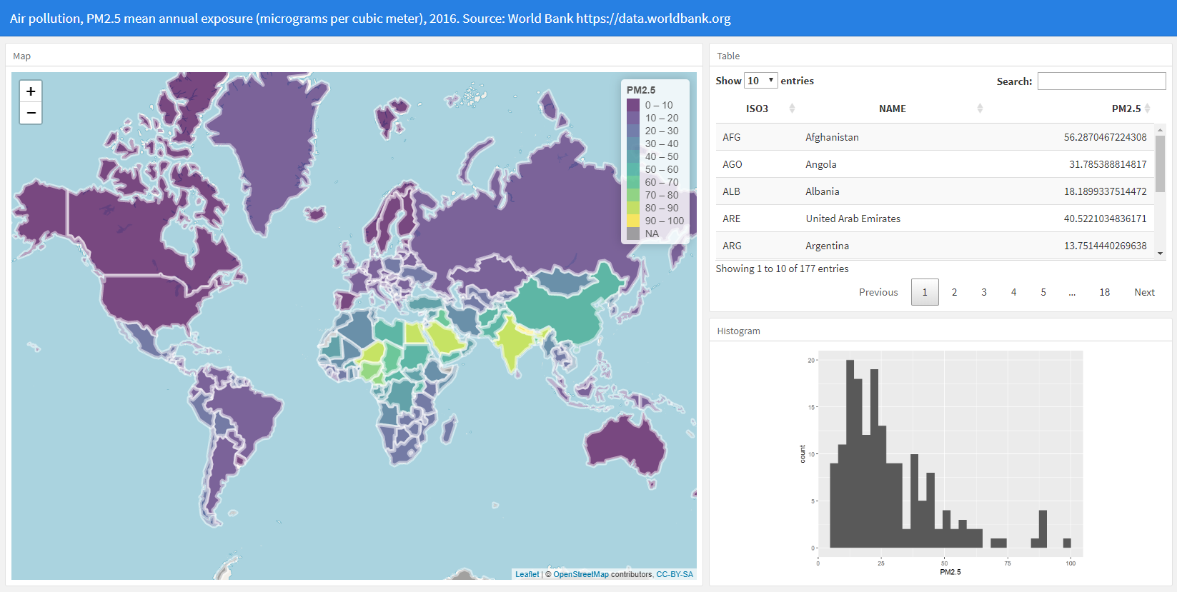
Now we create the visualizations that will be put in the dashboard. We create an interactive table that shows the data by using the DT package. We use the datatable() function with a data frame with variables ISO3, NAME, and PM2.5. We set rownames = FALSE to hide row names, and options = list(pageLength = 10) to set the page length equal to 10 rows. The table created enables filtering and sorting of the variables shown.
library(DT)
DT::datatable(map@data[, c("ISO3", "NAME", "PM2.5")],
              rownames = FALSE, options = list(pageLength = 10))
2.3 Map using leaflet
Next, we create an interactive map with the PM2.5 levels of each country by using the leaflet package. To colour the countries according to their PM2.5 values, we first create a colour palette. We called this palette pal and create it by using the colorNumeric() function with color viridis, domain equal to the PM2.5 values, and cut points equal to the sequence from 0 to the maximum PM\(_{2.5}\) values in increments of 10. To create the map we use the leaflet() function passing the map object. We write addTiles() to add a background world map, and setView() to center the map and zoom the map. Then we use addPolygons() to plot the areas of the map. We colour the areas with the colours given by the PM2.5 values and the palette pal. Moreover, we colour the border of the areas (color) white and set fillOpacity = 0.7 so the background map can be seen. Finally we add a legend with the function addLegend() specifying the colour palette, values, opacity and title.
We also wish to show labels with the name and PM2.5 levels of each of the countries. We can create the labels using HTML code and then apply the htmltools::HTML() function so leaflet knows how to plot them. Then we add the labels to the argument label of addPolygons() and add highlight options to highlight areas as the mouse passes over them.
library(leaflet)

pal <- colorBin(palette = "viridis", domain = map$PM2.5,
                bins = seq(0, max(map$PM2.5, na.rm = TRUE) + 10, by = 10))

map$labels <- paste0("<strong> Country: </strong> ", map$NAME, "<br/> ",
                     "<strong> PM2.5: </strong> ", map$PM2.5, "<br/> ") %>%
                       lapply(htmltools::HTML)

leaflet(map) %>% addTiles() %>%
setView(lng = 0, lat = 30, zoom = 2) %>%
  addPolygons(
  fillColor = ~pal(PM2.5),
  color = "white",
  fillOpacity = 0.7,
  label = ~labels,
  highlight = highlightOptions(color = "black", bringToFront = TRUE)) %>%
  leaflet::addLegend(pal = pal, values = ~PM2.5, opacity = 0.7, title = "PM2.5")
2.4 Histogram using ggplot2
We also create a histogram with the PM2.5 values. We use the ggplot() function of the ggplot2 package.
library(ggplot2)
ggplot(data = map@data, aes(x = PM2.5)) + geom_histogram()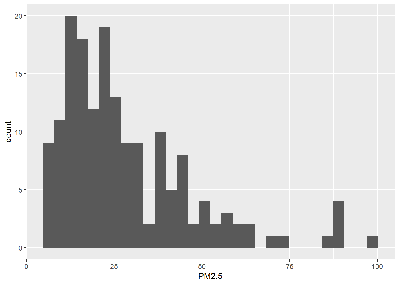
2.5 R Markdown structure. YAML header and layout
Now we write the structure of the R Markdown document. In the YAML header, we specify the title and the type of output file (flexdashboard::flex_dashboard). We create a dashboard with two columns with one and two rows, respectively. Columns are created by using --------------, and the components are included by using ###. We set the width of first column to 600 pixels, and the second column to 400 pixels using the {data-width} attribute. We write an R chunk for the leaflet map in the first column, and R chunks for the table and the histogram in the second column.
---
title: "Air pollution, PM2.5 mean annual exposure (micrograms per cubic meter), 2016"
output: flexdashboard::flex_dashboard
---

Column {data-width=600}
-------------------------------------

### Map

```{r}

```

Column {data-width=400}
-------------------------------------

### Table

```{r}

```

### Histogram

```{r}

```

```
2.6 R code to obtain the data and create the visualizations
We finish the dashboard by adding the R code needed to obtain the data and create the visualizations. Below the YAML code, we add the code to load the packages needed, and obtain the map and the PM2.5 data. Then, in the corresponding R chunks, we add the code to create the leaflet map, the table and the histogram. Finally, we compile the R Markdown file and obtain the interactive flexdashboard showing world PM2.5 concentration levels in 2016. The complete code is as follows.
---
title: "Air pollution, PM2.5 mean annual exposure (micrograms per cubic meter), 2016. Source: World Bank https://data.worldbank.org"
output: flexdashboard::flex_dashboard
---
```{r}
library(rnaturalearth)
library(wbstats)
library(leaflet)
library(DT)
library(ggplot2)
library(sp)
map <- ne_countries()
names(map)[names(map) == "iso_a3"] <- "ISO3"
names(map)[names(map) == "name"] <- "NAME"
d <- wb(indicator = "EN.ATM.PM25.MC.M3", startdate = 2016, enddate = 2016)
map$PM2.5 <- d[match(map$ISO3, d$iso3), "value"]
```
Column {data-width=600}
-------------------------------------
### Map
```{r}
pal <- colorBin(palette = "viridis", domain = map$PM2.5,
bins = seq(0, max(map$PM2.5, na.rm = TRUE) + 10, by = 10))
map$labels <- paste0("<
strong> Country: <
/strong> ", map$NAME, "<
br/> ",
"<
strong> PM2.5: <
/strong> ", map$PM2.5, "<
br/> ") %>%
lapply(htmltools::HTML)
leaflet(map) %>% addTiles() %>%
setView(lng = 0, lat = 30, zoom = 2) %>%
addPolygons(
fillColor = ~pal(PM2.5),
color = "white",
fillOpacity = 0.7,
label = ~labels,
highlight = highlightOptions(color = "black", bringToFront = TRUE)) %>%
leaflet::addLegend(pal = pal, values = ~PM2.5, opacity = 0.7, title = "PM2.5")
```
Column {data-width=400}
-------------------------------------
### Table
```{r}
DT::datatable(map@data[, c("ISO3", "NAME", "PM2.5")],
rownames = FALSE, options = list(pageLength = 10))
```
### Histogram
```{r}
ggplot(data = map@data, aes(x = PM2.5)) + geom_histogram()
```
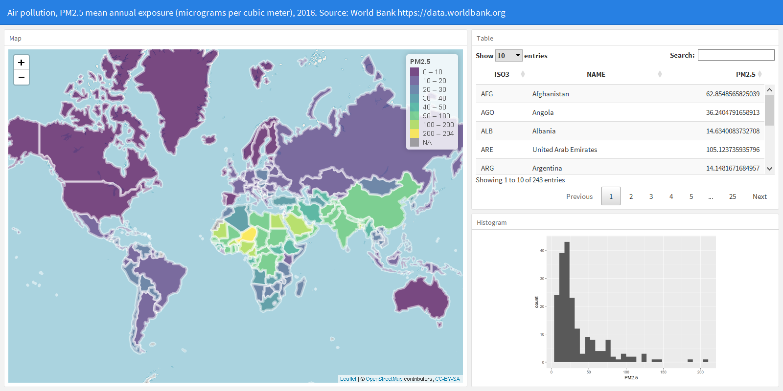
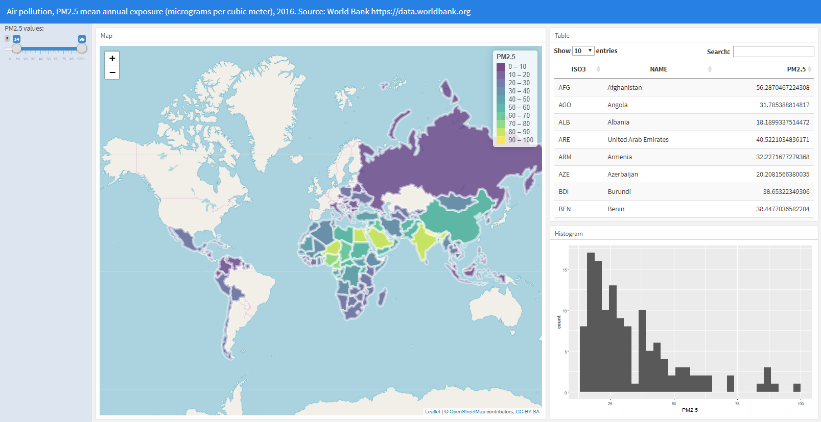
3 Adding a slider to filter countries
This dashboard created can be further customized to include other visualizations, and Shiny can be used to create dynamic documents that enable the user to change parameters to update the data. Here, we add has a slider with the PM\(_{2.5}\) values that the user can modify to filter the countries that he or she wants to inspect. When the slider is changed, the dashboard visualizations update and show the data corresponding to the countries that have PM\(_{2.5}\) values in the range of values specified in the slider.
To build this dashboard, we add runtime: shiny to the YAML header.
---
title: "Air pollution, PM2.5 mean annual exposure
  (micrograms per cubic meter), 2016.
  Source: World Bank https://data.worldbank.org"
output: flexdashboard::flex_dashboard
runtime: shiny
---
Then, we add a column on the left-hand side of the dashboard where we add the slider to filter the countries that are shown in the visualizations. In this column we add the .{sidebar} attribute to indicate that the column appears on the left and has a special background color. The default width of a {.sidebar} column is 250 pixels. Here we modify the width of this column and the other two columns of the dashboard as follows. We use {.sidebar data-width=200} for the sidebar column, {data-width=500} for the column that contains the map, and {data-width=300} for the column that contains the table and the histogram.
Column {.sidebar data-width=200}
-------------------------------------
Then, we add the slider using the sliderInput() function with inputId equal to "rangevalues" and label (text that appears next to the slider) equal to "PM2.5 values:". Then we calculate the variables minvalue and maxvalue as the minimum and maximum integers of the PM\(_{2.5}\) values in the data. After that, we indicate that the slider minimum and maximum values (min and max) are equal to the the minimum and maximum values of the PM\(_{2.5}\) values in the data (minvalue and maxvalue). Finally, we set value = c(minvalue, maxvalue) so initially the slider values are in the range minvalue to maxvalue.
Column {.sidebar data-width=200}
-------------------------------------

```{r}
minvalue <- floor(min(map$PM2.5, na.rm = TRUE))
maxvalue <- ceiling(max(map$PM2.5, na.rm = TRUE))
sliderInput("rangevalues", label = "PM2.5 values:",
            min = minvalue, max = maxvalue,
            value = c(minvalue, maxvalue))
```
Then we modify the code that creates the map, the table and the histogram so they show the data corresponding to the countries with PM\(_{2.5}\) values in the range of values selected in the slider. First we calculate a vector rowsinrangeslider with the indices of the rows of the map that are in the range of values specified in the slider. That is, between input$rangevalues[1] and input$rangevalues[2]. Then we use a reactive expression to create the object mapFiltered that is equal to the subset of rows of map corresponding to rowsinrangeslider.
```{r}
mapFiltered <- reactive({
rowsinrangeslider <- which(map$PM2.5 >= input$rangevalues[1] &
                           map$PM2.5 <= input$rangevalues[2])
map[rowsinrangeslider, ]})
```
After that, we create the visualizations using mapFiltered() instead of map, and using render*() functions to be able to access the mapFiltered() object calculated in the reactive expression. Specifically, we enclose the map with renderLeaflet({}), the table with renderDT({}), and the histogram with renderPlot({}) so they are interactive. Finally, to avoid the error that appears when the leaflet map is rendered with mapFiltered() that does not contain any country, we check the number of rows before rendering the map. If the number of rows of mapFiltered() is equal to 0 the execution stops returning NULL.
```{r}
if(nrow(mapFiltered()) == 0){
  return(NULL)
}
```
The complete code to build this interactive dashboard to global air pollution is shown below.
---
title: "Air pollution, PM2.5 mean annual exposure
(micrograms per cubic meter), 2016.
Source: World Bank https://data.worldbank.org"
output: flexdashboard::flex_dashboard
runtime: shiny
---
```{r}
library(rnaturalearth)
library(wbstats)
library(leaflet)
library(DT)
library(ggplot2)
map <- ne_countries()
names(map)[names(map) == "iso_a3"] <- "ISO3"
names(map)[names(map) == "name"] <- "NAME"
d <- wb(indicator = "EN.ATM.PM25.MC.M3",
startdate = 2016, enddate = 2016)
map$PM2.5 <- d[match(map$ISO3, d$iso3), "value"]
```
Column {.sidebar data-width=200}
-------------------------------------
```{r}
minvalue <- floor(min(map$PM2.5, na.rm = TRUE))
maxvalue <- ceiling(max(map$PM2.5, na.rm = TRUE))
sliderInput("rangevalues",
label = "PM2.5 values:",
min = minvalue, max = maxvalue,
value = c(minvalue, maxvalue)
)
```
Column {data-width=500}
-------------------------------------
### Map
```{r}
pal <- colorBin(
palette = "viridis", domain = map$PM2.5,
bins = seq(0, max(map$PM2.5, na.rm = TRUE) + 10, by = 10)
)
map$labels <- paste0("<
strong> Country: <
/strong> ", map$NAME, "<
br/> ",
"<
strong> PM2.5: <
/strong> ", map$PM2.5, "<
br/> ") %>%
lapply(htmltools::HTML)
mapFiltered <- reactive({
rowsinrangeslider <- which(map$PM2.5 >= input$rangevalues[1] &
map$PM2.5 <= input$rangevalues[2])
map[rowsinrangeslider, ]
})
renderLeaflet({
if (nrow(mapFiltered()) == 0) {
return(NULL)
}
leaflet(mapFiltered()) %>%
addTiles() %>%
setView(lng = 0, lat = 30, zoom = 2) %>%
addPolygons(
fillColor = ~ pal(PM2.5),
color = "white",
fillOpacity = 0.7,
label = ~labels,
highlight = highlightOptions(
color = "black",
bringToFront = TRUE
)
) %>%
leaflet::addLegend(
pal = pal, values = ~PM2.5,
opacity = 0.7, title = "PM2.5"
)
})
```
Column {data-width=300}
-------------------------------------
### Table
```{r}
renderDT({
DT::datatable(mapFiltered()@data[, c("ISO3", "NAME", "PM2.5")],
rownames = FALSE, options = list(pageLength = 10)
)
})
```
### Histogram
```{r}
renderPlot({
ggplot(data = mapFiltered()@data, aes(x = PM2.5)) +
geom_histogram()
})
```

This work by Paula Moraga is licensed under a Creative Commons Attribution-NonCommercial-NoDerivatives 4.0 International License.