6 Spatial modeling of areal data. Lip cancer in Scotland
In this chapter we estimate the risk of lip cancer in males in Scotland, UK, using the R-INLA package (Havard Rue, Lindgren, and Teixeira Krainski 2024). We use data on the number of observed and expected lip cancer cases, and the proportion of population engaged in agriculture, fishing, or forestry (AFF) for each of the Scotland counties. These data are obtained from the SpatialEpi package (Kim, Wakefield, and Moise 2023). First, we describe how to calculate and interpret the standardized incidence ratios (SIRs) in the Scotland counties. Then, we show how to fit the Besag-York-Mollié (BYM) model to obtain relative risk estimates and quantify the effect of the AFF variable. We also show how to calculate exceedance probabilities of relative risk being greater than a given threshold value. Results are shown by means of tables, static plots created with ggplot2 (Wickham et al. 2024), and interactive maps created with leaflet (Cheng et al. 2024). A similar example that analyzes lung cancer data in Pennsylvania, USA, appears in Moraga (2018).
6.1 Data and map
We start by loading the SpatialEpi package and attaching the scotland data.
The data contain, for each of the Scotland counties, the number of observed and expected lip cancer cases between 1975 and 1980, and a variable that indicates the proportion of the population engaged in agriculture, fishing, or forestry (AFF).
The AFF variable is related to exposure to sunlight which is a risk factor for lip cancer.
The data also contain a map of the Scotland counties.
library(SpatialEpi)
data(scotland)
Next we inspect the data.
class(scotland)## [1] "list"
names(scotland)## [1] "geo" "data"
## [3] "spatial.polygon" "polygon"We see that scotland is a list object with the following elements:
-
geo: data frame with names and centroid coordinates (eastings/northings) of each of the counties, -
data: data frame with names, number of observed and expected lip cancer cases, and AFF values of each of the counties, -
spatial.polygon:SpatialPolygonsobject with the map of Scotland, -
polygon: polygon map of Scotland.
We can type head(scotland$data) to see the number of observed and expected lip cancer cases and the AFF values of the first counties.
head(scotland$data)## county.names cases expected AFF
## 1 skye-lochalsh 9 1.4 0.16
## 2 banff-buchan 39 8.7 0.16
## 3 caithness 11 3.0 0.10
## 4 berwickshire 9 2.5 0.24
## 5 ross-cromarty 15 4.3 0.10
## 6 orkney 8 2.4 0.24The map of Scotland counties is given by the SpatialPolygons object called scotland$spatial.polygon (Figure 6.1).
map <- scotland$spatial.polygon
plot(map)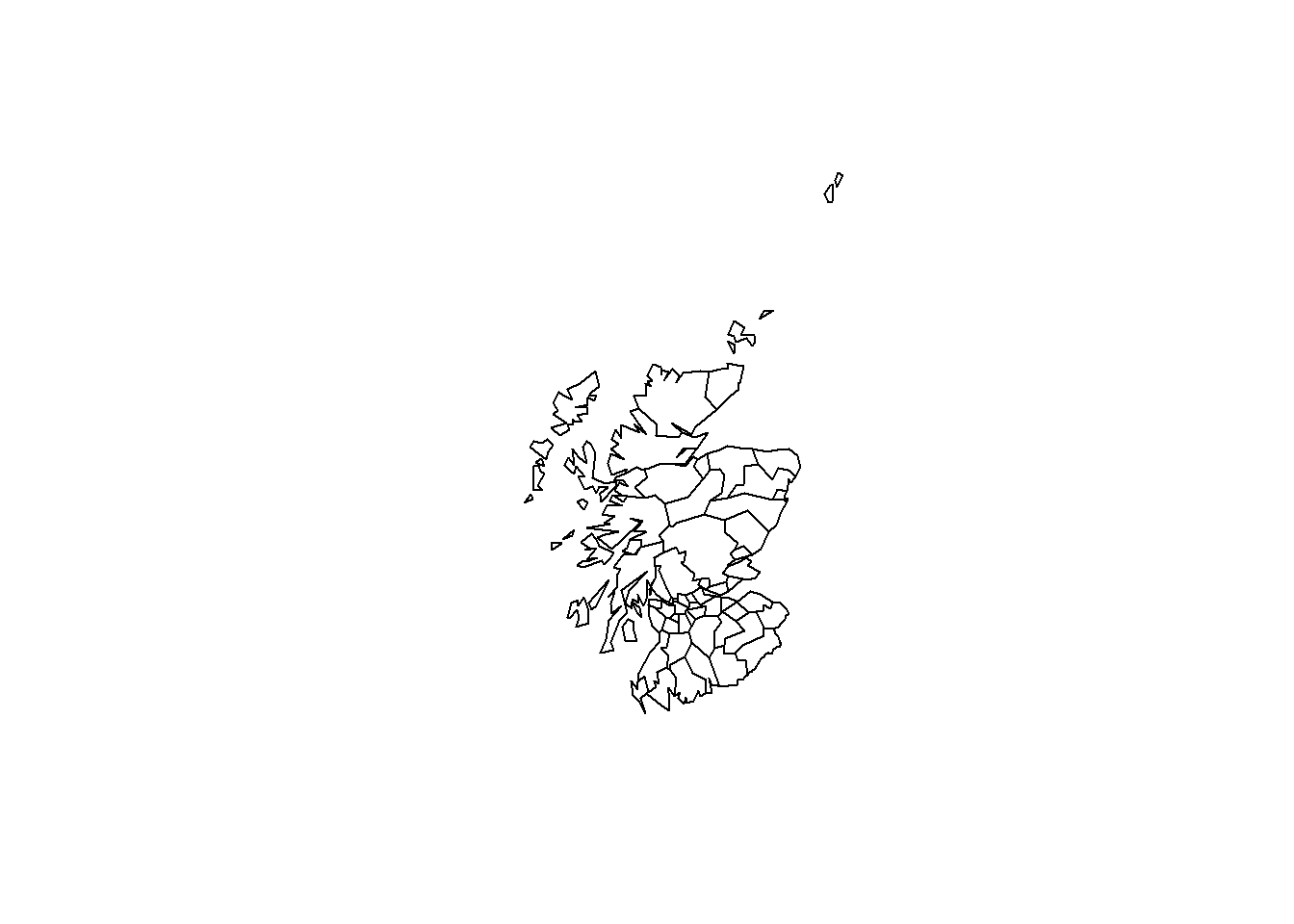
FIGURE 6.1: Map of Scotland counties.
map does not contain information about the Coordinate Reference System (CRS), so we specify a CRS
by assigning the corresponding proj4 string to the map.
The map is in the projection OSGB 1936/British National Grid which has EPSG code 27700.
The proj4 string of this projection can be seen in
https://spatialreference.org/ref/epsg/27700/.
We assign this proj4 string to map and set +units=km because this is the unit of the map projection.
proj4string(map) <- "+proj=tmerc +lat_0=49 +lon_0=-2
+k=0.9996012717 +x_0=400000 +y_0=-100000 +datum=OSGB36
+units=km +no_defs"
We wish to use the leaflet package to create maps.
leaflet expects data to be specified in latitude and longitude using WGS84, so
we transform map to this projection by first converting map from a sp to a sf object, and then using st_transform() to convert the coordinates.
library(sf)
map <- st_as_sf(map)
map <- st_transform(map, crs = 4326)
6.2 Data preparation
In order to analyze the data, we create
a data frame called d with columns containing the counties ids, the observed and expected number of lip cancer cases, the AFF values, and the SIRs. Specifically, d contains the following columns:
-
county: id of each county, -
Y: observed number of lip cancer cases in each county, -
E: expected number of lip cancer cases in each county, -
AFF: proportion of population engaged in agriculture, fishing, or forestry, -
SIR: SIR of each county.
We create the data frame d by selecting the columns of
scotland$data that denote the counties, the number of observed cases, the number of expected cases, and the variable AFF.
Then we set the column names of the data frame to c("county", "Y", "E", "AFF").
d <- scotland$data[, c("county.names", "cases", "expected", "AFF")]
names(d) <- c("county", "Y", "E", "AFF")
Note that in this example the number of expected counts are given in the data. If the expected counts were not available, we could calculate them using indirect standardization as demonstrated in Chapter 5. Then, we can compute the SIR values as the ratio of the observed to the expected number of lip cancer cases.
d$SIR <- d$Y / d$EThe first rows of the data frame d are the following:
head(d)## county Y E AFF SIR
## 1 skye-lochalsh 9 1.4 0.16 6.429
## 2 banff-buchan 39 8.7 0.16 4.483
## 3 caithness 11 3.0 0.10 3.667
## 4 berwickshire 9 2.5 0.24 3.600
## 5 ross-cromarty 15 4.3 0.10 3.488
## 6 orkney 8 2.4 0.24 3.3336.2.1 Adding data to map
The map with the counties map and the data d contains the Scotland counties in the same order. We join the data to the map as follows:
map <- cbind(map, d)We can see the first part of the data by typing head(map).
Here the first column corresponds to the row names of the data, and the rest of the columns correspond to the variables county, Y, E, AFF and SIR.
head(map)## Simple feature collection with 6 features and 5 fields
## Geometry type: MULTIPOLYGON
## Dimension: XY
## Bounding box: xmin: -6.79 ymin: 55.63 xmax: -1.792 ymax: 59.28
## Geodetic CRS: WGS 84
##          county  Y   E  AFF   SIR
## 1 skye-lochalsh  9 1.4 0.16 6.429
## 2  banff-buchan 39 8.7 0.16 4.483
## 3     caithness 11 3.0 0.10 3.667
## 4  berwickshire  9 2.5 0.24 3.600
## 5 ross-cromarty 15 4.3 0.10 3.488
## 6        orkney  8 2.4 0.24 3.333
## geometry
## 1 MULTIPOLYGON (((-5.493 57.0...
## 2 MULTIPOLYGON (((-2.272 57.6...
## 3 MULTIPOLYGON (((-3.525 58.6...
## 4 MULTIPOLYGON (((-2.367 55.9...
## 5 MULTIPOLYGON (((-4.044 57.8...
## 6 MULTIPOLYGON (((-3.401 58.9...6.3 Mapping SIRs
We can visualize the observed and expected lip cancer cases, the SIRs, as well as the AFF values in an interactive choropleth map
using the leaflet package.
We create a map with the SIRs by first calling leaflet() and adding the default OpenStreetMap
map tiles to the map with addTiles().
Then we add the Scotland counties with addPolygons() where we specify the areas boundaries color (color) and the stroke width (weight).
We fill the areas with the colors given by the color palette function generated with
colorNumeric(), and set fillOpacity to a value less than 1 to be able to see the background map.
We use colorNumeric() to create a color palette function that maps data values to colors according to a given palette.
We create the function using the parameters
palette with color function that values will be mapped to, and
domain with the possible values that can be mapped.
Finally, we add the legend by specifying the color palette function (pal) and the values used to generate colors from the palette function (values).
We set opacity to the same value as the opacity in the map, and specify a title and a position for the legend (Figure 6.2).
library(leaflet)
l <- leaflet(map) %>% addTiles()

pal <- colorNumeric(palette = "YlOrRd", domain = map$SIR)

l %>%
  addPolygons(
    color = "grey", weight = 1,
    fillColor = ~ pal(SIR), fillOpacity = 0.5
  ) %>%
  addLegend(
    pal = pal, values = ~SIR, opacity = 0.5,
    title = "SIR", position = "bottomright"
  )
FIGURE 6.2: Interactive map of lip cancer SIR in Scotland counties created with leaflet.
We can improve the map by highlighting the counties when the mouse hovers over them, and showing information about the observed and expected counts, SIRs, and AFF values.
We do this by adding the arguments highlightOptions, label and labelOptions to addPolygons().
We choose to highlight the areas using a bigger stroke width (highlightOptions(weight = 4)).
We create the labels using HTML syntax. First, we create the text to be shown
using the function sprintf() which returns a character vector containing a formatted combination of text and variable values and then applying
htmltools::HTML() which marks the text as HTML.
In labelOptions we specify the style, textsize, and direction of the labels. Possible values for direction are left, right and auto and this specifies the direction the label displays in relation to the marker.
We set direction equal to auto so the optimal direction will be chosen depending on the position of the marker.
labels <- sprintf("<strong> %s </strong> <br/>
  Observed: %s <br/> Expected: %s <br/>
  AFF: %s <br/> SIR: %s",
  map$county, map$Y, round(map$E, 2),
  map$AFF, round(map$SIR, 2)
) %>%
  lapply(htmltools::HTML)

l %>%
  addPolygons(
    color = "grey", weight = 1,
    fillColor = ~ pal(SIR), fillOpacity = 0.5,
    highlightOptions = highlightOptions(weight = 4),
    label = labels,
    labelOptions = labelOptions(
      style = list(
        "font-weight" = "normal",
        padding = "3px 8px"
      ),
      textsize = "15px", direction = "auto"
    )
  ) %>%
  addLegend(
    pal = pal, values = ~SIR, opacity = 0.5,
    title = "SIR", position = "bottomright"
  )
FIGURE 6.3: Interactive map of lip cancer SIR in Scotland counties created with leaflet after adding labels.
We can examine the map of SIRs and see which counties in Scotland have SIR equal to 1 indicating observed counts are the same as expected counts, and which counties have SIR greater (or smaller) than 1, indicating observed counts are greater (or smaller) than expected counts. This map gives a sense of the lip cancer risk across Scotland. However, SIRs may be misleading and insufficiently reliable in counties with small populations. In contrast, model-based approaches enable to incorporate covariates and borrow information from neighboring counties to improve local estimates, resulting in the smoothing of extreme values based on small sample sizes. In the next section, we show how to obtain disease risk estimates using a spatial model with the R-INLA package.
6.4 Modeling
In this section we specify the model for the data, and detail the required steps to fit the model and obtain the disease risk estimates using R-INLA.
6.4.1 Model
We specify a model assuming that the observed counts, \(Y_i\), are conditionally independently Poisson distributed:
\[Y_i \sim Poisson(E_i \theta_i),\ i=1,\ldots,n,\]
where \(E_i\) is the expected count and \(\theta_i\) is the relative risk in area \(i\). The logarithm of \(\theta_i\) is expressed as
\[\log(\theta_i) = \beta_0 + \beta_1 \times AFF_i + u_i + v_i,\]
where \(\beta_0\) is the intercept that represents the overall risk, \(\beta_1\) is the coefficient of the AFF covariate, \(u_i\) is a spatial structured component modeled with a CAR distribution, \(u_i|\boldsymbol{u_{-i}} \sim N\left(\bar u_{\delta_i}, \frac{\sigma^2_u}{n_{\delta_i}}\right)\), and \(v_i\) is an unstructured spatial effect defined as \(v_i \sim N(0, \sigma^2_v)\). The relative risk \(\theta_i\) quantifies whether area \(i\) has higher (\(\theta_i > 1\)) or lower (\(\theta_i < 1\)) risk than the average risk in the standard population.
6.4.2 Neighborhood matrix
We create the neighborhood matrix needed to define the spatial random effect using the poly2nb() and the nb2INLA() functions of the spdep package (Bivand 2024).
First, we use poly2nb() to create a neighbors list based on areas with contiguous boundaries.
Each element of the list nb represents one area and contains the indices of its neighbors.
For example, nb[[2]] contains the neighbors of area 2.
## [[1]]
## [1]  5  9 19
##
## [[2]]
## [1]  7 10
##
## [[3]]
## [1] 12
##
## [[4]]
## [1] 18 20 28
##
## [[5]]
## [1]  1 12 19
##
## [[6]]
## [1] 0
Then, we use nb2INLA() to convert this list into a file with the representation of the neighborhood matrix as required by R-INLA.
Then we read the file using the inla.read.graph() function of R-INLA, and store it in the object g which we will later use to specify the spatial random effect.
nb2INLA("map.adj", nb)
g <- inla.read.graph(filename = "map.adj")
6.4.3 Inference using INLA
The model includes two random effects, namely, \(u_i\) for modeling the spatial residual variation, and \(v_i\) for modeling unstructured noise.
We need to include two vectors in the data that denote the indices of these random effects.
We call idareau the indices vector for \(u_i\), and idareav the indices vector for \(v_i\).
We set both idareau and idareav equal to \(1,\ldots,n\), where \(n\) is the number of counties. In our example, \(n\)=56 and this can be obtained with the number of rows in the data (nrow(map)).
We specify the model formula by including the response in the left-hand side, and the fixed and random effects in the right-hand side.
The response variable is Y and we use the covariate AFF.
Random effects are defined using f() with parameters equal to the name of the index variable and the chosen model.
For \(u_i\), we use model = "besag" with neighborhood matrix given by g.
We also use option scale.model = TRUE to make the precision parameter of models with different CAR priors comparable (Freni-Sterrantino, Ventrucci, and Rue 2018).
For \(v_i\), we choose model = "iid".
formula <- Y ~ AFF +
  f(idareau, model = "besag", graph = g, scale.model = TRUE) +
  f(idareav, model = "iid")
We fit the model by calling the inla() function. We specify the formula, family ("poisson"), data, and the expected counts (E).
We also set control.predictor equal to list(compute = TRUE) to compute the posteriors of the predictions.
6.4.4 Results
We can inspect the results object res by typing summary(res).
summary(res)## Time used:
## Pre = 0.979, Running = 0.677, Post = 0.141, Total = 1.8
## Fixed effects:
## mean sd 0.025quant 0.5quant
## (Intercept) -0.306 0.119 -0.538 -0.307
## AFF 4.316 1.273 1.755 4.336
## 0.975quant mode kld
## (Intercept) -0.069 -0.307 0
## AFF 6.762 4.336 0
##
## Random effects:
## Name Model
## idareau Besags ICAR model
## idareav IID model
##
## Model hyperparameters:
## mean sd 0.025quant
## Precision for idareau 4.14 1.44 2.02
## Precision for idareav 22019.83 23929.37 1507.70
## 0.5quant 0.975quant mode
## Precision for idareau 3.91 7.60 3.48
## Precision for idareav 14540.41 85565.13 4131.12
##
## Marginal log-Likelihood: -189.62
## is computed
## Posterior summaries for the linear predictor and the fitted values are computed
## (Posterior marginals needs also 'control.compute=list(return.marginals.predictor=TRUE)')We observe the intercept \(\hat \beta_0=\) -0.305 with a 95% credible interval equal to (-0.5386, -0.0684),
and the coefficient of AFF is \(\hat \beta_1=\) 4.330 with a 95% credible interval equal to (1.7435, 6.7702).
This indicates that AFF increases lip cancer risk.
We can plot the posterior distribution of the AFF coefficient by first calculating a smoothing of the marginal distribution of the coefficient with inla.smarginal(), and then using the ggplot() function of the ggplot2 package (Figure 6.4).
library(ggplot2)
marginal <- inla.smarginal(res$marginals.fixed$AFF)
marginal <- data.frame(marginal)
ggplot(marginal, aes(x = x, y = y)) + geom_line() +
  labs(x = expression(beta[1]), y = "Density") +
  geom_vline(xintercept = 0, col = "black") + theme_bw()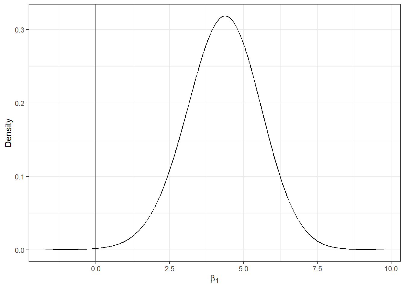
FIGURE 6.4: Posterior distribution of the coefficient of covariate AFF.
6.5 Mapping relative risks
The estimates of the relative risk of lip cancer and their uncertainty for each of the counties are given by the
mean posterior and the 95% credible intervals which are contained in the object res$summary.fitted.values.
Column mean is the mean posterior and 0.025quant and 0.975quant are the 2.5 and 97.5 percentiles, respectively.
head(res$summary.fitted.values)## mean sd 0.025quant 0.5quant
## fitted.Predictor.01 4.891 1.4600 2.668 4.679
## fitted.Predictor.02 4.353 0.6769 3.177 4.301
## fitted.Predictor.03 3.502 1.0216 1.921 3.362
## fitted.Predictor.04 3.006 0.8971 1.631 2.878
## fitted.Predictor.05 3.271 0.7524 2.046 3.187
## fitted.Predictor.06 2.884 0.9237 1.491 2.745
## 0.975quant mode
## fitted.Predictor.01 8.334 4.287
## fitted.Predictor.02 5.825 4.199
## fitted.Predictor.03 5.889 3.098
## fitted.Predictor.04 5.114 2.641
## fitted.Predictor.05 4.980 3.025
## fitted.Predictor.06 5.073 2.491We add these data to map to be able to create maps of these variables.
We assign mean to the estimate of the relative risk, and 0.025quant and 0.975quant to the lower and upper limits of 95% credible intervals of the risks.
map$RR <- res$summary.fitted.values[, "mean"]
map$LL <- res$summary.fitted.values[, "0.025quant"]
map$UL <- res$summary.fitted.values[, "0.975quant"]
Then, we show the relative risk of lip cancer in an interactive map using leaflet. In the map, we add labels that appear when the mouse hovers over the counties showing information about observed and expected counts, SIRs, AFF values, relative risks, and lower and upper limits of 95% credible intervals. The map created is shown in Figure 6.5. We observe counties with greater lip cancer risk are located in the north of Scotland, and counties with lower risk are located in the center. The 95% credible intervals indicate the uncertainty in the risk estimates.
pal <- colorNumeric(palette = "YlOrRd", domain = map$RR)

labels <- sprintf("<strong> %s </strong> <br/>
  Observed: %s <br/> Expected: %s <br/>
  AFF: %s <br/> SIR: %s <br/> RR: %s (%s, %s)",
  map$county, map$Y, round(map$E, 2),
  map$AFF, round(map$SIR, 2), round(map$RR, 2),
  round(map$LL, 2), round(map$UL, 2)
) %>% lapply(htmltools::HTML)

lRR <- leaflet(map) %>%
  addTiles() %>%
  addPolygons(
    color = "grey", weight = 1, fillColor = ~ pal(RR),
    fillOpacity = 0.5,
    highlightOptions = highlightOptions(weight = 4),
    label = labels,
    labelOptions = labelOptions(
      style =
        list(
          "font-weight" = "normal",
          padding = "3px 8px"
        ),
      textsize = "15px", direction = "auto"
    )
  ) %>%
  addLegend(
    pal = pal, values = ~RR, opacity = 0.5, title = "RR",
    position = "bottomright"
  )
lRR
FIGURE 6.5: Interactive map of lip cancer relative risk in Scotland counties created with leaflet.
6.6 Exceedance probabilities
We can also calculate the probabilities of relative risk estimates being greater than a given threshold value. These probabilities are called exceedance probabilities and are useful to assess unusual elevation of disease risk. The probability that the relative risk of area \(i\) is higher than a value \(c\) can be written as \(P(\theta_i > c)\). This probability can be calculated by substracting \(P(\theta_i \leq c)\) to 1 as follows:
\[P(\theta_i > c) = 1- P(\theta_i \leq c).\]
In R-INLA, the probability \(P(\theta_i \leq c)\) can be calculated using the inla.pmarginal() function
with arguments equal to the marginal distribution of \(\theta_i\) and the threshold value \(c\).
Then, the exceedance probability \(P(\theta_i > c)\) can be calculated by substracting this probability to 1:
1 - inla.pmarginal(q = c, marginal = marg)where marg is the marginal distribution of the predictions, and c is the threshold value.
The marginals of the relative risks are in the list res$marginals.fitted.values, and the marginal corresponding to the first county is res$marginals.fitted.values[[1]].
In our example, we can calculate the probability that the relative risk of the first county exceeds 2, \(P(\theta_1 > 2)\), as follows:
marg <- res$marginals.fitted.values[[1]]
1 - inla.pmarginal(q = 2, marginal = marg)
## [1] 0.9985To calculate the exceedance probabilities for all counties, we can use the sapply() function passing as arguments the list with the marginals of all counties (res$marginals.fitted.values), and the function to calculate the exceedance probabilities (1- inla.pmarginal()).
sapply() returns a vector of the same length as the list res$marginals.fitted.values with values equal to the result of applying the function 1- inla.pmarginal() to each of the elements of the list of marginals.
exc <- sapply(res$marginals.fitted.values,
FUN = function(marg){1 - inla.pmarginal(q = 2, marginal = marg)})
Then we can add the exceedance probabilities to the map and create a map of the exceedance probabilities with leaflet.
map$exc <- exc
pal <- colorNumeric(palette = "YlOrRd", domain = map$exc)

labels <- sprintf("<strong> %s </strong> <br/>
  Observed: %s <br/> Expected: %s <br/>
  AFF: %s <br/> SIR: %s <br/> RR: %s (%s, %s) <br/> P(RR>2): %s",
  map$county, map$Y, round(map$E, 2),
  map$AFF, round(map$SIR, 2), round(map$RR, 2),
  round(map$LL, 2), round(map$UL, 2), round(map$exc, 2)
) %>% lapply(htmltools::HTML)

lexc <- leaflet(map) %>%
  addTiles() %>%
  addPolygons(
    color = "grey", weight = 1, fillColor = ~ pal(exc),
    fillOpacity = 0.5,
    highlightOptions = highlightOptions(weight = 4),
    label = labels,
    labelOptions = labelOptions(
      style =
        list(
          "font-weight" = "normal",
          padding = "3px 8px"
        ),
      textsize = "15px", direction = "auto"
    )
  ) %>%
  addLegend(
    pal = pal, values = ~exc, opacity = 0.5, title = "P(RR>2)",
    position = "bottomright"
  )
lexc
FIGURE 6.6: Interactive map of exceedance probabilities in Scotland counties created with leaflet.
Figure 6.6 shows the map of the exceedance probabilities. This map provides evidence of excess risk within individual areas. In areas with probabilities close to 1, it is very likely that the relative risk exceeds 2, and areas with probabilities close to 0 correspond to areas where it is very unlikely that the relative risk exceeds 2. Areas with probabilities around 0.5 have the highest uncertainty, and correspond to areas where the relative risk is below or above 2 with equal probability. We observe that the counties in the north of Scotland are the counties where it is most likely that relative risk exceeds 2.