9 Spatial modeling of geostatistical data. Malaria in The Gambia
In this chapter we show how to fit a geostatistical model to predict malaria prevalence in The Gambia using the stochastic partial differential equation (SPDE) approach and the R-INLA package (Havard Rue, Lindgren, and Teixeira Krainski 2024). We use data of malaria prevalence in children obtained at 65 villages in The Gambia which are contained in the geoR package (Ribeiro Jr et al. 2024), and high-resolution environmental covariates downloaded with the raster package (Hijmans 2023). We show how to create a triangulated mesh that covers The Gambia, the projection matrix and the data stacks to fit the model. Then we show how to manipulate the results to obtain the malaria prevalence predictions, and 95% credible intervals denoting uncertainty. We also show how to compute exceedance probabilities of prevalence being greater than a given threshold value of interest for policymaking. Results are shown by means of interactive maps created with the leaflet package (Cheng et al. 2024).
9.1 Data
First, we load the geoR package and attach the data gambia which contains information about malaria prevalence in children obtained at 65 villages in The Gambia.
Next we inspect the data and see it is a data frame with 2035 observations and the following 8 variables:
-
x: x coordinate of the village (UTM), -
y: y coordinate of the village (UTM), -
pos: presence (1) or absence (0) of malaria in a blood sample taken from the child, -
age: age of the child in days, -
netuse: indicator variable denoting whether the child regularly sleeps under a bed net, -
treated: indicator variable denoting whether the bed net is treated, -
green: satellite-derived measure of the greenness of vegetation in the vicinity of the village, -
phc: indicator variable denoting the presence or absence of a health center in the village.
head(gambia)## x y pos age netuse treated green phc
## 1850 349631 1458055 1 1783 0 0 40.85 1
## 1851 349631 1458055 0 404 1 0 40.85 1
## 1852 349631 1458055 0 452 1 0 40.85 1
## 1853 349631 1458055 1 566 1 0 40.85 1
## 1854 349631 1458055 0 598 1 0 40.85 1
## 1855 349631 1458055 1 590 1 0 40.85 19.2 Data preparation
Data in gambia are given at an individual level. Here, we do the analysis at the village level by aggregating the malaria tests by village.
We create a data frame called d with columns containing, for each village, the longitude and latitude, the number of malaria tests, the number of positive tests, the prevalence, and the altitude.
9.2.1 Prevalence
We can see that gambia has 2035 rows and the matrix of the unique coordinates has 65 rows.
This indicates that 2035 malaria tests were conducted at 65 locations.
dim(gambia)## [1] 2035 8## [1] 65 2We create a data frame called d containing, for each village, the coordinates (x, y), the total number of tests performed (total), the number of positive tests (positive), and the malaria prevalence (prev).
In data gambia, column pos indicates the tests results. Positive tests have pos equal to 1 and negative tests have pos equal to 0.
Therefore, we can calculate the number of positive tests in each village by adding up the elements in gambia$pos.
Then we calculate the prevalence in each village by calculating the proportion of positive tests (number of positive results divided by the total number of tests in each village).
We can create the data frame d using the dplyr package as follows:
library(dplyr)
d <- group_by(gambia, x, y) %>%
  summarize(
    total = n(),
    positive = sum(pos),
    prev = positive / total
  )
head(d)
## # A tibble: 6 × 5
## # Groups: x [6]
## x y total positive prev
## <dbl> <dbl> <int> <dbl> <dbl>
## 1 349631. 1458055 33 17 0.515
## 2 358543. 1460112 63 19 0.302
## 3 360308. 1460026 17 7 0.412
## 4 363796. 1496919 24 8 0.333
## 5 366400. 1460248 26 10 0.385
## 6 366688. 1463002 18 7 0.389An alternative to dplyr to calculate the number of positive tests in each village is to use the aggregate() function.
We can use aggregate()
to obtain the total number of tests (total) and positive results (positive) in each village.
Then we can calculate the prevalence prev by dividing positive by total, and create the data frame d with these vectors and the x and y coordinates.
total <- aggregate(
  gambia$pos,
  by = list(gambia$x, gambia$y),
  FUN = length
)
positive <- aggregate(
  gambia$pos,
  by = list(gambia$x, gambia$y),
  FUN = sum
)
prev <- positive$x / total$x

d <- data.frame(
  x = total$Group.1,
  y = total$Group.2,
  total = total$x,
  positive = positive$x,
  prev = prev
)
9.2.2 Transforming coordinates
Now we can plot the malaria prevalence in a map created with the leaflet() function of the leaflet package.
leaflet() expects data to be specified in geographic coordinates (longitude/latitude).
However, the coordinates in the data are in UTM format (Easting/Northing).
We transform the UTM coordinates in the data to geographic coordinates using the st_transform() function of the sf package (Pebesma 2024).
First, we create a sf object called sf where we specify the projection of The Gambia, that is, UTM zone 28.
Then, we transform the UTM coordinates in sf to geographic coordinates using st_transform()
where we set the CRS to 4326.
library(sf)
sf <- st_as_sf(as.data.frame(d), coords = c("x", "y"),
               crs = "+proj=utm +zone=28")
sft <- st_transform(sf, crs = 4326)
Finally, we add the longitude and latitude variables to the data frame d.
d[, c("long", "lat")] <- st_coordinates(sft)
head(d)
## # A tibble: 6 × 7
## # Groups: x [6]
## x y total positive prev long lat
## <dbl> <dbl> <int> <dbl> <dbl> <dbl> <dbl>
## 1 349631. 1458055 33 17 0.515 -16.4 13.2
## 2 358543. 1460112 63 19 0.302 -16.3 13.2
## 3 360308. 1460026 17 7 0.412 -16.3 13.2
## 4 363796. 1496919 24 8 0.333 -16.3 13.5
## 5 366400. 1460248 26 10 0.385 -16.2 13.2
## 6 366688. 1463002 18 7 0.389 -16.2 13.29.2.3 Mapping prevalence
Now we use leaflet() to create a map with the locations of the villages and the malaria prevalence (Figure 9.1).
We use addCircles() to put circles on the map, and color circles according to the value of the prevalences.
We choose a palette function with colors from viridis and four equal intervals from values 0 to 1.
We use the base map given by providers$CartoDB.Positron so that point colors can be distinguised from the background map.
We also add a scale bar using addScaleBar().
library(leaflet)
library(viridis)

pal <- colorBin("viridis", bins = c(0, 0.25, 0.5, 0.75, 1))
leaflet(d) %>%
  addProviderTiles(providers$CartoDB.Positron) %>%
  addCircles(lng = ~long, lat = ~lat, color = ~ pal(prev)) %>%
  addLegend("bottomright",
    pal = pal, values = ~prev,
    title = "Prev."
  ) %>%
  addScaleBar(position = c("bottomleft"))
FIGURE 9.1: Malaria prevalence in The Gambia.
9.2.4 Environmental covariates
We model malaria prevalence using a covariate that indicates the elevation in The Gambia. This covariate can be obtained with the elevation_30s() function of the geodata package.. This function obtains elevation for any country at a resolution of 30 arc seconds (~ 1 km). In order to get the elevation values in The Gambia, we need to call elevation_30s() specifying country with the 3 letters of the International Organization for Standardization (ISO) code of The Gambia (GMB).
library(geodata)
r <- elevation_30s(country = "GMB", path = tempdir())
We make a map with the elevation raster using the addRasterImage() function of leaflet.
To create this map, we use a palette function pal with the values of the raster (values(r)) and specifying that the NA values are transparent (Figure 9.2).
pal <- colorNumeric("viridis", values(r),
  na.color = "transparent"
)

leaflet() %>%
  addProviderTiles(providers$CartoDB.Positron) %>%
  addRasterImage(r, colors = pal, opacity = 0.5) %>%
  addLegend("bottomright",
    pal = pal, values = values(r),
    title = "Elevation"
  ) %>%
  addScaleBar(position = c("bottomleft"))
FIGURE 9.2: Map of elevation in The Gambia.
Now we add the elevation values to the data frame d to be able to use it as a covariate in the model.
To do that, we get the elevation values at the village locations using the extract() function of terra (Hijmans 2024).
The first argument of this function is the elevation raster (r). The second argument is a two-column matrix with the coordinates where we want to know the values, that is, the coordinates of the villages given by d[, c("long", "lat")]. We assign the elevation vector to the column cov of the data frame d.
The final dataset is the following:
head(d)## # A tibble: 6 × 8
## # Groups: x [6]
## x y total positive prev long lat cov
## <dbl> <dbl> <int> <dbl> <dbl> <dbl> <dbl> <dbl>
## 1 349631. 1.46e6 33 17 0.515 -16.4 13.2 15
## 2 358543. 1.46e6 63 19 0.302 -16.3 13.2 33
## 3 360308. 1.46e6 17 7 0.412 -16.3 13.2 32
## 4 363796. 1.50e6 24 8 0.333 -16.3 13.5 20
## 5 366400. 1.46e6 26 10 0.385 -16.2 13.2 29
## 6 366688. 1.46e6 18 7 0.389 -16.2 13.2 189.3 Modeling
Here we specify the model to predict malaria prevalence in The Gambia and detail the steps to fit the model using the SPDE approach and the R-INLA package.
9.3.1 Model
Conditional on the true prevalence \(P(\boldsymbol{x}_i)\) at location \(\boldsymbol{x}_i\), \(i = 1, \ldots, n\), the number of positive results \(Y_i\) out of \(N_i\) people sampled follows a binomial distribution:
\[Y_i|P(\boldsymbol{x}_i) \sim Binomial(N_i, P(\boldsymbol{x}_i)),\]
\[logit(P(\boldsymbol{x}_i)) = \beta_0 + \beta_1 \times \mbox{elevation} + S(\boldsymbol{x}_i).\] Here, \(\beta_0\) denotes the intercept, \(\beta_1\) is the coefficient of elevation, and \(S(\cdot)\) is a spatial random effect that follows a zero-mean Gaussian process with Matérn covariance function
\[\mbox{Cov}(S(\boldsymbol{x}_i),S(\boldsymbol{x}_j))=\frac{\sigma^2}{2^{\nu-1}\Gamma(\nu)}(\kappa ||\boldsymbol{x}_i - \boldsymbol{x}_j ||)^\nu K_\nu(\kappa ||\boldsymbol{x}_i - \boldsymbol{x}_j ||).\] Here, \(K_\nu(\cdot)\) is the modified Bessel function of second kind and order \(\nu>0\). \(\nu\) is the smoothness parameter, \(\sigma^2\) denotes the variance, and \(\kappa >0\) is related to the practical range \(\rho = \sqrt{8 \nu}/\kappa\) which is the distance at which the spatial correlation is close to 0.1.
9.3.2 Mesh construction
Then, we need to build a triangulated mesh that covers The Gambia over which to make the random field discretization (Figure
9.3).
For building the mesh, we use the inla.mesh.2d() function passing the following parameters:
-
loc: location coordinates that are used as initial mesh vertices, -
max.edge: values denoting the maximum allowed triangle edge lengths in the region and in the extension, -
cutoff: minimum allowed distance between points.
Here, we call inla.mesh.2d() setting loc equal to the matrix with the coordinates coo.
We set max.edge = c(0.1, 5) to use small triangles within the region, and larger triangles in the extension.
We also set cutoff = 0.01 to avoid building many small triangles where we have some very close points.
library(INLA)
coo <- cbind(d$long, d$lat)
mesh <- inla.mesh.2d(
  loc = coo, max.edge = c(0.1, 5),
  cutoff = 0.01
)
The number of the mesh vertices is given by mesh$n and we can plot the mesh with plot(mesh).
mesh$n## [1] 673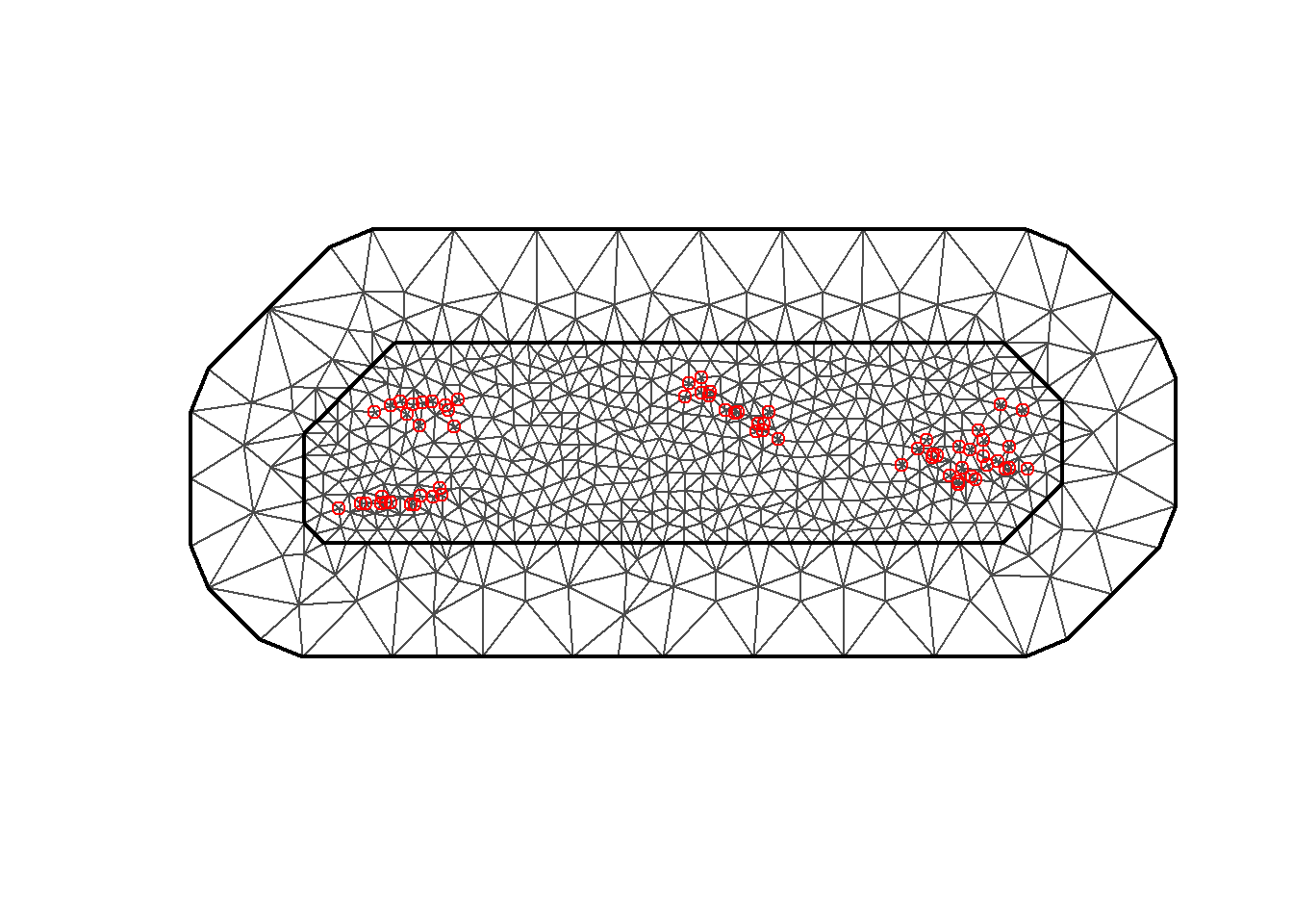
FIGURE 9.3: Triangulated mesh used to build the SPDE model.
9.3.3 Building the SPDE model on the mesh
Then, we use the inla.spde2.matern() function to build the SPDE model.
spde <- inla.spde2.matern(mesh = mesh, alpha = 2, constr = TRUE)Here, we set constr = TRUE to impose an integrate-to-zero constraint.
Here alpha is a parameter related to the smoothness parameter of the process, namely, \(\alpha=\nu+d/2\).
In this example, we set the smoothness parameter \(\nu\) equal to 1 and in the spatial case \(d=2\) so alpha=1+2/2=2.
9.3.4 Index set
Now we generate the index set for the SPDE model.
We do this with the function inla.spde.make.index() where we specify the name of the effect (s) and the number of vertices in the SPDE model (spde$n.spde).
This creates a list with vector s equal to 1:spde$n.spde, and vectors s.group and s.repl that have all elements equal to 1s and length given by the number of mesh vertices.
indexs <- inla.spde.make.index("s", spde$n.spde)
lengths(indexs)
## s s.group s.repl
## 673 673 6739.3.5 Projection matrix
We need to build a projection matrix \(A\) that projects the spatially continuous Gaussian random field from the observations to the mesh nodes.
The projection matrix can be built with the inla.spde.make.A() function passing the mesh and the coordinates.
A <- inla.spde.make.A(mesh = mesh, loc = coo)9.3.6 Prediction data
Here we specify the locations where we wish to predict the prevalence.
We set the prediction locations to the locations of the raster of the covariate elevation.
We can get the coordinates of the raster r with the function crds() of the terra package.
## [1] 12847 2We see there are 12847 points.
In this example, we use fewer prediction points so the computation is faster.
We can lower the resolution of the raster by using the aggregate() function of terra. The arguments of the function are
-
x: raster object, -
fact: aggregation factor expressed as number of cells in each direction (horizontally and vertically), -
fun: function used to aggregate values.
We specify fact = 5 to aggregate 5 cells in each direction, and fun = mean to compute the mean of the cell values.
ra <- aggregate(r, fact = 5, fun = mean)We call coop to the matrix of coordinates with the prediction locations.
We add to the prediction data dp a column cov with the elevation values for the prediction coordinates.
dp <- terra::crds(ra)
dp <- as.data.frame(dp)
dim(dp)
## [1] 411 2We also construct the matrix that projects the spatially continuous Gaussian random field from the prediction locations to the mesh nodes.
Ap <- inla.spde.make.A(mesh = mesh, loc = coop)9.3.7 Stack with data for estimation and prediction
Now we use the inla.stack() function to organize data, effects, and projection matrices. We use the following arguments:
-
tag: string to identify the data, -
data: list of data vectors, -
A: list of projection matrices, -
effects: list with fixed and random effects.
We construct a stack called stk.e with data for estimation and we tag it with the string "est".
The fixed effects are the intercept (b0) and the elevation covariate (cov). The random effect is the spatial Gaussian random field (s).
Therefore, in effects we pass a list with a data.frame with the fixed effects, and a list s containing the indices of the SPDE object (indexs).
A is set to a list where
the second element is A, the projection matrix for the random effects,
and the first element is 1 to indicate the fixed effects are mapped one-to-one to the response.
In data we specify the response vector and the number of trials.
We also construct a stack for prediction that called stk.p. This stack has tag equal to "pred", the response vector is set to NA, and the data is specified at the prediction locations.
Finally, we put stk.e and stk.p together in a full stack stk.full.
# stack for estimation stk.e
stk.e <- inla.stack(
  tag = "est",
  data = list(y = d$positive, numtrials = d$total),
  A = list(1, A),
  effects = list(data.frame(b0 = 1, elevation = d$cov), s = indexs)
)

# stack for prediction stk.p
stk.p <- inla.stack(
  tag = "pred",
  data = list(y = NA, numtrials = NA),
  A = list(1, Ap),
  effects = list(data.frame(b0 = 1, elevation = dp$cov),
    s = indexs
  )
)

# stk.full has stk.e and stk.p
stk.full <- inla.stack(stk.e, stk.p)
9.3.8 Model formula
We specify the model formula by including the response in the left-hand side, and the fixed and random effects in the right-hand side.
In the formula, we remove the intercept (adding 0) and add it as a covariate term (adding b0),
so all the covariate terms can be captured in the projection matrix.
formula <- y ~ 0 + b0 + elevation + f(s, model = spde)
9.3.9 inla() call
We fit the model by calling inla() and using the default priors in R-INLA. We specify the formula, family, data, and options.
In control.predictor we set compute = TRUE to compute the posteriors of the predictions. We set link=1 to
compute the fitted values (res$summary.fitted.values and res$marginals.fitted.values) with the same link function as the family specified in the model. We also add control.compute = list(return.marginals.predictor = TRUE) to obtain the marginals.
res <- inla(formula,
  family = "binomial", Ntrials = numtrials,
  control.family = list(link = "logit"),
  data = inla.stack.data(stk.full),
  control.predictor = list(compute = TRUE, link = 1,
                           A = inla.stack.A(stk.full)),
  control.compute = list(return.marginals.predictor = TRUE)
)
9.4 Mapping malaria prevalence
Now we map the malaria prevalence predictions using leaflet.
The mean prevalence and lower and upper limits of 95% credible intervals are in the data frame res$summary.fitted.values.
The rows of res$summary.fitted.values that correspond to the prediction locations
can be obtained by selecting the indices of the stack stk.full that are tagged with tag = "pred".
We can obtain these indices by using inla.stack.index() passing stk.full and tag = "pred".
index <- inla.stack.index(stack = stk.full, tag = "pred")$dataWe create vectors with the mean prevalence and lower and upper limits of 95% credible intervals with the values of the columns "mean", "0.025quant" and "0.975quant" and the rows given by index.
prev_mean <- res$summary.fitted.values[index, "mean"]
prev_ll <- res$summary.fitted.values[index, "0.025quant"]
prev_ul <- res$summary.fitted.values[index, "0.975quant"]
Now we create a map with the predicted prevalence (prev_mean) at the prediction locations coop using the addCircles() function of leaflet.
We use a palette function created with colorNumeric(). We could set the domain to the range of values we plot (prev_mean), but we decide to use the interval [0, 1] because we will use the same palette to plot the mean prevalence and the lower and upper limits of the 95% credible intervals (Figure 9.4).
pal <- colorNumeric("viridis", c(0, 1), na.color = "transparent")

leaflet() %>%
  addProviderTiles(providers$CartoDB.Positron) %>%
  addCircles(
    lng = coop[, 1], lat = coop[, 2],
    color = pal(prev_mean)
  ) %>%
  addLegend("bottomright",
    pal = pal, values = prev_mean,
    title = "Prev."
  ) %>%
  addScaleBar(position = c("bottomleft"))
FIGURE 9.4: Map of malaria prevalence predictions in The Gambia created with leaflet() and addCircles().
Instead of showing the prevalence predictions at points, we can also plot them using a raster.
Here, the prediction locations coop are not on a regular grid; therefore, we need to create a raster with the predicted values using the rasterize() function of terra.
This function is useful for transferring the values of a vector at some locations to raster cells.
We transfer the predicted values prev_mean from the locations coop to the raster ra that we used to get the prediction locations.
We use the following arguments:
-
x = sv:SpatVectorobject with the coordinates where we made the predictions and the values of the variable we would like to transfer, -
y = ra: raster where we transfer the values, -
field = "prev_mean": name of the variable to be transferred (prevalence predictions at locationscoop), -
fun = mean: to assign the mean of the values to cells that have more than one point.
# Create SpatVector object
sv <- terra::vect(coop, atts = data.frame(prev_mean = prev_mean,
                               prev_ll = prev_ll, prev_ul = prev_ul),
                  crs = "+proj=longlat +datum=WGS84")

# rasterize
r_prev_mean <- terra::rasterize(
  x = sv, y = ra, field = "prev_mean",
  fun = mean
)
Now we plot the raster with the prevalence values in a map using the addRasterImage() function of leaflet (Figure 9.5).
pal <- colorNumeric("viridis", c(0, 1), na.color = "transparent")

leaflet() %>%
  addProviderTiles(providers$CartoDB.Positron) %>%
  addRasterImage(r_prev_mean, colors = pal, opacity = 0.5) %>%
  addLegend("bottomright",
    pal = pal,
    values = values(r_prev_mean), title = "Prev."
  ) %>%
  addScaleBar(position = c("bottomleft"))
FIGURE 9.5: Map of malaria prevalence predictions in The Gambia created with leaflet() and addRasterImage().
We can follow the same approach to create maps with the lower and upper limits of the prevalence predictions. First, we create rasters with the lower and upper limits of the predictions. Then we make the maps with the same palette function we used to create the map of mean prevalence predictions (Figures 9.6 and 9.7).
r_prev_ll <- terra::rasterize(
  x = sv, y = ra, field = "prev_ll",
  fun = mean
)

leaflet() %>%
  addProviderTiles(providers$CartoDB.Positron) %>%
  addRasterImage(r_prev_ll, colors = pal, opacity = 0.5) %>%
  addLegend("bottomright",
    pal = pal,
    values = values(r_prev_ll), title = "LL"
  ) %>%
  addScaleBar(position = c("bottomleft"))
FIGURE 9.6: Map of lower limit of 95% CI of malaria prevalence in The Gambia.
r_prev_ul <- terra::rasterize(
  x = sv, y = ra, field = "prev_ul",
  fun = mean
)

leaflet() %>%
  addProviderTiles(providers$CartoDB.Positron) %>%
  addRasterImage(r_prev_ul, colors = pal, opacity = 0.5) %>%
  addLegend("bottomright",
    pal = pal,
    values = values(r_prev_ul), title = "UL"
  ) %>%
  addScaleBar(position = c("bottomleft"))
FIGURE 9.7: Map of upper limit of 95% CI of malaria prevalence in The Gambia.
9.5 Mapping exceedance probabilities
We can also calculate the exceedance probabilities of malaria prevalence being greater than a given threshold value that is of interest for policymaking. For example, we can be interested in knowing what are the probabilities that malaria prevalence is greater than 20%. Let \(p_i\) be the malaria prevalence at location \(\boldsymbol{x}_i\). The probability that the malaria prevalence \(p_i\) is greater than a value \(c\) can be written as \(P(p_i > c)\). This probability can be calculated by substracting \(P(p_i \leq c)\) to 1 as
\[P(p_i > c) = 1 - P(p_i \leq c).\]
In R-INLA, \(P(p_i \leq c)\) can be calculated using the inla.pmarginal() function
with arguments on the posterior distribution of the predictions and the threshold value.
Then, the exceedance probability \(P(p_i > c)\) can be calculated as
1 - inla.pmarginal(q = c, marginal = marg)where marg is the marginal distribution of the predictions, and c is the threshold value.
In our example, we can calculate the probabilites that malaria prevalence exceeds 20% as follows.
First, we obtain the posterior marginals of the predictions for each location.
These marginals are in the list object res$marginals.fitted.values[index] where index is the vector of the indices of the stack stk.full corresponding to the predictions.
In the previous section, we obtained these indices by using the inla.stack.index() function and specifying tag = "pred".
index <- inla.stack.index(stack = stk.full, tag = "pred")$dataThe first element of the list, res$marginals.fitted.values[index][[1]], contains the marginal distribution of the prevalence prediction corresponding to the first location.
The probability that malaria prevalence exceeds 20% at this location is given by
marg <- res$marginals.fitted.values[index][[1]]
1 - inla.pmarginal(q = 0.20, marginal = marg)
## [1] 0.7573To compute the exceedance probabilities for all the prediction locations, we can use the sapply() function
with two arguments. The first argument denotes the marginal distributions of the predictions (res$marginals.fitted.values[index])
and the second argument denotes the function to compute the exceedance probabilities (1- inla.pmarginal()).
Then the sapply() function returns a vector of the same length as the list res$marginals.fitted.values[index], where each element is the result of applying the function 1- inla.pmarginal() to the corresponding element of the list of marginals.
excprob <- sapply(res$marginals.fitted.values[index],
FUN = function(marg){1-inla.pmarginal(q = 0.20, marginal = marg)})

head(excprob)
## fitted.APredictor.066 fitted.APredictor.067
## 0.7573 0.6856
## fitted.APredictor.068 fitted.APredictor.069
## 0.6495 0.6271
## fitted.APredictor.070 fitted.APredictor.071
## 0.5788 0.7635Finally, we can make maps of the exceedance probabilities by creating a raster with the exceedance probabilities with
rasterize() and then using leaflet() to create the map.
sv$excprob <- excprob
r_excprob <- terra::rasterize(
  x = sv, y = ra, field = "excprob",
  fun = mean
)
pal <- colorNumeric("viridis", c(0, 1), na.color = "transparent")

leaflet() %>%
  addProviderTiles(providers$CartoDB.Positron) %>%
  addRasterImage(r_excprob, colors = pal, opacity = 0.5) %>%
  addLegend("bottomright",
    pal = pal,
    values = values(r_excprob), title = "P(p>0.2)"
  ) %>%
  addScaleBar(position = c("bottomleft"))
FIGURE 9.8: Map of probability malaria prevalence in The Gambia exceeds 20%.
Figure 9.8 shows the probability that malaria prevalence exceeds 20% in The Gambia. This map quantifies the uncertainty relating to the exceedance of the threshold value 20%, and highlights the locations most in need of targeted interventions. In this map, locations with probabilities close to 0 are locations where it is very unlikely that prevalence exceeds 20%, and locations with probabilities close to 1 correspond to locations where it is very likely that prevalence exceeds 20%. Locations with probabilities around 0.5 have the highest uncertainty and correspond to locations where malaria prevalence is with equal probability below or above 20%.