7 Spatio-temporal modeling of areal data. Lung cancer in Ohio
In this chapter we estimate the risk of lung cancer in Ohio, USA, from 1968 to 1988 using the R-INLA package (Havard Rue, Lindgren, and Teixeira Krainski 2024). The lung cancer data and the Ohio map are obtained from the SpatialEpiApp package (R-SpatialEpiApp?). First, we show how to calculate the expected disease counts using indirect standardization, and the standardized incidence ratios (SIRs). Then we fit a Bayesian spatio-temporal model to obtain disease risk estimates for each of the Ohio counties and years of study. We also show how to create static and interactive maps and time plots of the SIRs and disease risk estimates using the ggplot2 (Wickham et al. 2024) and plotly (Sievert et al. 2024) packages, and how to generate animated maps showing disease risk for each year with the gganimate package (R-gganimate?).
7.1 Data and map
The lung cancer data and the Ohio map that we use in this chapter can be obtained from the SpatialEpiApp package.
The file dataohiocomplete.csv that is in folder SpatialEpiApp/data/Ohio of the package
contains the lung cancer cases and population stratified by gender and race in each of the Ohio counties from 1968 to 1988.
We can find the full name of file dataohiocomplete.csv in the SpatialEpiApp package by using the system.file() function.
Then we can read the data using the read.csv() function.
library(SpatialEpiApp)
namecsv <- "SpatialEpiApp/data/Ohio/dataohiocomplete.csv"
dohio <- read.csv(system.file(namecsv, package = "SpatialEpiApp"))
head(dohio)
## county gender race year y n NAME
## 1 1 1 1 1968 6 8912 Adams
## 2 1 1 1 1969 5 9139 Adams
## 3 1 1 1 1970 8 9455 Adams
## 4 1 1 1 1971 5 9876 Adams
## 5 1 1 1 1972 8 10281 Adams
## 6 1 1 1 1973 5 10876 AdamsA shapefile with the Ohio counties is in folder SpatialEpiApp/data/Ohio/fe_2007_39_county of SpatialEpiApp.
We can read the shapefile with the function st_read() of the sf package specifying the full path of the shapefile
(Figure 7.1).
nameshp <- system.file(
"SpatialEpiApp/data/Ohio/fe_2007_39_county/fe_2007_39_county.shp",
package = "SpatialEpiApp")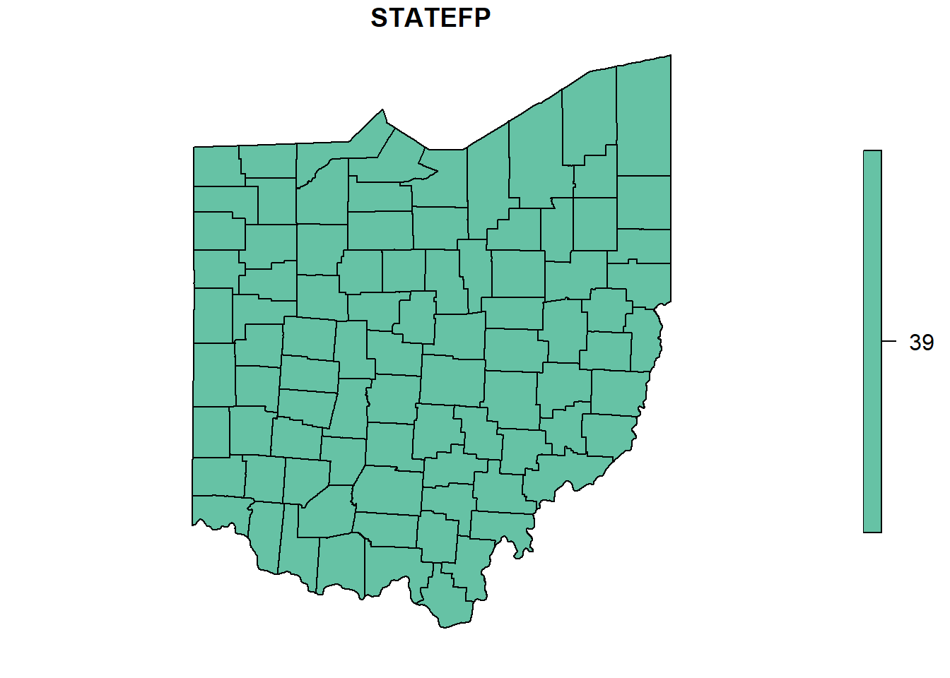
FIGURE 7.1: Map of Ohio counties.
7.2 Data preparation
The data contain the number of lung cancer cases and population stratified by gender and race in each of the Ohio counties from 1968 to 1988. Here, we calculate the observed and expected counts, and the SIRs for each county and year, and create a data frame with the following variables:
-
county: id of county, -
year: year, -
Y: observed number of cases in the county and year, -
E: expected number of cases in the county and year, -
SIR: SIR of the county and year.
7.2.1 Observed cases
We obtain the number of cases for all the strata together in each county and year by aggregating the data dohio by county and year and adding up the number of cases.
To do this, we use the aggregate() function specifying the vector of cases, the list of grouping elements as list(county = dohio$NAME, year = dohio$year), and the function to apply to the data subsets equal to sum. We also set the names of the returned data frame equal to county, year and Y.
d <- aggregate(
  x = dohio$y,
  by = list(county = dohio$NAME, year = dohio$year),
  FUN = sum
)
names(d) <- c("county", "year", "Y")
head(d)
## county year Y
## 1 Adams 1968 6
## 2 Allen 1968 32
## 3 Ashland 1968 15
## 4 Ashtabula 1968 27
## 5 Athens 1968 12
## 6 Auglaize 1968 77.2.2 Expected cases
Now we calculate the expected number of cases using indirected standardization with the expected() function of the SpatialEpi package.
The arguments of this function are the population and cases for each strata and year, and the number of strata.
The vectors of population and cases need to be sorted first by area and year, and then within each area and year, the counts for all strata need to be listed in the same order. If for some strata there are no cases, we still need to include them by writing 0 cases.
We sort the values of the data dohio as it is needed by the expected() function.
To do that, we use the order() function specifying that we want to sort by county, year, gender and then race.
dohio <- dohio[order(
  dohio$county,
  dohio$year,
  dohio$gender,
  dohio$race
), ]
We can inspect the first rows of the sorted data and check they are sorted as we wish.
dohio[1:20, ]## county gender race year y n NAME
## 1 1 1 1 1968 6 8912 Adams
## 22 1 1 2 1968 0 24 Adams
## 43 1 2 1 1968 0 8994 Adams
## 64 1 2 2 1968 0 22 Adams
## 2 1 1 1 1969 5 9139 Adams
## 23 1 1 2 1969 0 20 Adams
## 44 1 2 1 1969 0 9289 Adams
## 65 1 2 2 1969 0 24 Adams
## 3 1 1 1 1970 8 9455 Adams
## 24 1 1 2 1970 0 18 Adams
## 45 1 2 1 1970 1 9550 Adams
## 66 1 2 2 1970 0 24 Adams
## 4 1 1 1 1971 5 9876 Adams
## 25 1 1 2 1971 0 20 Adams
## 46 1 2 1 1971 1 9991 Adams
## 67 1 2 2 1971 0 27 Adams
## 5 1 1 1 1972 8 10281 Adams
## 26 1 1 2 1972 0 23 Adams
## 47 1 2 1 1972 2 10379 Adams
## 68 1 2 2 1972 0 31 AdamsNow we calculate the expected number of cases by using the expected() function
and specifying population = dohio$n and cases = dohio$y.
Data are stratified by 2 races and 2 genders, so the number of strata is 2 x 2 = 4.
library(SpatialEpi)
n.strata <- 4
E <- expected(
  population = dohio$n,
  cases = dohio$y,
  n.strata = n.strata
)
Now we create a data frame called dE with the expected counts for each county and year. Data frame dE has columns denoting counties (county), years (year), and expected counts (E).
The elements in E correspond to counties given by unique(dohio$NAME) and years given by unique(dohio$year).
Specifically, the counties of E are those obtained by repeating
each element of counties nyears times, where nyears is the number of years.
This can be computed with the rep() function using the argument each.
The years of E are those obtained by repeating the whole vector of
years ncounties times, where ncounties is the number of counties.
This can be computed with the rep() function using the argument times.
ncounties <- length(unique(dohio$NAME))
yearsE <- rep(unique(dohio$year),
              times = ncounties)

dE <- data.frame(county = countiesE, year = yearsE, E = E)

head(dE)
## county year E
## 1 Adams 1968 8.279
## 2 Adams 1969 8.502
## 3 Adams 1970 8.779
## 4 Adams 1971 9.175
## 5 Adams 1972 9.549
## 6 Adams 1973 10.100The data frame d that we constructed before contains the counties, years, and number of cases.
We add the expected counts to d by merging the data frames d and dE using the merge() function and merging by county and year.
##   county year  Y      E
## 1  Adams 1968  6  8.279
## 2  Adams 1969  5  8.502
## 3  Adams 1970  9  8.779
## 4  Adams 1971  6  9.175
## 5  Adams 1972 10  9.549
## 6  Adams 1973  7 10.100
7.2.3 SIRs
We calculate the SIR of county \(i\) and year \(j\) as \(\mbox{SIR}_{ij} = Y_{ij}/E_{ij}\), where \(Y_{ij}\) is the observed number of cases, and \(E_{ij}\) is the expected number of cases obtained based on the total population of Ohio during the period of study.
d$SIR <- d$Y / d$E
head(d)
## county year Y E SIR
## 1 Adams 1968 6 8.279 0.7248
## 2 Adams 1969 5 8.502 0.5881
## 3 Adams 1970 9 8.779 1.0251
## 4 Adams 1971 6 9.175 0.6539
## 5 Adams 1972 10 9.549 1.0473
## 6 Adams 1973 7 10.100 0.6931\(\mbox{SIR}_{ij}\) quantifies whether the county \(i\) and year \(j\) has higher (\(\mbox{SIR}_{ij} > 1\)), equal (\(\mbox{SIR}_{ij} = 1\)) or lower (\(\mbox{SIR}_{ij} < 1\)) occurrence of cases than expected.
7.2.4 Adding data to map
Now we add the data d that contain the lung cancer data to the map object. To do so, we need to transform the data d which is in long format to wide format.
Data d contain the variables county, year, Y, E and SIR.
We need to reshape the data to wide format, where the first column is county, and the rest of the columns denote the observed number of cases, the expected number of cases, and the SIRs separately for each of the years.
We can do this with the reshape() function passing the following arguments:
-
data: datad, -
timevar: name of the variable in the long format that corresponds to multiple variables in the wide format (year), -
idvar: name of the variable in the long format that identifies multiple records from the same group (county), -
direction: string equal to"wide"to reshape the data to wide format.
dw <- reshape(d,
  timevar = "year",
  idvar = "county",
  direction = "wide"
)

dw[1:2, ]
## county Y.1968 E.1968 SIR.1968 Y.1969 E.1969
## 1 Adams 6 8.279 0.7248 5 8.502
## 22 Allen 32 51.037 0.6270 33 50.956
## SIR.1969 Y.1970 E.1970 SIR.1970 Y.1971 E.1971
## 1 0.5881 9 8.779 1.0251 6 9.175
## 22 0.6476 39 50.901 0.7662 44 51.217
## SIR.1971 Y.1972 E.1972 SIR.1972 Y.1973 E.1973
## 1 0.6539 10 9.549 1.0473 7 10.10
## 22 0.8591 36 50.803 0.7086 38 50.65
## SIR.1973 Y.1974 E.1974 SIR.1974 Y.1975 E.1975
## 1 0.6931 12 10.41 1.1533 12 10.26
## 22 0.7502 41 50.80 0.8071 35 50.83
## SIR.1975 Y.1976 E.1976 SIR.1976 Y.1977 E.1977
## 1 1.1701 10 10.68 0.936 7 10.86
## 22 0.6886 54 50.31 1.073 63 50.64
## SIR.1977 Y.1978 E.1978 SIR.1978 Y.1979 E.1979
## 1 0.6445 13 11.02 1.1797 5 11.03
## 22 1.2442 42 50.34 0.8343 76 51.04
## SIR.1979 Y.1980 E.1980 SIR.1980 Y.1981 E.1981
## 1 0.4534 14 11.19 1.2510 12 11.34
## 22 1.4891 46 51.23 0.8979 53 51.20
## SIR.1981 Y.1982 E.1982 SIR.1982 Y.1983 E.1983
## 1 1.059 15 11.32 1.3256 9 11.20
## 22 1.035 47 50.34 0.9336 62 49.94
## SIR.1983 Y.1984 E.1984 SIR.1984 Y.1985 E.1985
## 1 0.8037 12 11.15 1.076 20 11.20
## 22 1.2416 69 50.39 1.369 53 50.56
## SIR.1985 Y.1986 E.1986 SIR.1986 Y.1987 E.1987
## 1 1.785 12 11.36 1.057 16 11.58
## 22 1.048 65 50.79 1.280 69 51.14
## SIR.1987 Y.1988 E.1988 SIR.1988
## 1 1.381 15 11.72 1.28
## 22 1.349 58 51.34 1.13Then, we merge the map and the data frame in wide format dw by using the left_join() function of the dplyr package.
We merge by column NAME in map and column county in dw.
## Simple feature collection with 2 features and 11 fields
## Geometry type: POLYGON
## Dimension:     XY
## Bounding box:  xmin: -84.46 ymin: 40.35 xmax: -82.72 ymax: 41
## Geodetic CRS:  NAD83
##   STATEFP COUNTYFP COUNTYNS CNTYIDFP     NAME
## 1      39      011     <NA>    39011 Auglaize
## 2      39      033     <NA>    39033 Crawford
##          NAMELSAD LSAD CLASSFP MTFCC UR FUNCSTAT
## 1 Auglaize County   06      H1 G4020  M        A
## 2 Crawford County   06      H1 G4020  M        A
##                         geometry
## 1 POLYGON ((-84.13 40.66, -84...
## 2 POLYGON ((-82.77 41, -82.77...## Simple feature collection with 2 features and 74 fields
## Geometry type: POLYGON
## Dimension: XY
## Bounding box: xmin: -84.46 ymin: 40.35 xmax: -82.72 ymax: 41
## Geodetic CRS: NAD83
## STATEFP COUNTYFP COUNTYNS CNTYIDFP NAME
## 1 39 011 <NA> 39011 Auglaize
## 2 39 033 <NA> 39033 Crawford
## NAMELSAD LSAD CLASSFP MTFCC UR FUNCSTAT
## 1 Auglaize County 06 H1 G4020 M A
## 2 Crawford County 06 H1 G4020 M A
## Y.1968 E.1968 SIR.1968 Y.1969 E.1969 SIR.1969 Y.1970
## 1 7 17.26 0.4055 10 17.40 0.5748 8
## 2 14 22.13 0.6327 19 22.59 0.8411 27
## E.1970 SIR.1970 Y.1971 E.1971 SIR.1971 Y.1972 E.1972
## 1 17.57 0.4554 16 17.89 0.8943 6 18.05
## 2 22.98 1.1749 13 23.58 0.5514 18 23.46
## SIR.1972 Y.1973 E.1973 SIR.1973 Y.1974 E.1974
## 1 0.3324 15 18.45 0.8128 12 18.70
## 2 0.7673 18 23.64 0.7615 13 23.46
## SIR.1974 Y.1975 E.1975 SIR.1975 Y.1976 E.1976
## 1 0.6416 12 19.42 0.6179 20 18.89
## 2 0.5542 24 23.31 1.0296 25 23.31
## SIR.1976 Y.1977 E.1977 SIR.1977 Y.1978 E.1978
## 1 1.058 18 18.99 0.948 11 19.23
## 2 1.073 17 23.16 0.734 30 23.40
## SIR.1978 Y.1979 E.1979 SIR.1979 Y.1980 E.1980
## 1 0.572 18 19.44 0.9261 17 19.44
## 2 1.282 23 23.10 0.9958 28 22.69
## SIR.1980 Y.1981 E.1981 SIR.1981 Y.1982 E.1982
## 1 0.8744 20 19.55 1.023 23 19.60
## 2 1.2343 21 22.70 0.925 37 22.47
## SIR.1982 Y.1983 E.1983 SIR.1983 Y.1984 E.1984
## 1 1.173 16 19.51 0.8203 35 19.78
## 2 1.647 21 22.11 0.9498 26 22.39
## SIR.1984 Y.1985 E.1985 SIR.1985 Y.1986 E.1986
## 1 1.769 22 19.88 1.107 23 19.94
## 2 1.161 35 22.37 1.564 30 22.16
## SIR.1986 Y.1987 E.1987 SIR.1987 Y.1988 E.1988
## 1 1.154 19 20.08 0.946 22 20.20
## 2 1.354 24 22.18 1.082 31 22.13
## SIR.1988 geometry
## 1 1.089 POLYGON ((-84.13 40.66, -84...
## 2 1.401 POLYGON ((-82.77 41, -82.77...7.3 Mapping SIRs
The object map contains the SIRs of each of the Ohio counties and years.
We make maps of the SIRs using ggplot() and geom_sf().
We use the facet_wrap() function to make maps for each of the years and put them together in the same plot.
To use facet_wrap(), we need to transform the data to long format so it has
a column value with the variable we want to plot (SIR), and a column key that specifies the year.
We can transform the data from the wide to the long format with the function gather() of the tidyr package (Wickham, Vaughan, and Girlich 2024).
The arguments of gather() are the following:
-
data: data object, -
key: name of new key column, -
value: name of new value column, -
...: names of the columns with the values, -
factor_key: logical value that indicates whether to treat the new key column as a factor instead of character vector (default isFALSE).
Column year of map_sf contains the values SIR.1968, …, SIR.1988. We set these values equal to years 1968, …, 1988 using the substring() function. We also convert the values to integers using the as.integer() function.
map$year <- as.integer(substring(map$year, 5, 8))Now we map the SIRs with ggplot() and geom_sf(). We split the data by year and put the maps of each year together using facet_wrap().
We pass parameters to divide by year (~ year), go horizontally (dir = "h"), and wrap with 7 columns (ncol = 7).
Then, we write a title with ggtitle(), use the classic dark-on-light theme theme_bw(), and eliminate axes and ticks in the maps by specifying theme elements element_blank().
We decide to use scale_fill_gradient2() to fill counties with SIRs less than 1 with colors in the gradient blue-white,
and fill counties with SIRs greater than 1 with colors in the gradient white-red (Figure 7.2).
library(ggplot2)
ggplot(map) + geom_sf(aes(fill = SIR)) +
  facet_wrap(~year, dir = "h", ncol = 7) +
  ggtitle("SIR") + theme_bw() +
  theme(
    axis.text.x = element_blank(),
    axis.text.y = element_blank(),
    axis.ticks = element_blank()
  ) +
  scale_fill_gradient2(
    midpoint = 1, low = "blue", mid = "white", high = "red"
  )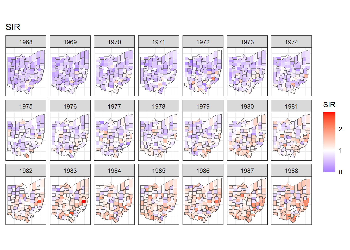
FIGURE 7.2: Maps of lung cancer SIR in Ohio counties from 1968 to 1988 created with a diverging color scale.
7.4 Time plots of SIRs
Now we plot the SIRs of each of the counties over time using the ggplot() function.
We use data d which has columns for county, year, Y, E and SIR.
In aes() we specify x-axis as year, y-axis as SIR, and grouping as county.
Inside aes(), we also put color = county to make color conditional on the variable county (Figure 7.3).
g <- ggplot(d, aes(x = year, y = SIR,
                   group = county, color = county)) +
  geom_line() + geom_point(size = 2) + theme_bw()
g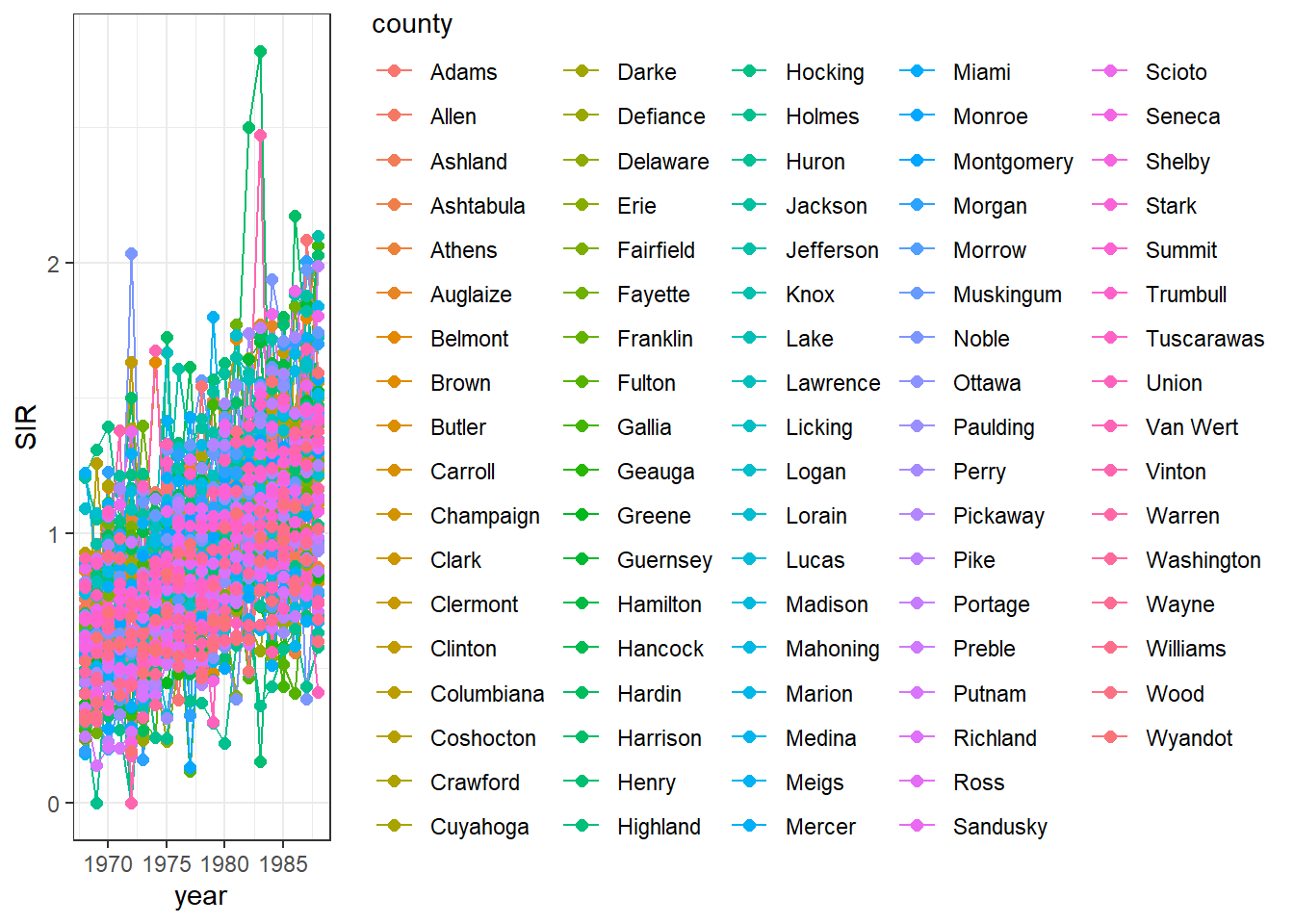
FIGURE 7.3: Time plot of lung cancer SIR in Ohio counties from 1968 to 1988.
We observe that the legend occupies a big part of the plot.
We can delete the legend by adding theme(legend.position = "none") (Figure 7.4).
g <- g + theme(legend.position = "none")
g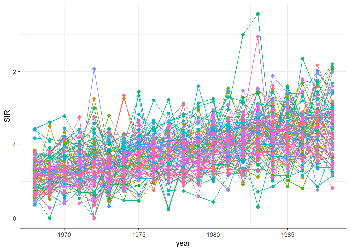
FIGURE 7.4: Time plot of lung cancer SIR in Ohio counties from 1968 to 1988 created without a legend.
We can also highlight the time series
of a specific county to see how this time series compares with the rest.
For example, we can highlight the data of the county called Adams using the function gghighlight() of the gghighlight package (Yutani 2023) (Figure 7.5).
library(gghighlight)
g + gghighlight(county == "Adams")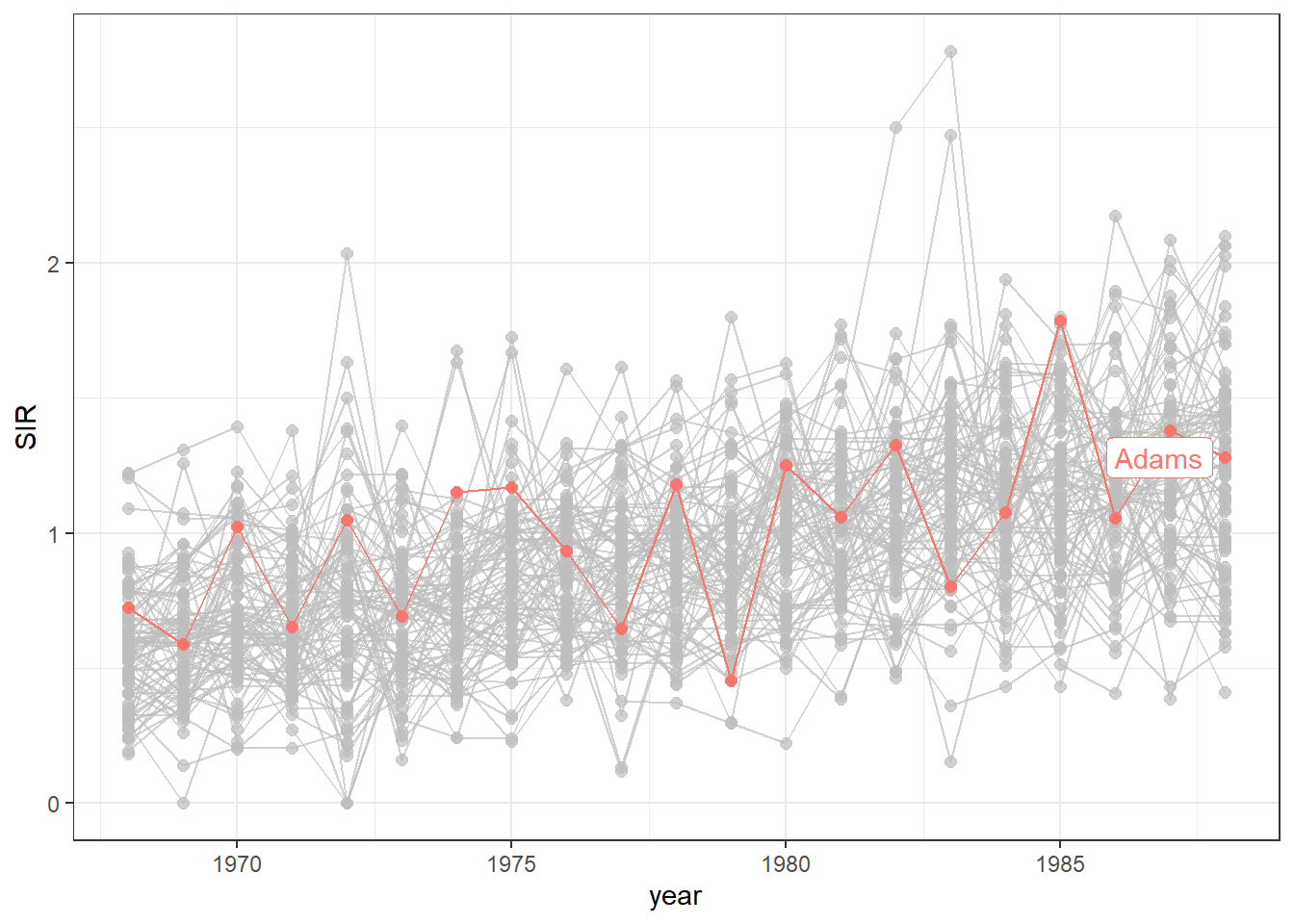
FIGURE 7.5: Time plot of lung cancer SIR in Ohio counties from 1968 to 1988 with the time series of the county called Adams highlighted.
Finally, we can transform the ggplot object into an interactive plot with the plotly package by just passing the object created with ggplot() to the ggplotly() function.
FIGURE 7.6: Interactive time plot of lung cancer SIR in Ohio counties from 1968 to 1988.
The maps and time plots reveal which counties and years have higher or lower occurrence of cases than expected. Specifically, \(\mbox{SIR} = 1\) indicates that the observed cases are equal as the expected cases, and \(\mbox{SIR} >1\) (\(\mbox{SIR} < 1\)) indicates that the observed cases are higher (lower) than the expected cases. SIRs may be misleading and insufficiently reliable for rare diseases and/or areas with small populations. Therefore, it is preferable to obtain disease risk estimates by using model-based approaches which may incorporate covariates and take into account spatial and spatio-temporal correlation. In the next section, we show how obtain model-based disease risk estimates.
7.5 Modeling
Here, we specify a spatio-temporal model and detail the required steps to obtain the disease risk estimates using R-INLA.
7.5.1 Model
We estimate the relative risk of lung cancer for each Ohio county and year using the Bernardinelli model (Bernardinelli et al. 1995). This model assumes that the number of cases \(Y_{ij}\) observed in county \(i\) and year \(j\) are modeled as
\[Y_{ij}\sim Po(E_{ij} \theta_{ij}),\]
where \(Y_{ij}\) is the observed number of cases, \(E_{ij}\) is the expected number of cases, and \(\theta_{ij}\) is the relative risk of county \(i\) and year \(j\). \(\log(\theta_{ij})\) is expressed as a sum of several components including spatial and temporal structures that take into account spatial and spatio-temporal correlation
\[log(\theta_{ij})=\alpha + u_i + v_i + (\beta + \delta_i) \times t_j.\]
Here, \(\alpha\) denotes the intercept, \(u_i+v_i\) is an area random effect, \(\beta\) is a global linear trend effect, and \(\delta_i\) is an interaction between space and time representing the difference between the global trend \(\beta\) and the area specific trend. We model \(u_i\) and \(\delta_i\) with a CAR distribution, and \(v_i\) as independent and identically distributed normal variables. This model allows each of the areas to have its own intercept \(\alpha+u_i+v_i\), and its own linear trend given by \(\beta + \delta_i\).
The relative risk \(\theta_{ij}\) quantifies whether the disease risk in county \(i\) and year \(j\) is higher (\(\theta_{ij}>1\)) or lower (\(\theta_{ij}<1\)) than the average risk in Ohio during the period of study. In next section, we explain how to specify this spatio-temporal model and obtain the relative risk estimates using R-INLA.
7.5.2 Neighborhood matrix
First, we create a neighborhood matrix needed to define the spatial random effect by using the poly2nb() and the nb2INLA() functions of the spdep package (Bivand 2024).
Then we read the file created using the inla.read.graph() function of R-INLA, and store it in the object g which we will later use to specify the spatial structure in the model.
## [[1]]
##   [1]   26   55   71   72   80   85   89  114  143  159
##  [11]  160  168  173  177  202  231  247  248  256  261
##  [21]  265  290  319  335  336  344  349  353  378  407
##  [31]  423  424  432  437  441  466  495  511  512  520
##  [41]  525  529  554  583  599  600  608  613  617  642
##  [51]  671  687  688  696  701  705  730  759  775  776
##  [61]  784  789  793  818  847  863  864  872  877  881
##  [71]  906  935  951  952  960  965  969  994 1023 1039
##  [81] 1040 1048 1053 1057 1082 1111 1127 1128 1136 1141
##  [91] 1145 1170 1199 1215 1216 1224 1229 1233 1258 1287
## [101] 1303 1304 1312 1317 1321 1346 1375 1391 1392 1400
## [111] 1405 1409 1434 1463 1479 1480 1488 1493 1497 1522
## [121] 1551 1567 1568 1576 1581 1585 1610 1639 1655 1656
## [131] 1664 1669 1673 1698 1727 1743 1744 1752 1757 1761
## [141] 1786 1815 1831 1832 1840 1845
##
## [[2]]
##   [1]   19   35   42   70   82   86   90  107  123  130
##  [11]  158  170  174  178  195  211  218  246  258  262
##  [21]  266  283  299  306  334  346  350  354  371  387
##  [31]  394  422  434  438  442  459  475  482  510  522
##  [41]  526  530  547  563  570  598  610  614  618  635
##  [51]  651  658  686  698  702  706  723  739  746  774
##  [61]  786  790  794  811  827  834  862  874  878  882
##  [71]  899  915  922  950  962  966  970  987 1003 1010
##  [81] 1038 1050 1054 1058 1075 1091 1098 1126 1138 1142
##  [91] 1146 1163 1179 1186 1214 1226 1230 1234 1251 1267
## [101] 1274 1302 1314 1318 1322 1339 1355 1362 1390 1402
## [111] 1406 1410 1427 1443 1450 1478 1490 1494 1498 1515
## [121] 1531 1538 1566 1578 1582 1586 1603 1619 1626 1654
## [131] 1666 1670 1674 1691 1707 1714 1742 1754 1758 1762
## [141] 1779 1795 1802 1830 1842 1846
##
## [[3]]
##   [1]    5    8   16   25   30   59   69   91   93   96
##  [11]  104  113  118  147  157  179  181  184  192  201
##  [21]  206  235  245  267  269  272  280  289  294  323
##  [31]  333  355  357  360  368  377  382  411  421  443
##  [41]  445  448  456  465  470  499  509  531  533  536
##  [51]  544  553  558  587  597  619  621  624  632  641
##  [61]  646  675  685  707  709  712  720  729  734  763
##  [71]  773  795  797  800  808  817  822  851  861  883
##  [81]  885  888  896  905  910  939  949  971  973  976
##  [91]  984  993  998 1027 1037 1059 1061 1064 1072 1081
## [101] 1086 1115 1125 1147 1149 1152 1160 1169 1174 1203
## [111] 1213 1235 1237 1240 1248 1257 1262 1291 1301 1323
## [121] 1325 1328 1336 1345 1350 1379 1389 1411 1413 1416
## [131] 1424 1433 1438 1467 1477 1499 1501 1504 1512 1521
## [141] 1526 1555 1565 1587 1589 1592 1600 1609 1614 1643
## [151] 1653 1675 1677 1680 1688 1697 1702 1731 1741 1763
## [161] 1765 1768 1776 1785 1790 1819 1829
##
## [[4]]
##   [1]   14   27   28   34   49   51   92  102  115  116
##  [11]  122  137  139  180  190  203  204  210  225  227
##  [21]  268  278  291  292  298  313  315  356  366  379
##  [31]  380  386  401  403  444  454  467  468  474  489
##  [41]  491  532  542  555  556  562  577  579  620  630
##  [51]  643  644  650  665  667  708  718  731  732  738
##  [61]  753  755  796  806  819  820  826  841  843  884
##  [71]  894  907  908  914  929  931  972  982  995  996
##  [81] 1002 1017 1019 1060 1070 1083 1084 1090 1105 1107
##  [91] 1148 1158 1171 1172 1178 1193 1195 1236 1246 1259
## [101] 1260 1266 1281 1283 1324 1334 1347 1348 1354 1369
## [111] 1371 1412 1422 1435 1436 1442 1457 1459 1500 1510
## [121] 1523 1524 1530 1545 1547 1588 1598 1611 1612 1618
## [131] 1633 1635 1676 1686 1699 1700 1706 1721 1723 1764
## [141] 1774 1787 1788 1794 1809 1811
##
## [[5]]
##   [1]    3   16   29   30   44   91   93  104  117  118
##  [11]  132  179  181  192  205  206  220  267  269  280
##  [21]  293  294  308  355  357  368  381  382  396  443
##  [31]  445  456  469  470  484  531  533  544  557  558
##  [41]  572  619  621  632  645  646  660  707  709  720
##  [51]  733  734  748  795  797  808  821  822  836  883
##  [61]  885  896  909  910  924  971  973  984  997  998
##  [71] 1012 1059 1061 1072 1085 1086 1100 1147 1149 1160
##  [81] 1173 1174 1188 1235 1237 1248 1261 1262 1276 1323
##  [91] 1325 1336 1349 1350 1364 1411 1413 1424 1437 1438
## [101] 1452 1499 1501 1512 1525 1526 1540 1587 1589 1600
## [111] 1613 1614 1628 1675 1677 1688 1701 1702 1716 1763
## [121] 1765 1776 1789 1790 1804
##
## [[6]]
##   [1]   11   12   83   84   94   99  100  171  172  182
##  [11]  187  188  259  260  270  275  276  347  348  358
##  [21]  363  364  435  436  446  451  452  523  524  534
##  [31]  539  540  611  612  622  627  628  699  700  710
##  [41]  715  716  787  788  798  803  804  875  876  886
##  [51]  891  892  963  964  974  979  980 1051 1052 1062
##  [61] 1067 1068 1139 1140 1150 1155 1156 1227 1228 1238
##  [71] 1243 1244 1315 1316 1326 1331 1332 1403 1404 1414
##  [81] 1419 1420 1491 1492 1502 1507 1508 1579 1580 1590
##  [91] 1595 1596 1667 1668 1678 1683 1684 1755 1756 1766
## [101] 1771 1772 1843 1844
nb2INLA("map.adj", nb)
g <- inla.read.graph(filename = "map.adj")
7.5.3 Inference using INLA
Next, we create the index vectors for the counties and years that will be used to specify the random effects of the model:
-
idareais the vector with the indices of counties and has elements 1 to 88 (number of areas). -
idtimeis the vector with the indices of years and has elements 1 to 21 (number of years).
We also create a second index vector for counties (idarea1) by replicating idarea.
We do this because we need to use the index vector of the areas in two different random effects,
and in R-INLA variables can be associated with an f() function only once.
d$idarea <- as.numeric(as.factor(d$county))
d$idarea1 <- d$idarea
d$idtime <- 1 + d$year - min(d$year)
Now we write the formula of the Bernardinelli model:
\[Y_{ij}\sim Po(E_{ij} \theta_{ij}),\]
\[log(\theta_{ij})=\alpha + u_i + v_i + (\beta + \delta_i) \times t_j.\]
In the formula, the intercept \(\alpha\) is included by default,
f(idarea, model = "bym", graph = g) corresponds to \(u_i+v_i\),
f(idarea1, idtime, model = "iid") is \(\delta_i \times t_j\),
and idtime denotes \(\beta \times t_j\).
Finally, we call inla() specifying the formula, the family, the data, and the expected cases.
We also set control.predictor equal to list(compute = TRUE) to compute the posterior means of the predictors.
7.6 Mapping relative risks
We add the relative risk estimates and the lower and upper limits of the 95% credible intervals to the data frame d.
Summaries of the posteriors of the relative risk are in data frame res$summary.fitted.values.
We assign mean to the relative risk estimates, and 0.025quant and 0.975quant to the lower and upper limits of 95% credible intervals.
d$RR <- res$summary.fitted.values[, "mean"]
d$LL <- res$summary.fitted.values[, "0.025quant"]
d$UL <- res$summary.fitted.values[, "0.975quant"]
To make maps of the relative risks, we first merge map with d so map has columns RR, LL and UL.
Then we can use ggplot() to make maps showing the relative risks and lower and upper limits of 95% credible intervals for each year.
For example, maps of the relative risks can be created as follows (Figure 7.7):
ggplot(map) + geom_sf(aes(fill = RR)) +
  facet_wrap(~year, dir = "h", ncol = 7) +
  ggtitle("RR") + theme_bw() +
  theme(
    axis.text.x = element_blank(),
    axis.text.y = element_blank(),
    axis.ticks = element_blank()
  ) +
  scale_fill_gradient2(
    midpoint = 1, low = "blue", mid = "white", high = "red"
  )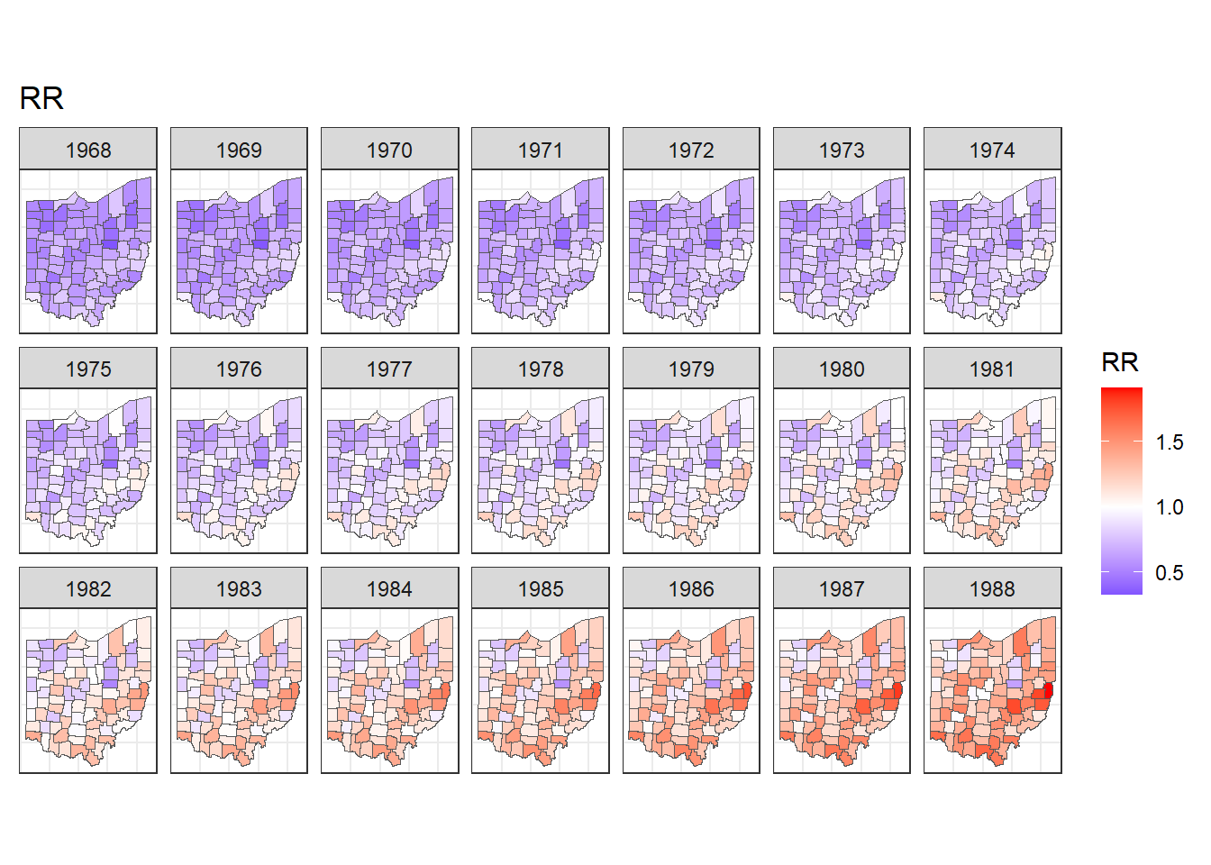
FIGURE 7.7: Maps of lung cancer relative risk in Ohio counties from 1968 to 1988.
Note that in addition to the mean and 95% credible intervals, we can also calculate the probabilities that relative risk exceeds a given threshold value, and this allows to identify counties with unusual elevation of disease risk. Examples about the calculation of exceedance probabilities are shown in Chapters 4, 6 and 9.
We can also create animated maps showing the relative risks for each year using the gganimate package.
To create an animation using this package, we need to write syntax to create a map using ggplot(),
and then add transition_time() or transition_states() to plot the data by the variable year and animate between the different frames. We also need to add a title that indicates the year corresponding to each frame using labs() and syntax of the glue package (Hester and Bryan 2024). For example, we can create an animation showing the relative risks for each of counties and years as follows:
library(gganimate)
ggplot(map) + geom_sf(aes(fill = RR)) +
  theme_bw() +
  theme(
    axis.text.x = element_blank(),
    axis.text.y = element_blank(),
    axis.ticks = element_blank()
  ) +
  scale_fill_gradient2(
    midpoint = 1, low = "blue", mid = "white", high = "red"
  ) +
  transition_time(year) +
  labs(title = "Year: {round(frame_time, 0)}")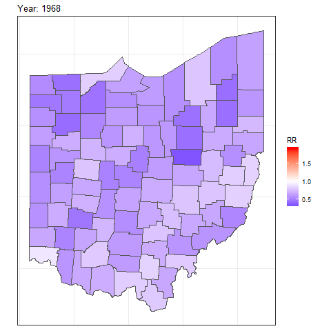
FIGURE 7.8: Animation of lung cancer relative risk in Ohio counties from 1968 to 1988.
To save the animation, we can use the anim_save() function which by default saves a file of type gif.
Other options of gganimate can be seen on the package website.