ggplot2
1 References
- Examples: https://ggplot2.tidyverse.org/reference/index.html
- ggplot2 book: https://ggplot2-book.org/
geomtextpath: https://github.com/AllanCameron/geomtextpathggplot2extensions: https://exts.ggplot2.tidyverse.org/ggplot2extensions: https://exts.ggplot2.tidyverse.org/gallery/- R graph gallery: https://www.r-graph-gallery.com/
- https://www.cedricscherer.com/2019/08/05/a-ggplot2-tutorial-for-beautiful-plotting-in-r/
- https://www.cedricscherer.com/2019/05/17/the-evolution-of-a-ggplot-ep.-1/
- https://www.cedricscherer.com/slides/OutlierConf2021_ggplot-wizardry.pdf
- Exercises: https://pkg.garrickadenbuie.com/trug-ggplot2/#53
2 Installation
install.packages("ggplot2")
library(ggplot2)
3 Introduction
ggplot2 uses a grammar of graphics which defines the
rules of structuring mathematic and aesthetic elements to build graphs
layer-by-layer.
To create a ggplot2 we call ggplot()
supplying a data frame with the variables to plot with data
and aesthetic mappings between variables in the data and visual
properties of the objects in the graph with mapping = aes()
(e.g., position, color of points or lines).
Then we use + to add layers of graphical components to
the graph. Layers consist of geoms, stats, scales, coords, facets and
themes. For example, we add objects to the graph with
geom_*() functions (e.g, geom_point() for
points, geom_line() for lines). We can also add color
scales (e.g., scale_colour_brewer(), faceting
specifications (e.g., facet_wrap()), and coordinate systems
(e.g., coord_flip()).
To save a plot, we use ggsave().
4 Basic ggplot
Dataset mpg {ggplot2} contains fuel economy data from
1999 to 2008 for 38 popular models of cars
displengine displacement, in litreshwy: highway miles per gallon
head(mpg)library(ggplot2)
ggplot(data = mpg, mapping = aes(x = displ, y = hwy)) + geom_point()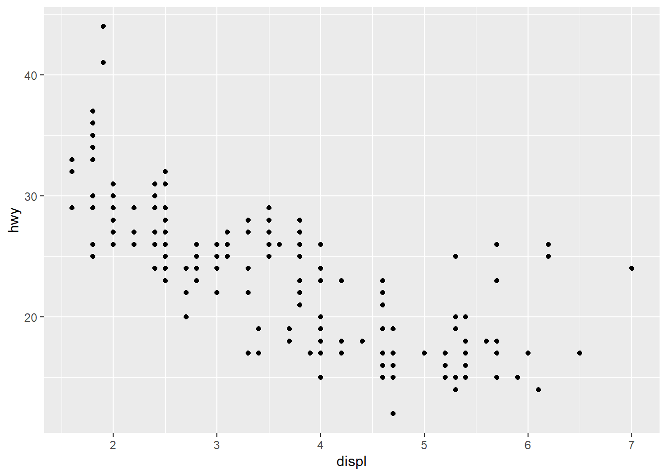
5 Scatterplot
Dataset mtcars {datasets} contains fuel consumption and
10 aspects of automobile design and performance for 32 automobiles
(1973-74 models)
wt: weight (1000 lbs)mpg: miles/(US) galloncyl: number of cylindersamTransmission (0 = automatic, 1 = manual)
head(mtcars)# Call ggplot() and supply data. This creates a blank canvas
ggplot(data = mtcars)
# Scatterplot
ggplot(data = mtcars) + geom_point(aes(x = wt, y = mpg))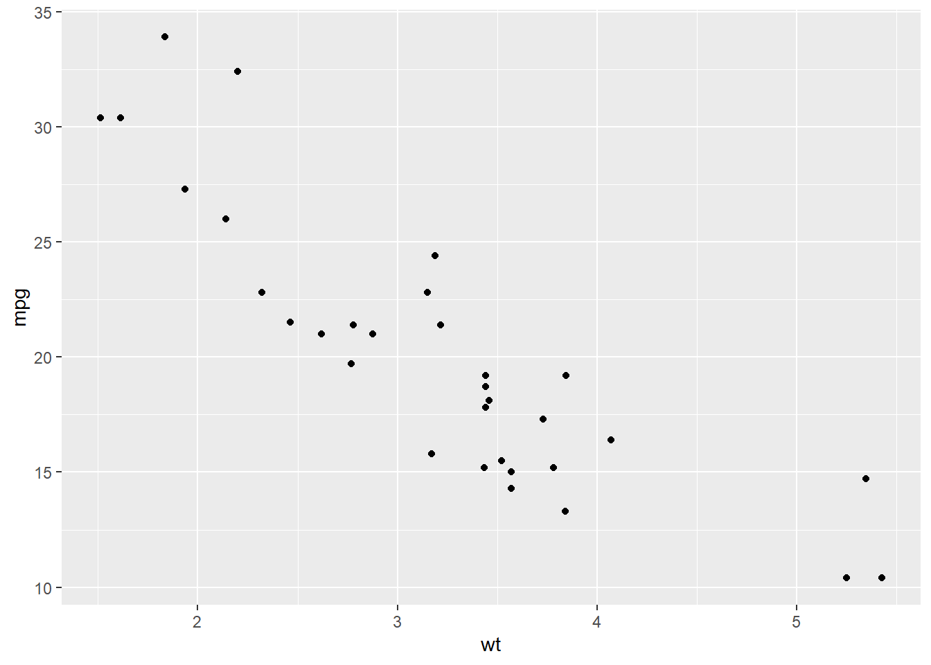
# Change color of the points to blue. Color outside aes()
ggplot(data = mtcars) + geom_point(aes(x = wt, y = mpg), color = "blue")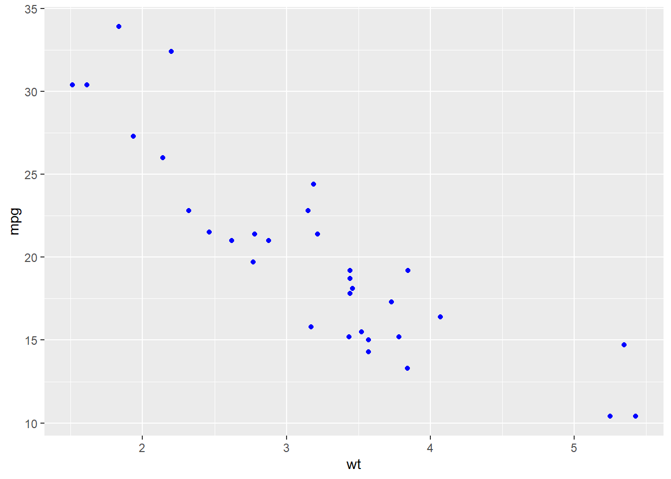
# Use a different color for each value of am. Color inside aes(). Map variable am to color
mtcars$am <- factor(mtcars$am)
ggplot(data = mtcars) + geom_point(aes(x = wt, y = mpg, color = am))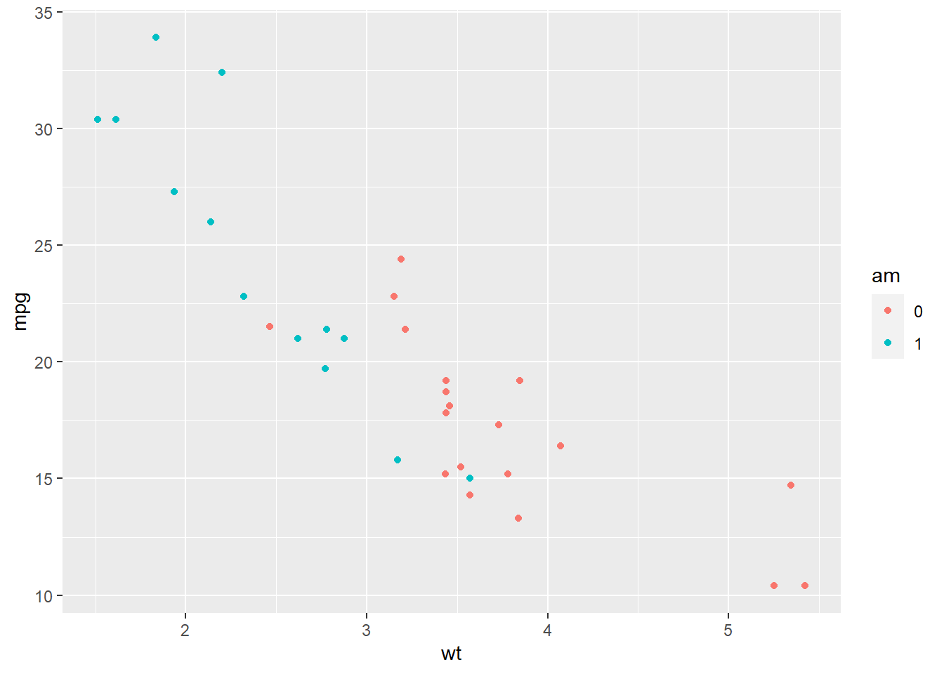
# Use a different shape for each value of am. Shape inside aes(). Map variable am to shape
mtcars$am <- factor(mtcars$am)
ggplot(data = mtcars) + geom_point(aes(x = wt, y = mpg, shape = am))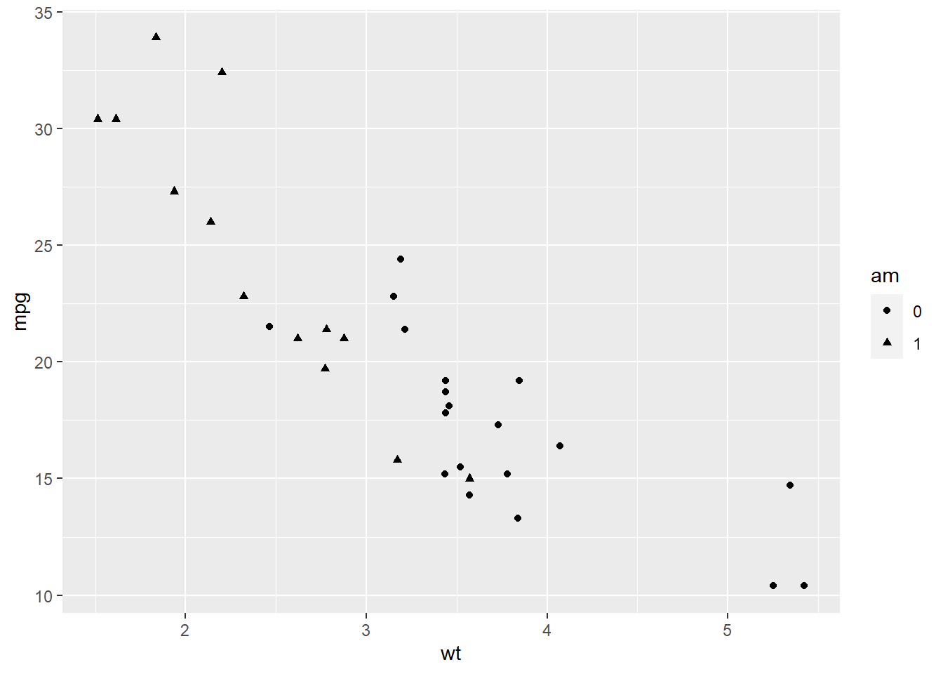
# Change the size aesthetic (bubble chart)
ggplot(data = mtcars) + geom_point(aes(x = wt, y = mpg, size = cyl))
## Warning: Using size for a discrete variable is not advised.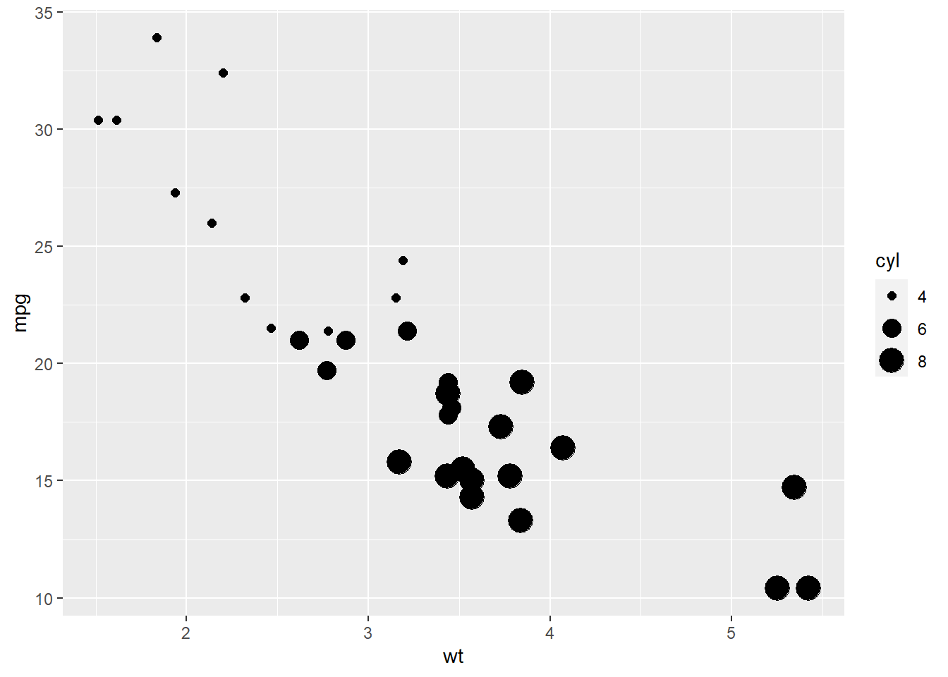
# Change the transparency aesthetic to see all the points
ggplot(data = mtcars) + geom_point(aes(x = wt, y = mpg, alpha = cyl))
## Warning: Using alpha for a discrete variable is not advised.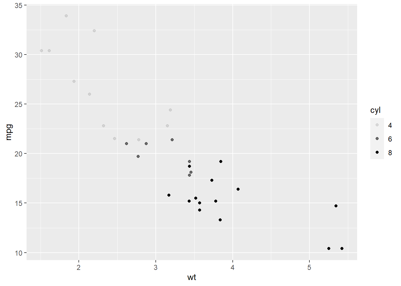
# Change the size aesthetic and set transparency all points to 0.3
ggplot(data = mtcars) + geom_point(aes(x = wt, y = mpg, size = cyl), alpha = 0.3)
## Warning: Using size for a discrete variable is not advised.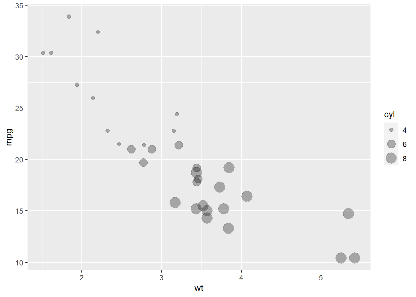
6 Aesthetic mappings
Aesthetics mapping vs parameters setting
- If we map aesthetics to variables inside the
aes()function, the aesthetic will vary as the variable varies. For example, mappingx = timecauses the position of the plotted data to vary with values of variabletime. Similarly, mappingcolor = groupcauses the color of objects to vary with values of variablegroup. - If we set aesthetics to a constant outside the
aes()function, the aesthetic will be applied to all objects in the graph.
Aesthetics mapping
geom_*()functions are used to plot objects in the graph (e.g.,geom_point()for points,geom_line()for lines,geom_bar()for bars with bases on the x-axis)Aesthetic mappings are a way of mapping variables in the data to particular visual properties (aesthetics) of the objects in the graph.
Aesthetics are specified inside
aes(). Each layer inherits the aestheticsaes()specified inside ofggplot(). If new aesthetics are specified in a layer this will override the aesthetics specified inggplot().Aesthetics vary by
geom_*(). Differentgeom_*()functions have some aesthetics as required and others as optional. For example,geom_point()requires bothxandy, the minimal specification for a scatterplot.geom_point()also accepts aestheticshapeto define the shapes of points whilegeom_bar()does not acceptshape.
Commonly used aesthetics are:
x: Map variable to a position on the x-axisy: Map variable to a position on the y-axiscolor(orcolour): Map variable to the color of an object (e.g., point) (compare to fill below)fill: Map variable to the fill color of an objectshape: Map variable to an object shape (e.g., in scatterplots)size: Map variable to an object sizealpha: Map variable to the transparency of objects (value between 0: transparent and 1: opaque)linetype: Map variable to the linetype of an object outline (solid, dashed, dotted, etc.)group: Map variable to a group (each group on a separate line)
We can learn about aesthetics by typing
vignette("ggplot2-specs").
7 Exercises ggplot2 - aesthetics
https://www.paulamoraga.com/book-r/99-problems-ggplot2-aesthetics.html
8 Lines
set.seed(12345)
d <- data.frame(x = 1:10, y = rnorm(10))
ggplot(data = d, aes(x = x, y = y)) + geom_line()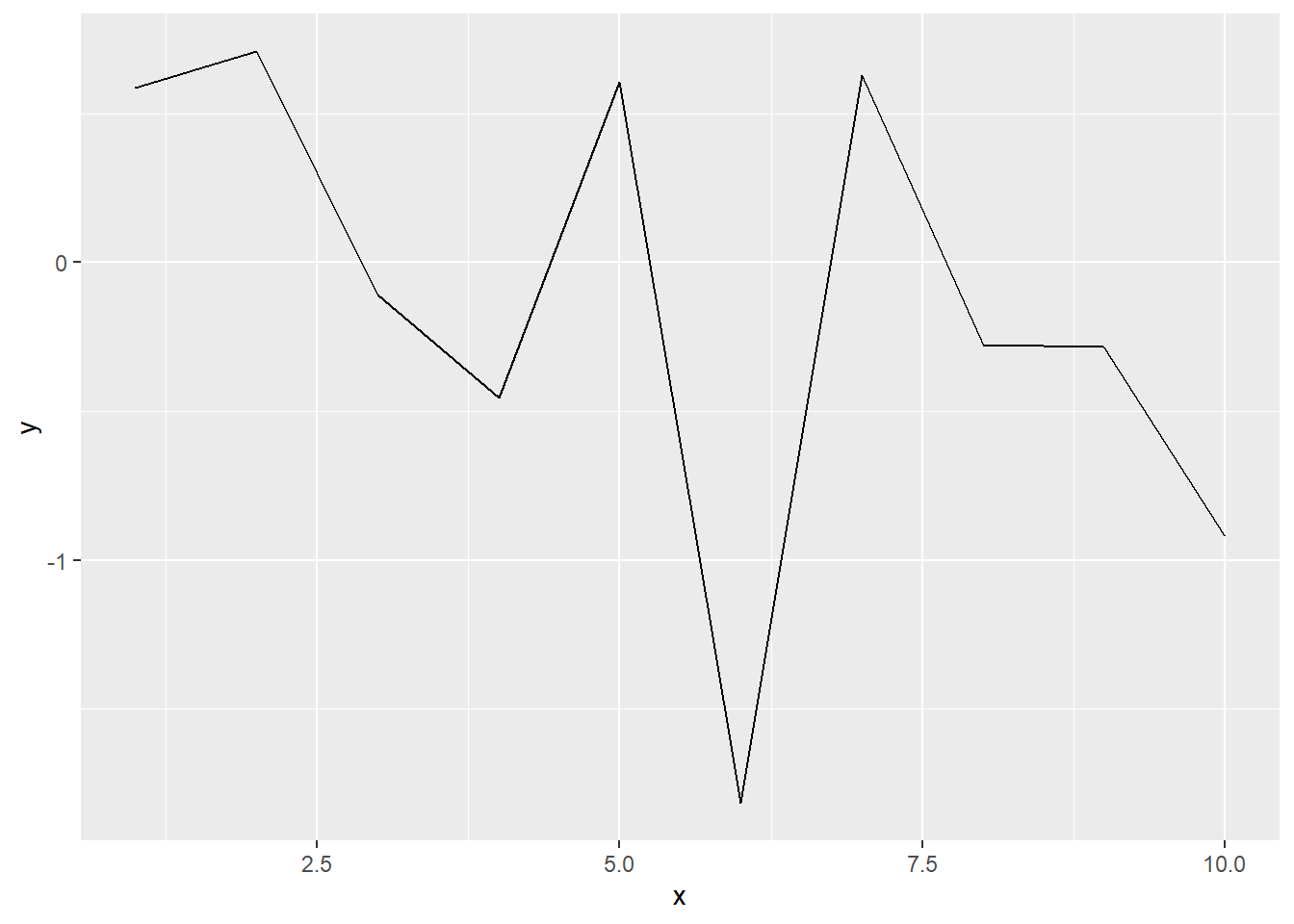
9 Histogram
Histograms depict the distribution of a continuous variable.
geom_histogram() cuts the continuous variable mapped to
x into bins, and count the number of values within each bin
(default is 30 bins)
Dataset diamonds {ggplot2} contains the prices and other
attributes of almost 54000 diamonds
caratweight of the diamond (0.2 - 5.01)
head(diamonds)ggplot(diamonds, aes(carat)) + geom_histogram()## `stat_bin()` using `bins = 30`. Pick better value with `binwidth`.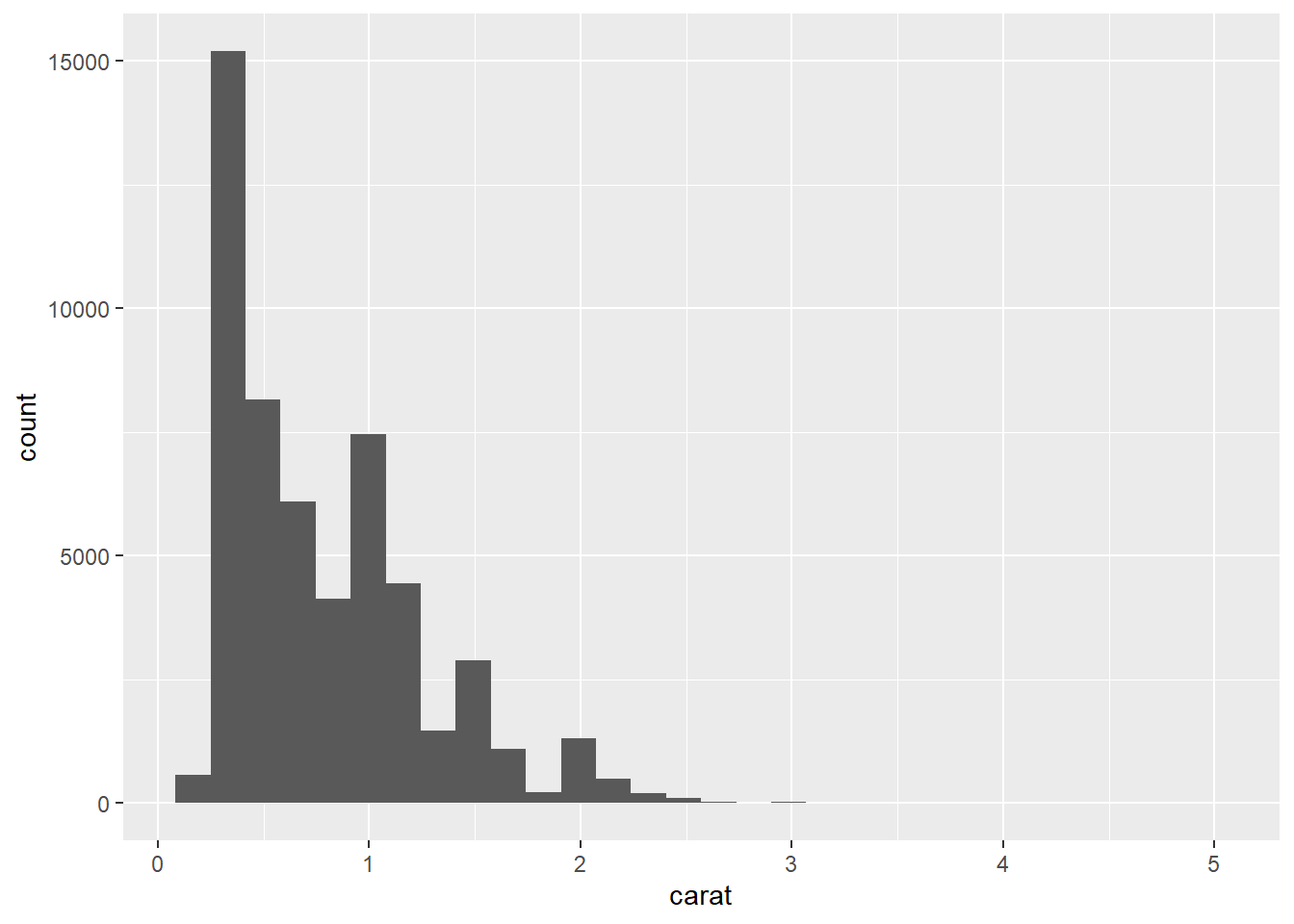
10 Barplot
Barplots are used to display the frequencies of categorical variables.
Dataset mpg {ggplot2} contains a subset of the fuel
economy data
class“type” of cardrvtype of drive train, where f = front-wheel drive, r = rear wheel drive, 4 = 4wdhwyhighway miles per gallon
head(mpg)# Number of cars in each class
ggplot(mpg, aes(x = class)) + geom_bar(color = 'blue')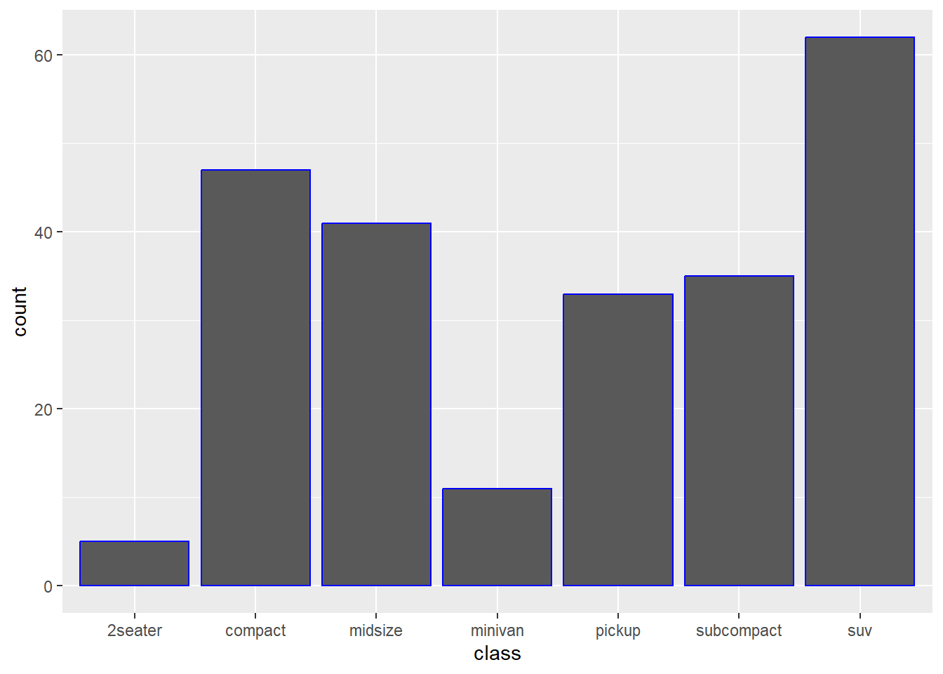
# Number of cars in each class. Bars coloured by type
ggplot(mpg, aes(class)) + geom_bar(aes(fill = drv))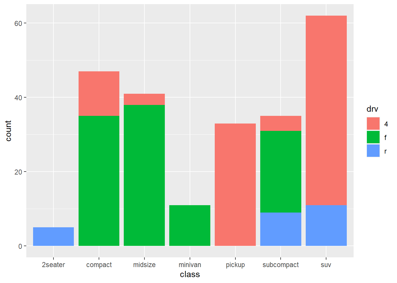
11 Boxplot
Boxplots are useful for comparing whole distributions of a continuous
variable between groups. geom_boxplot() creates boxplots of
the variable mapped to y for each group defined by the
values of the x variable.
ggplot(mpg, aes(class, hwy)) + geom_boxplot()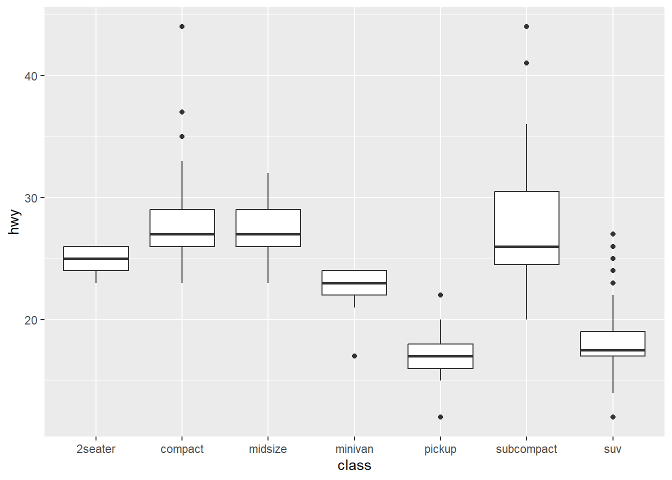
12 Titles and labels
We can use labs() to give labels for all aesthetics and
titles. We can also use xlab() and ylab() to
give labels to x-axis and y-axis, and ggtitle() to give a
title to the graph.
ggplot(mpg, aes(x = displ, y = hwy, color = class)) + geom_point() +
  labs(title = "Fuel Efficiency by Engine Power",
       subtitle = "Fuel economy data from 1999 and 2008 for 38 popular models of cars",
       caption = "This is a caption",
       x = "Engine power (litres displacement)",
       y = "Fuel Efficiency (miles per gallon)",
       color = "Car Type")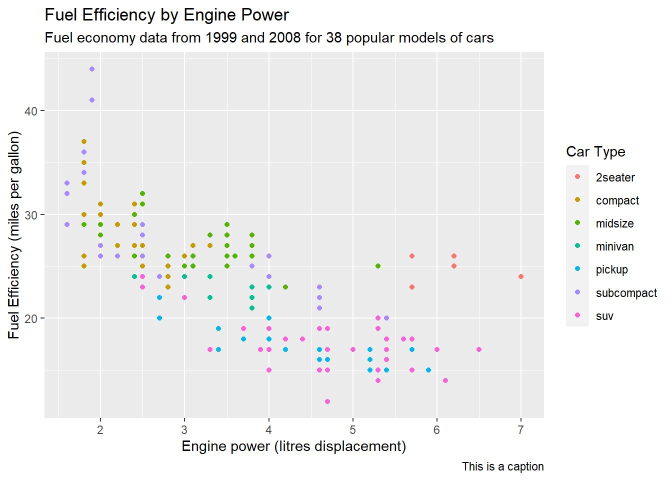
Quick and easy ways to deal with long labels
https://www.andrewheiss.com/blog/2022/06/23/long-labels-ggplot/
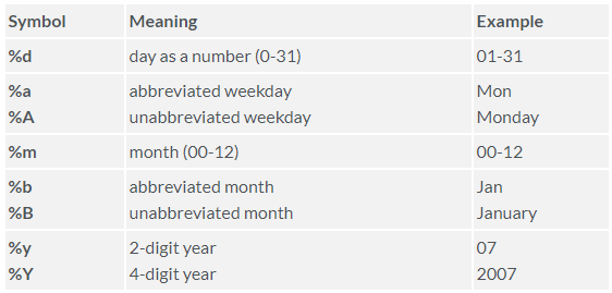
13 Time plots
To plot time series we need to have the time variable in
Date format. We can check the class of the time variable
with str() or class() and use
as.Date() to convert it to Date format if
necessary. ggplot2 recognizes the date format and uses the
appropriate x-axis labels. We can also customize the labels with
scale_x_date()
set.seed(12345)
day <- seq(as.Date("2010/1/1"), as.Date("2011/12/31"), "week")
value <- rnorm(n = length(day), mean = 100, sd = 1)
day
## [1] "2010-01-01" "2010-01-08" "2010-01-15" "2010-01-22" "2010-01-29"
## [6] "2010-02-05" "2010-02-12" "2010-02-19" "2010-02-26" "2010-03-05"
## [11] "2010-03-12" "2010-03-19" "2010-03-26" "2010-04-02" "2010-04-09"
## [16] "2010-04-16" "2010-04-23" "2010-04-30" "2010-05-07" "2010-05-14"
## [21] "2010-05-21" "2010-05-28" "2010-06-04" "2010-06-11" "2010-06-18"
## [26] "2010-06-25" "2010-07-02" "2010-07-09" "2010-07-16" "2010-07-23"
## [31] "2010-07-30" "2010-08-06" "2010-08-13" "2010-08-20" "2010-08-27"
## [36] "2010-09-03" "2010-09-10" "2010-09-17" "2010-09-24" "2010-10-01"
## [41] "2010-10-08" "2010-10-15" "2010-10-22" "2010-10-29" "2010-11-05"
## [46] "2010-11-12" "2010-11-19" "2010-11-26" "2010-12-03" "2010-12-10"
## [51] "2010-12-17" "2010-12-24" "2010-12-31" "2011-01-07" "2011-01-14"
## [56] "2011-01-21" "2011-01-28" "2011-02-04" "2011-02-11" "2011-02-18"
## [61] "2011-02-25" "2011-03-04" "2011-03-11" "2011-03-18" "2011-03-25"
## [66] "2011-04-01" "2011-04-08" "2011-04-15" "2011-04-22" "2011-04-29"
## [71] "2011-05-06" "2011-05-13" "2011-05-20" "2011-05-27" "2011-06-03"
## [76] "2011-06-10" "2011-06-17" "2011-06-24" "2011-07-01" "2011-07-08"
## [81] "2011-07-15" "2011-07-22" "2011-07-29" "2011-08-05" "2011-08-12"
## [86] "2011-08-19" "2011-08-26" "2011-09-02" "2011-09-09" "2011-09-16"
## [91] "2011-09-23" "2011-09-30" "2011-10-07" "2011-10-14" "2011-10-21"
## [96] "2011-10-28" "2011-11-04" "2011-11-11" "2011-11-18" "2011-11-25"
## [101] "2011-12-02" "2011-12-09" "2011-12-16" "2011-12-23" "2011-12-30"value## [1] 100.58553 100.70947 99.89070 99.54650 100.60589 98.18204 100.63010
## [8] 99.72382 99.71584 99.08068 99.88375 101.81731 100.37063 100.52022
## [15] 99.24947 100.81690 99.11364 99.66842 101.12071 100.29872 100.77962
## [22] 101.45579 99.35567 98.44686 98.40229 101.80510 99.51835 100.62038
## [29] 100.61212 99.83769 100.81187 102.19683 102.04919 101.63245 100.25427
## [36] 100.49119 99.67591 98.33795 101.76773 100.02580 101.12851 97.61964
## [43] 98.93973 100.93714 100.85445 101.46073 98.58690 100.56740 100.58319
## [50] 98.69320 99.45961 101.94769 100.05359 100.35166 99.32902 100.27795
## [57] 100.69117 100.82380 102.14507 97.65306 100.14959 98.65747 100.55330
## [64] 101.58996 99.41312 98.16762 100.88814 101.59349 100.51685 98.70433
## [71] 100.05462 99.21535 98.95065 102.33051 101.40271 100.94260 100.82626
## [78] 99.18846 100.47625 101.02126 100.64538 101.04314 99.69563 102.47711
## [85] 100.97122 101.86710 100.67204 99.69205 100.53652 100.82487 99.03610
## [92] 99.14492 101.88695 99.60818 99.01937 100.68733 99.49496 102.15772
## [99] 99.40020 99.30545 100.22393 98.84378 100.42242 98.67524 100.14108d <- data.frame(day, value)
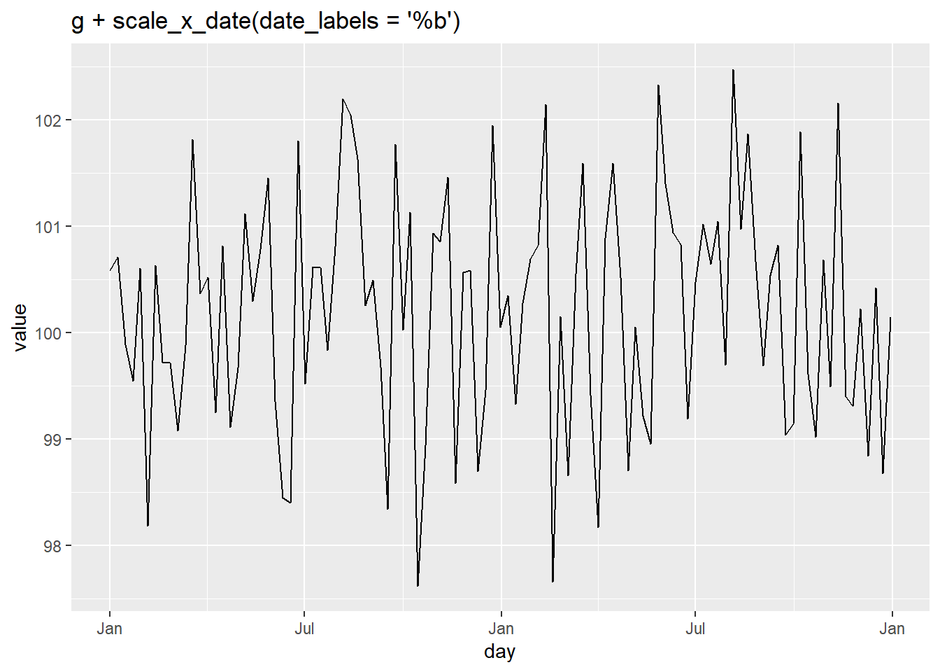
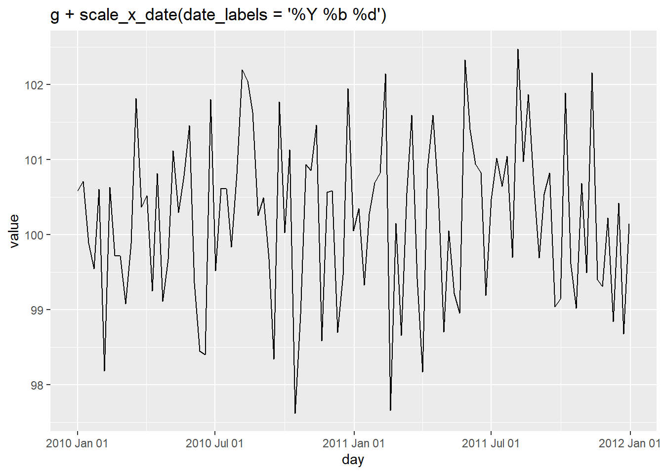
(g <- ggplot(d, aes(x = day, y = value)) + geom_line())
Format on the x-axis
We can use the scale_x_date() function to customize the
format of the time variable displayed on the x-axis.
Breaks
We can also control the breaks and minor breaks to display with
arguments date_breaks and
date_minor_breaks.
g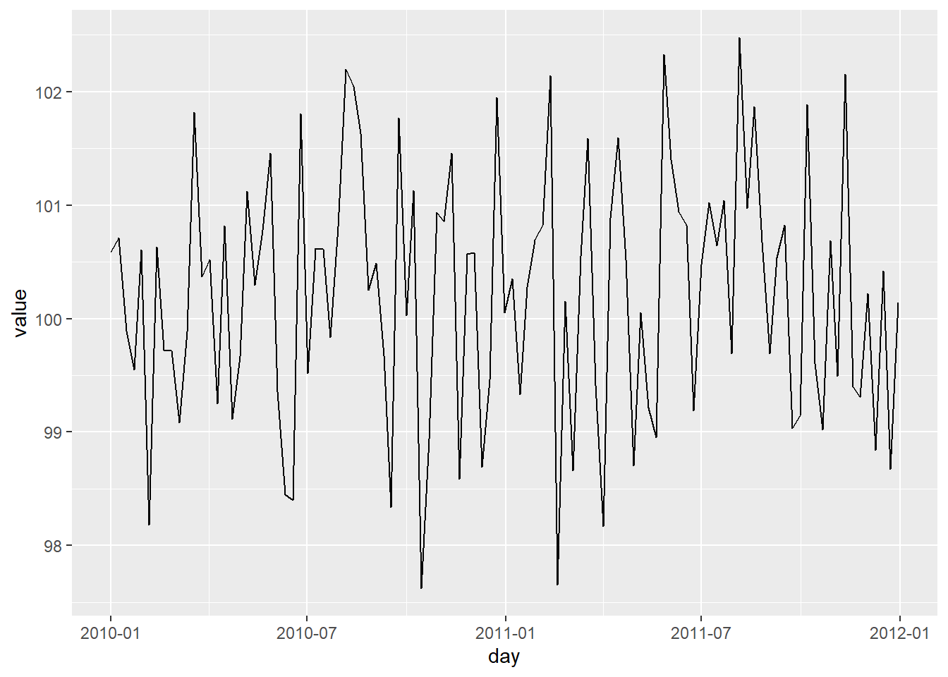
g + scale_x_date(date_breaks = "1 month", date_labels = "%m")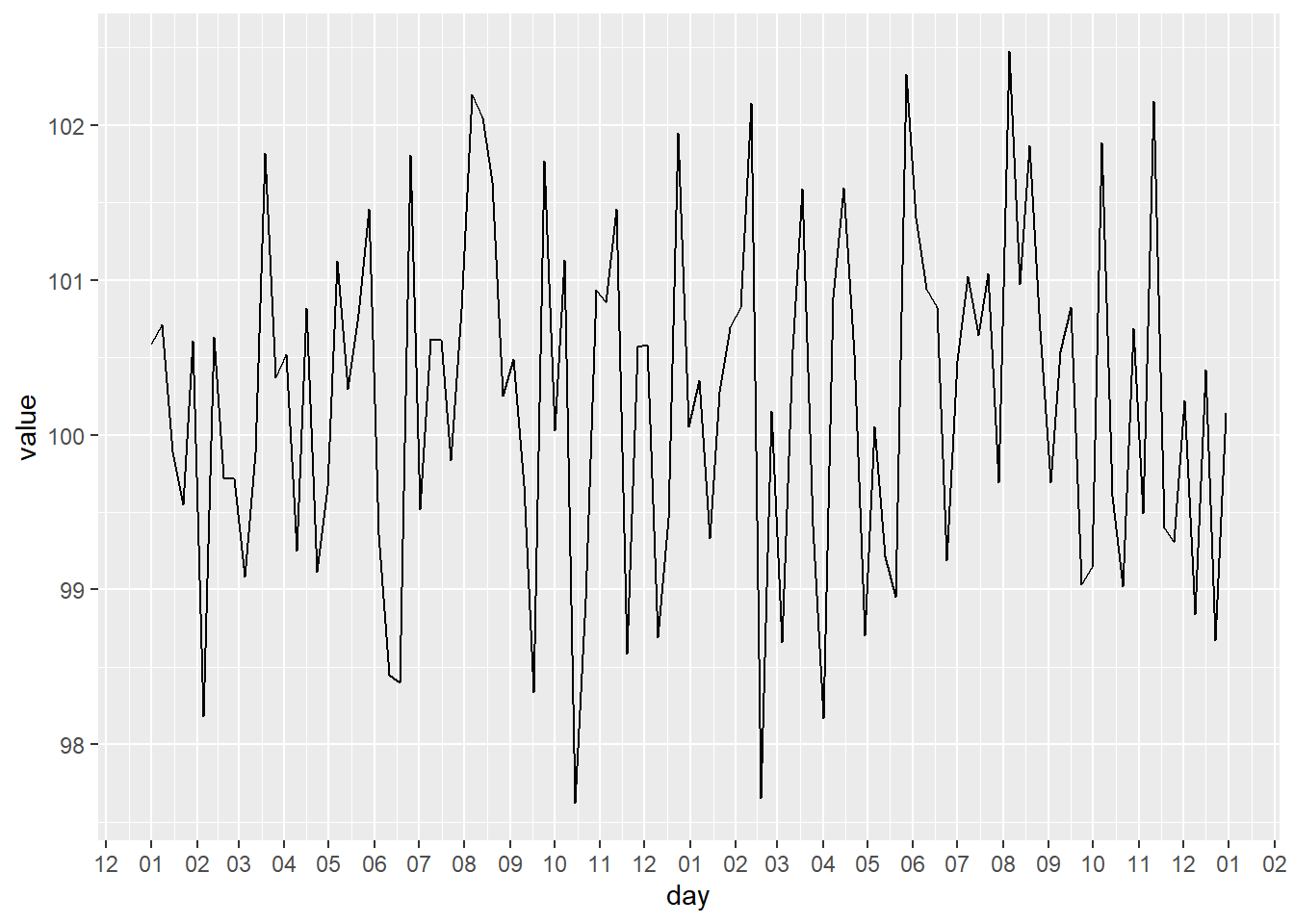
g + scale_x_date(date_minor_breaks = "2 day")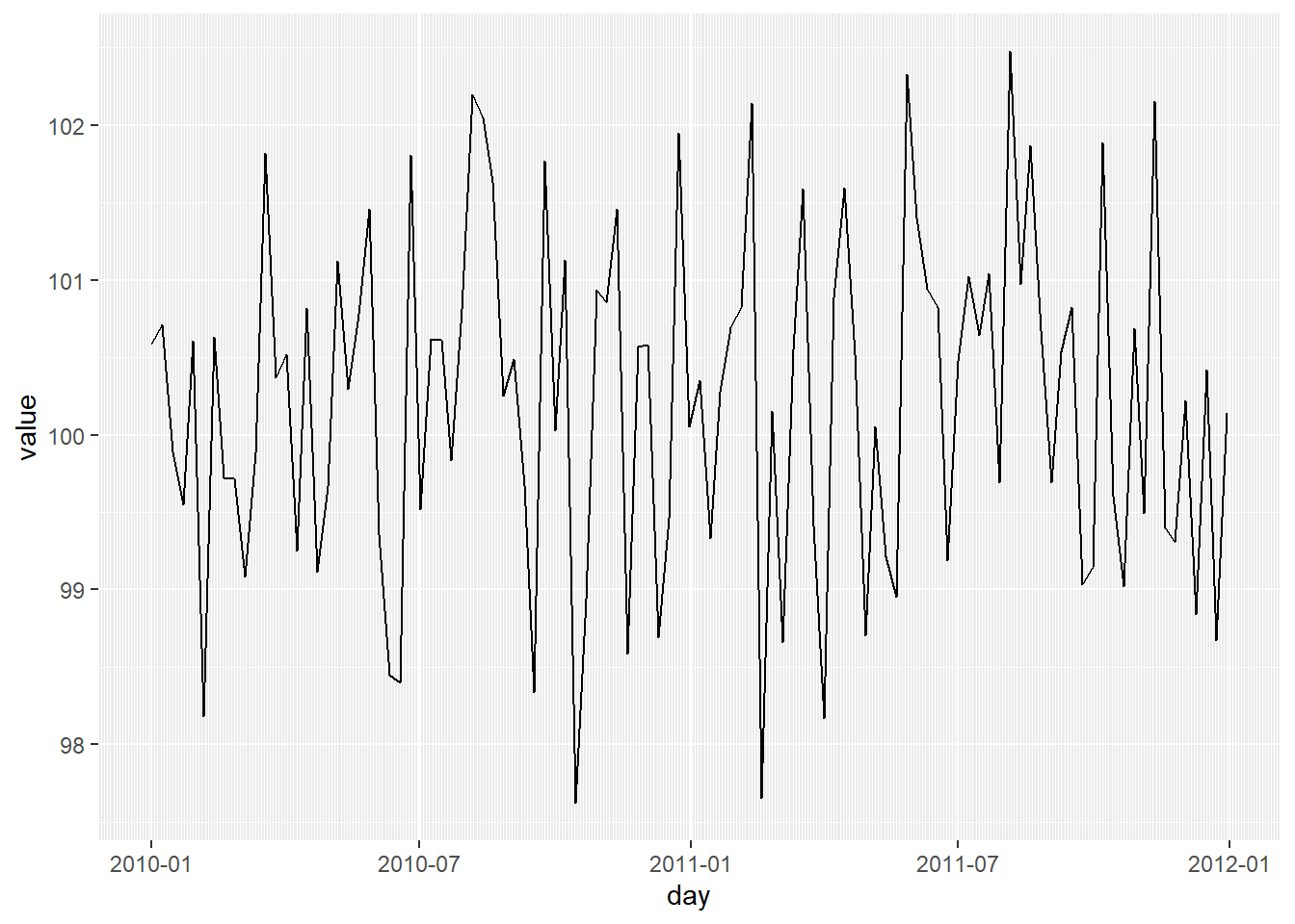
14 Exercises ggplot2 - axes
https://www.paulamoraga.com/book-r/99-problems-ggplot2-axes.html
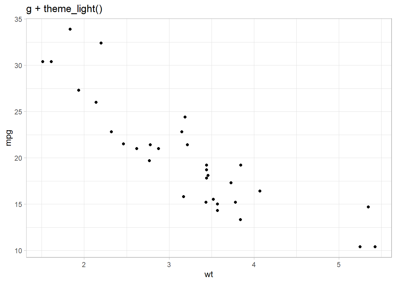
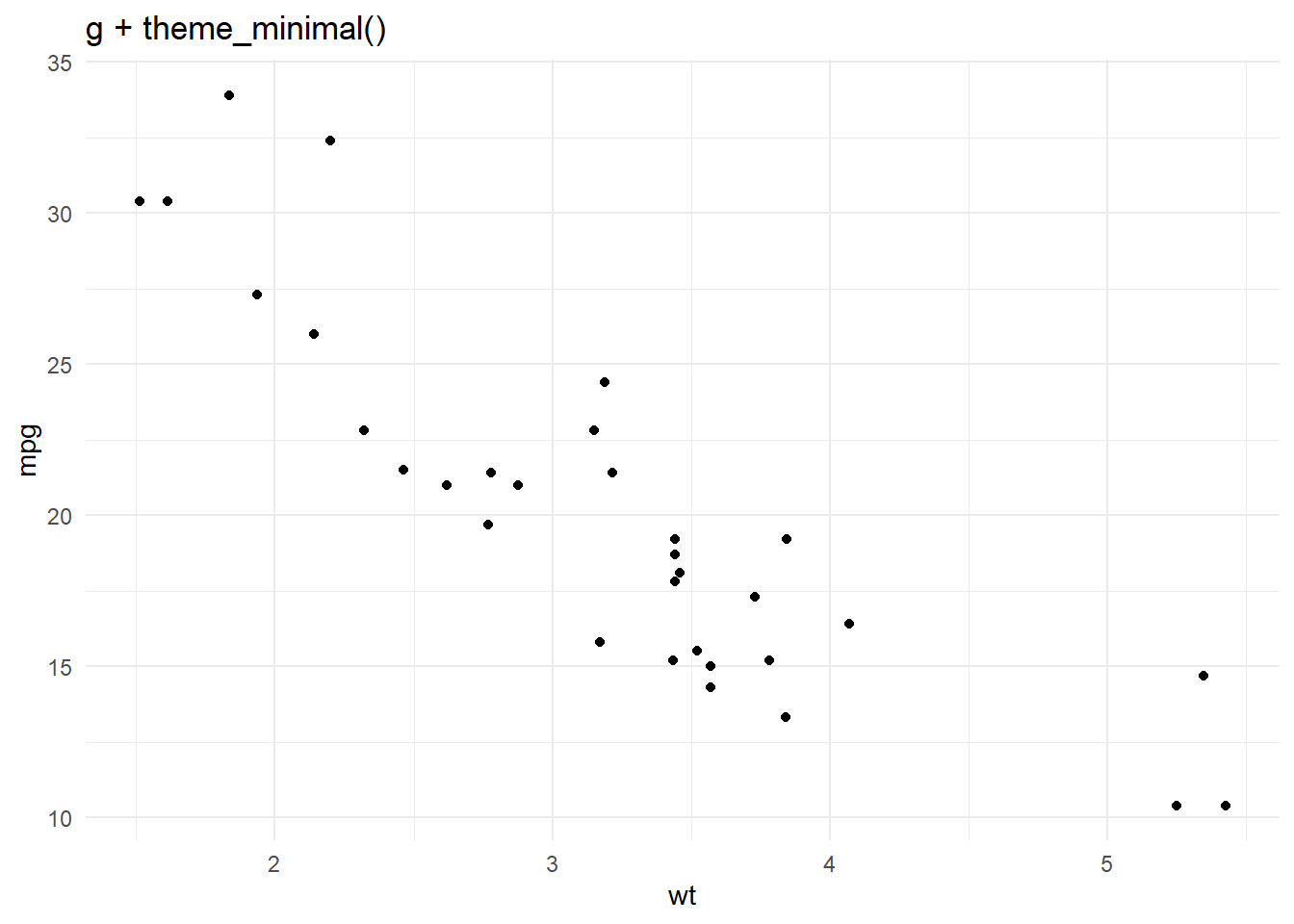
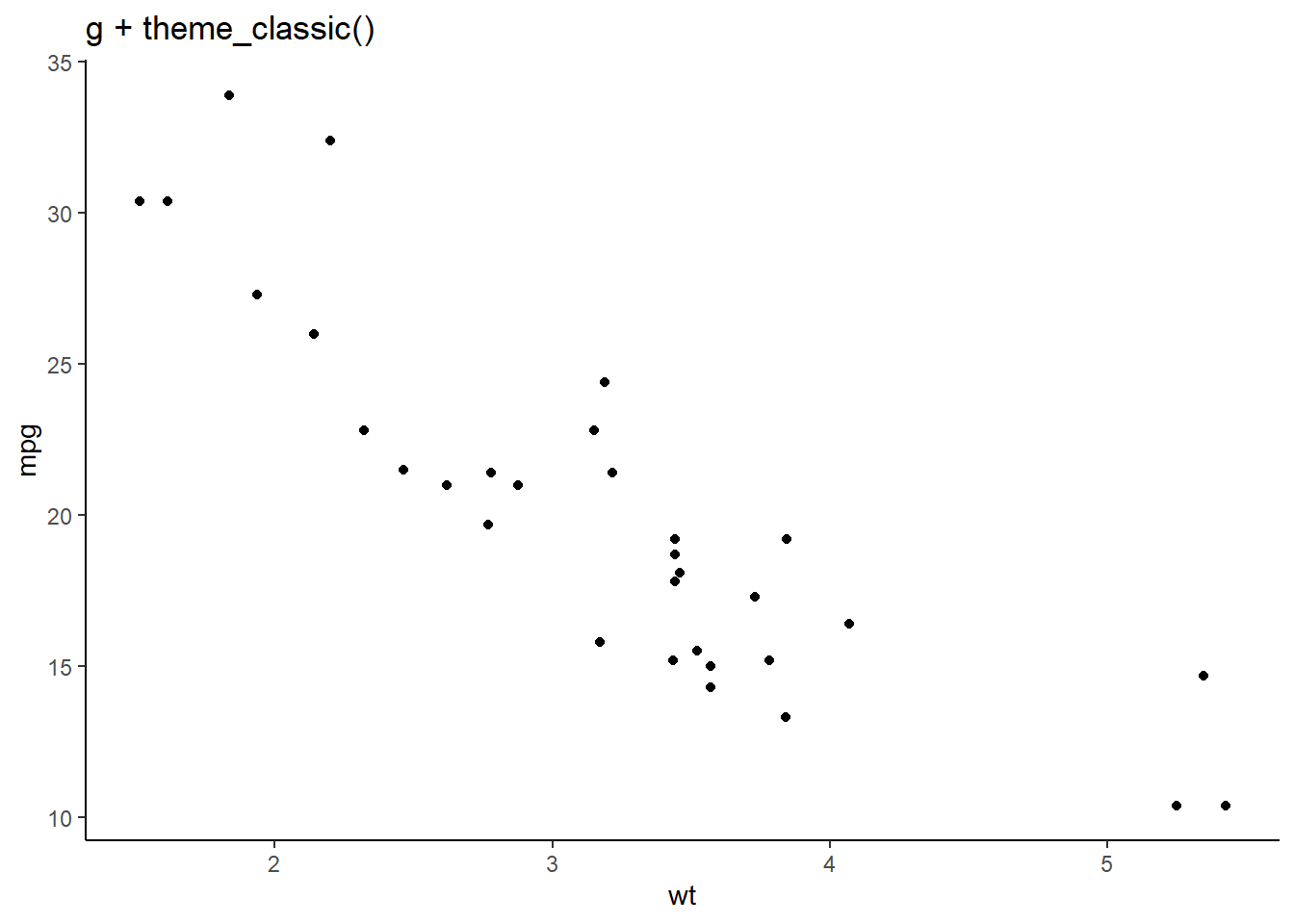
15 Themes
ggplot2 provides a few complete themes that enable to
change the overall look of the graph. These themes control elements of
the graph not related to the data such as background color, size of
fonts, gridlines and color of labels.
We can add a theme to a specific graph or we can use
theme_set() to make all plots with the same theme. For
example, we can set theme_set(theme_bw()) to create all
graphs with the dark-on-light theme.
- https://ggplot2.tidyverse.org/reference/ggtheme.html
- https://cedricscherer.netlify.app/2019/08/05/a-ggplot2-tutorial-for-beautiful-plotting-in-r/#themes
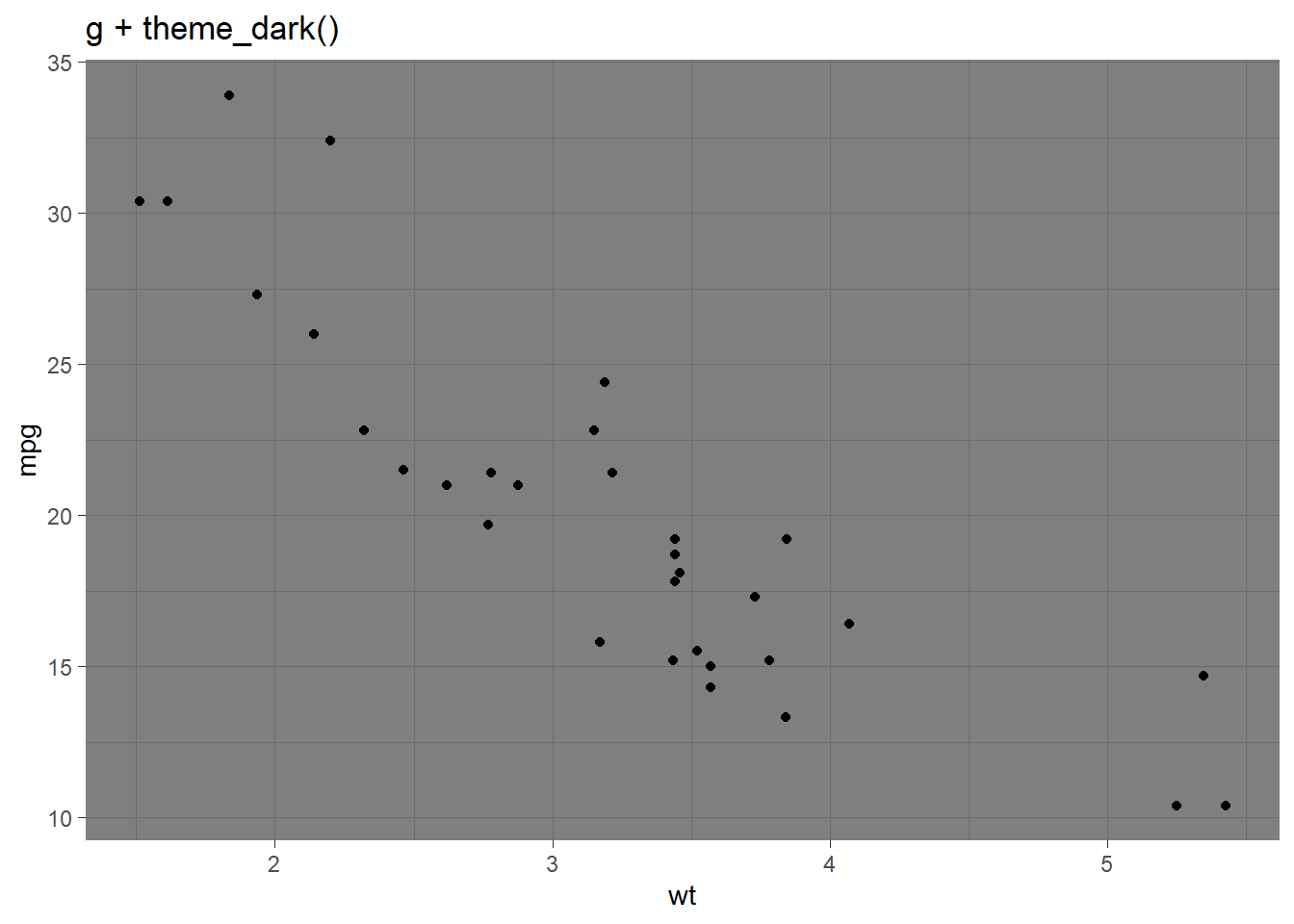
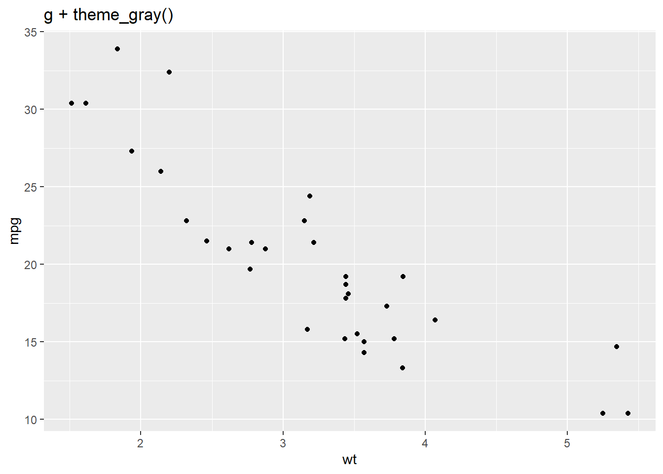
g <- ggplot(mtcars, aes(wt, mpg)) + geom_point()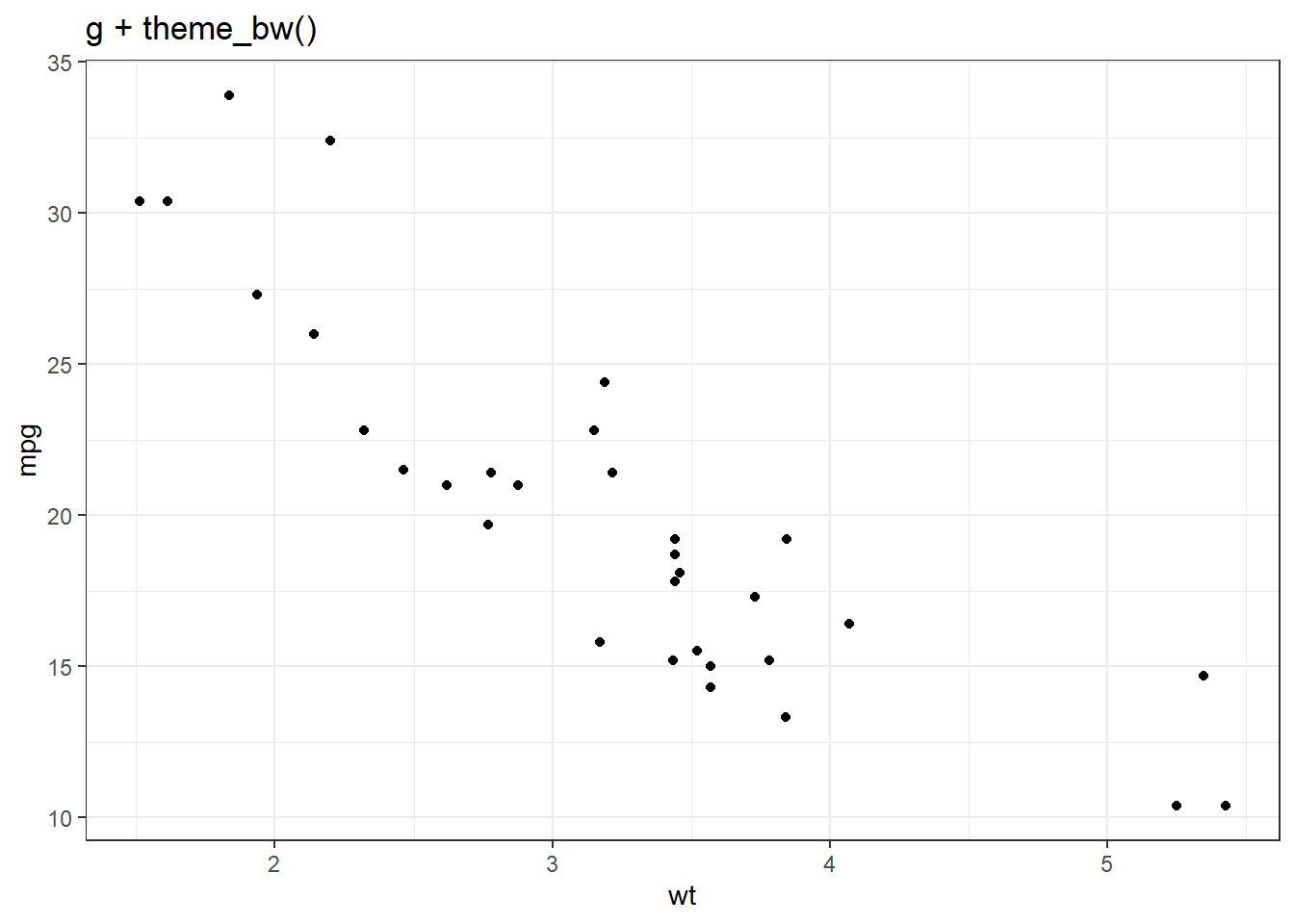
In conjunction with the theme system, the
element_*() functions specify the display of how non-data
components of the plot are drawn:
element_blank(): draws nothing and assigns no spaceelement_rect(): borders and backgroundselement_line(): lineselement_text(): text
Angle of x-axis labels
We can modify the angle of the x-axis labels with
element_text().
set.seed(12345)
day <- seq(as.Date("2010/1/1"), as.Date("2011/12/31"), "week")
value <- rnorm(n = length(day), mean = 100, sd = 1)
d <- data.frame(day, value)
(g <- ggplot(d, aes(x = day, y = value)) + geom_line())
# hjust: horizontal justification in [0, 1]
g + theme(axis.text.x = element_text(angle = 60, hjust = 1)) 
16 Annotations
g + annotate(geom = "text",  x = as.Date("2011-09-17"), y = 103, label="Annotation \n here") +
    annotate(geom = "point", x = as.Date("2011-12-17"), y = 103, size = 10, shape = 21, fill = "transparent") +
    geom_hline(yintercept = 100, color = "orange", size = .5)
## Warning: Using `size` aesthetic for lines was deprecated in ggplot2 3.4.0.
## ℹ Please use `linewidth` instead.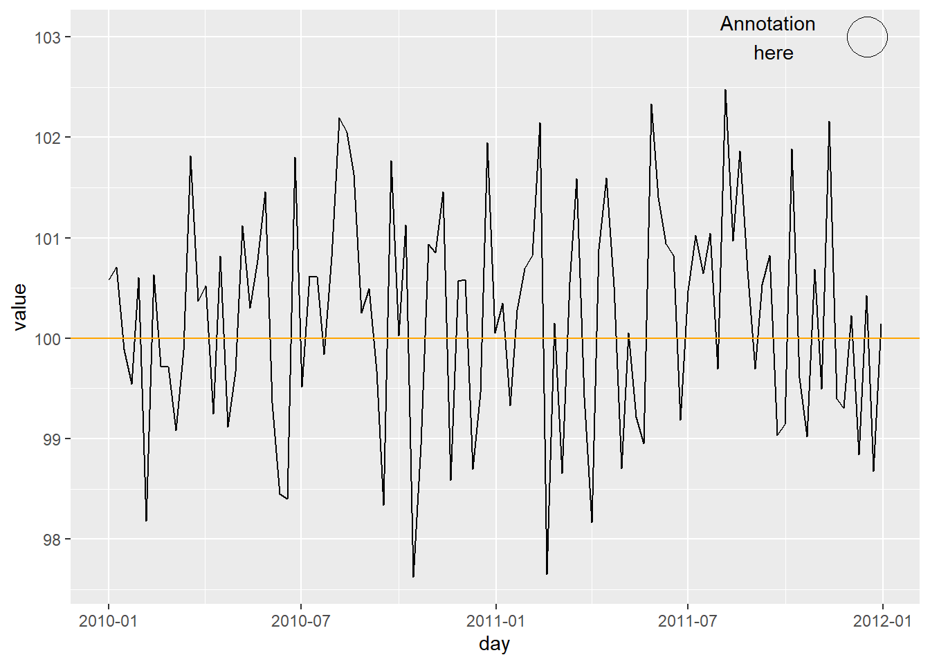
17 Exercises ggplot2 - theme
https://www.paulamoraga.com/book-r/99-problems-ggplot2-theme.html
18 Facets
We can use thefacet_wrap() and facet_grid()
functions to split the data into subsets and create multiple plots
(panels).
facet_wrap()wraps a 1d ribbon of plots into a multirow panel of plots.facet_grid(): produces a 2d grid of panels defined by variables which form the rows and columns.
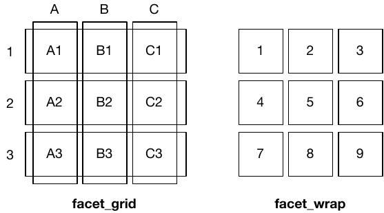
facet_wrap()wraps a 1d ribbon of plots into a multirow panel of plots. Number of rows and columns can be specified withnrowandncol.
# facet_wrap() creates a ribbon of plots using cut
ggplot(diamonds, aes(x = carat, y = price)) + geom_point() +
  facet_wrap(~cut)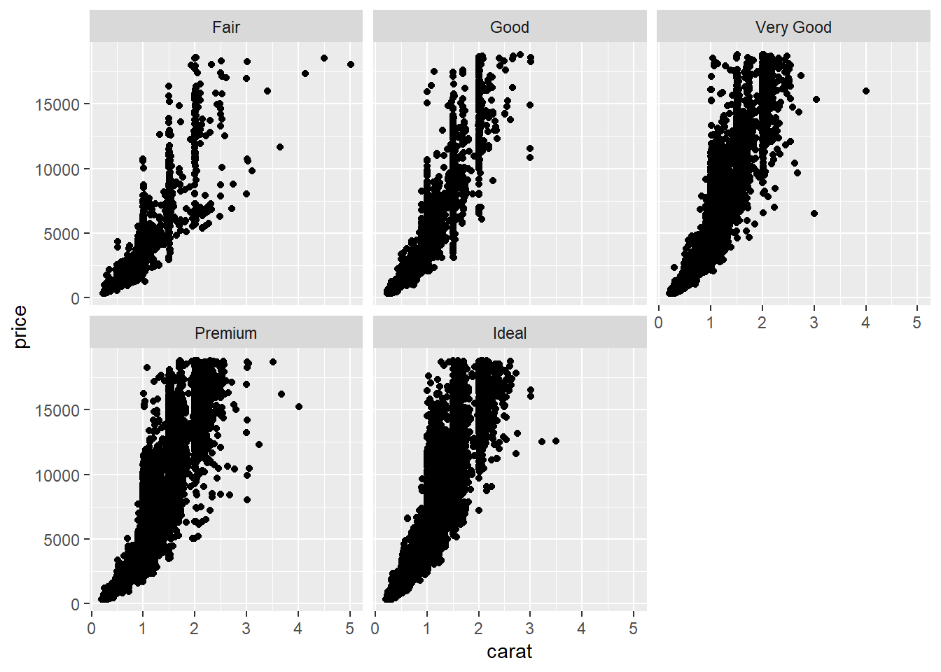
facet_grid() allows to specify which variables are used
to split the data along rows and columns. Put the row-splitting
variable, then ~ and then the column-splitting variable.
The character . specifies no faceting along that
dimension
# facet_grid() splits using clarity along rows and cut along columns
ggplot(diamonds, aes(x = carat, y = price)) + geom_point() +
  facet_grid(clarity ~ cut)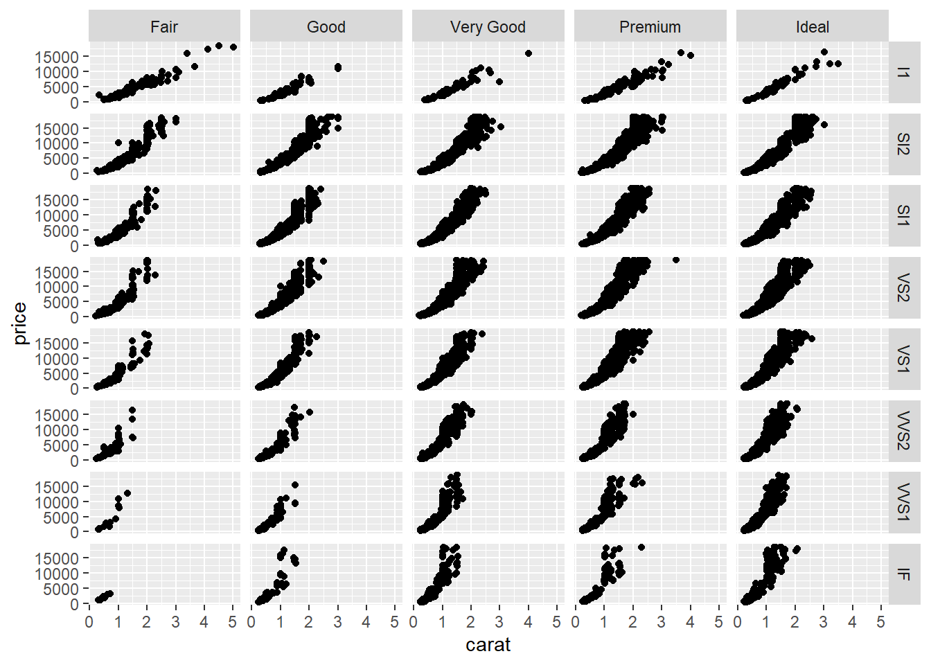
Argument scales can be used to set scales shared across
all facets (the default, "fixed"), or vary across rows
("free_x"), columns ("free_y"), or both rows
and columns ("free").
ggplot(mpg, aes(displ, hwy)) + geom_point() +
  facet_wrap(vars(class), scales = "fixed")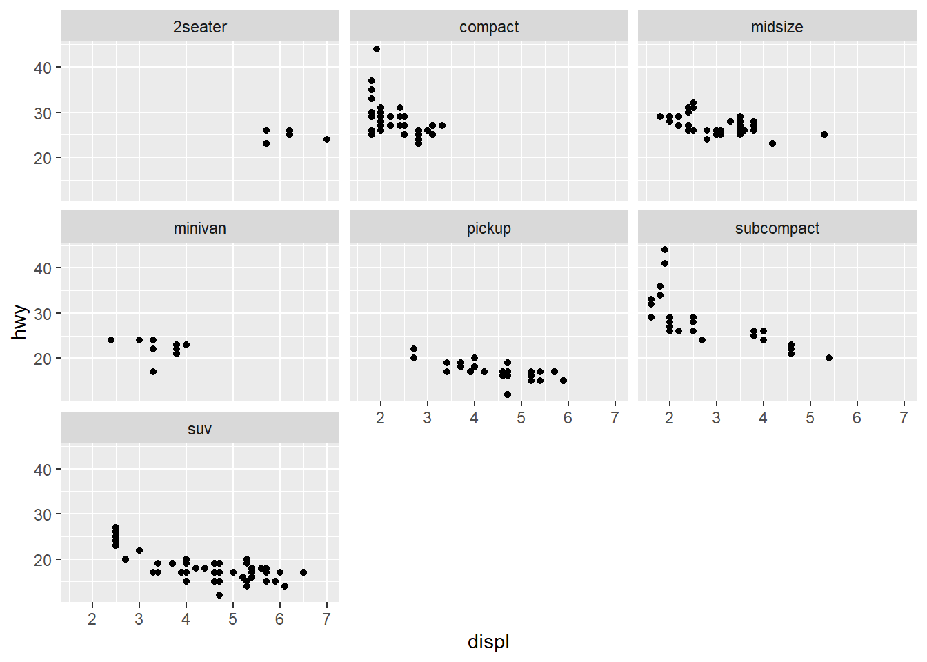
ggplot(mpg, aes(displ, hwy)) + geom_point() +
  facet_wrap(vars(class), scales = "free")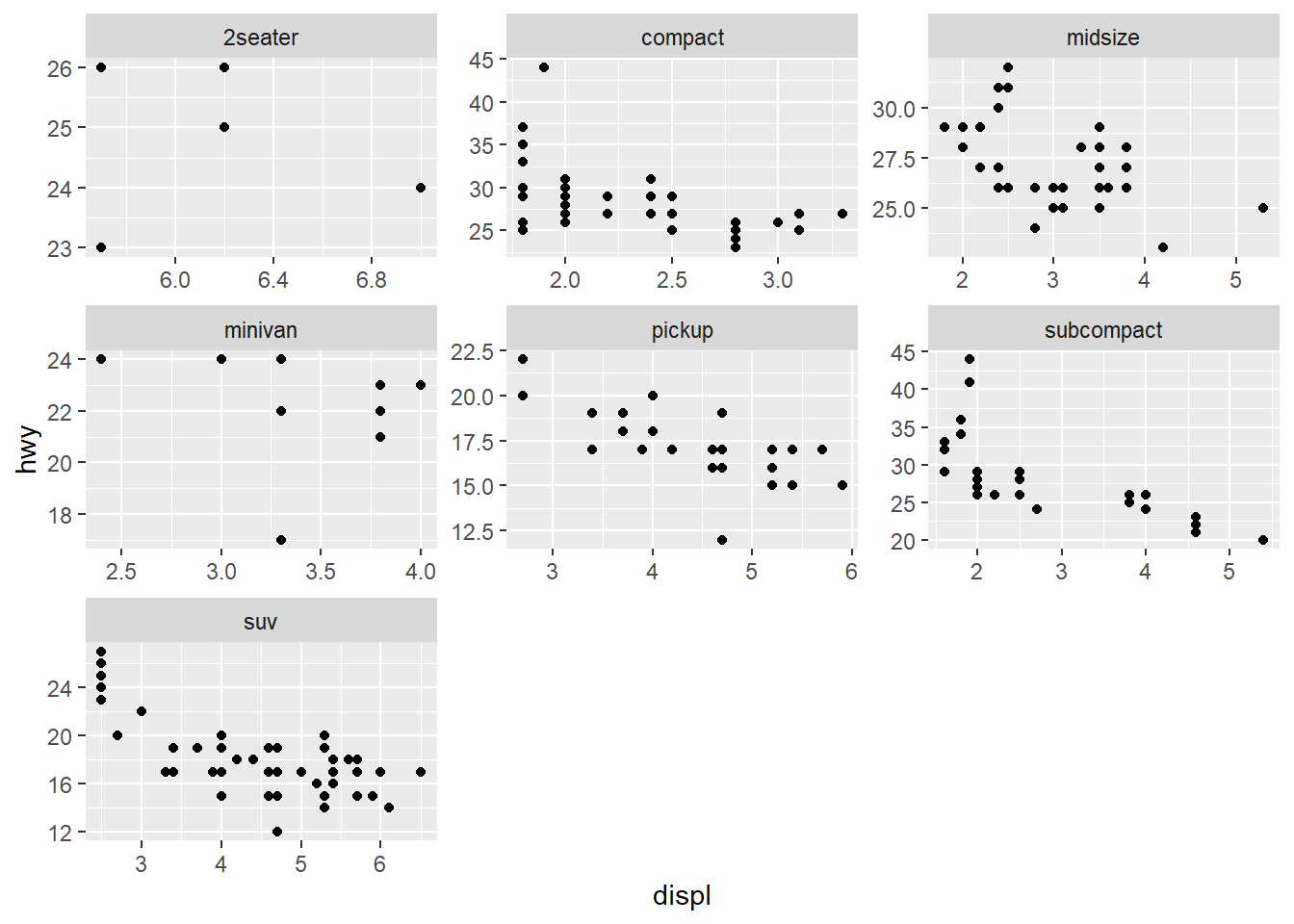
19 Multiple ggplots in the same graphic
patchwork makes it simple to combine separate ggplots
into the same graphic. Alternatively functions are
gridExtra::grid.arrange() and
cowplot::plot_grid().
# install.packages("devtools")
devtools::install_github("thomasp85/patchwork")
library(patchwork)

p1 <- ggplot(mtcars) + geom_point(aes(mpg, disp))
p2 <- ggplot(mtcars) + geom_boxplot(aes(gear, disp, group = gear))
p1 + p2

p3 <- ggplot(mtcars) + geom_smooth(aes(disp, qsec))
p4 <- ggplot(mtcars) + geom_bar(aes(carb))

(p1 | p2 | p3) / p4
20 Saving plots
To save a plot produced with ggplot2, we can use the
ggsave() function.
# Last plot displayed is saved by default
ggsave("plot.pdf")

# Store plot in an R object and use the plot argument to specify which plot to save instead of the last
g <- ggplot(diamonds, aes(x = carat, y = price)) + geom_point()
ggsave("plot.png", plot = g)
Alternatively, we can save the plot by specifying a device driver
(e.g., png, pdf), printing the plot, and then
shutting down the device with dev.off().
# Open plot device, print plot, and close device
png("plot.png")
ggplot(diamonds, aes(x = carat, y = price)) + geom_point()
dev.off()