1 Types of Variables
Variables can be classified:
- Discrete Variables: variables that assume only a finite number of values. For example, race categorized as non-Hispanic white, Hispanic, black, Asian, other. Discrete variables may be further subdivided into:
- Dichotomous variables (takes two possible values)
- Categorical variables (or nominal variables) (two or more categories)
- Ordinal variables (there is clear order in the categories unlike categorical variables)
- Continuous Variables: These are sometimes called quantitative or measurement variables; they can take on any value within a range of plausible values. For example, total serum cholesterol level, height, weight and systolic blood pressure.
2 Descriptive statistics for continuous variables
Daily air quality measurements in New York, May to September 1973.
?airquality.
d <- airquality
head(d)
Measures of central tendency
There are three common measures of central tendency, all of which try to answer the basic question of which value is the most “typical.” These are the mean (average of all observations), median (middle observation), and mode (appears most often).
Sample Mean \[\bar x = \frac{\sum_{i=1}^n x_i}{n}\]
mean(d$Temp)## [1] 77.88235median(d$Temp)## [1] 79getmode <- function(v) {
uniqv <- unique(v)
uniqv[which.max(tabulate(match(v, uniqv)))]
}
getmode(d$Temp)## [1] 81Variability
The central tendencies give a sense of the most typical values but do not provide with information on the variability of the values. Variability measures provide understanding of how the values are spread out.
Range corresponds to maximum value minus the minimum value.
min(d$Temp)## [1] 56max(d$Temp)## [1] 97max(d$Temp)-min(d$Temp)## [1] 41range(d$Temp)## [1] 56 97Percentiles and quartiles answer questions like this: What is the temperature value such that a given percentage of temperatures is below it?
Specifically, for any percentage p, the pth percentile is the value such that a percentage p of all values are less than it. Similarly, the first, second, and third quartiles are the percentiles corresponding to p=25%, p=50%, and p=75%. These three values divide the data into four groups, each with (approximately) a quarter of all observations. Note that the second quartile is equal to the median.
Quantiles are the same as percentiles, but are indexed by sample fractions rather than by sample percentages.
Interquartile range (IQR) corresponds to the difference between the first and third quartiles.
# default quantile() percentiles are 0% (minimum), 25%, 50%, 75%, and 100% (maximum)
# provides same output as fivenum()
quantile(d$Temp, na.rm = TRUE)
## 0% 25% 50% 75% 100%
## 56 72 79 85 97# we can customize quantile() for specific percentiles
quantile(d$Temp, probs = seq(from = 0, to = 1, by = .1), na.rm = TRUE)## 0% 10% 20% 30% 40% 50% 60% 70% 80% 90% 100%
## 56.0 64.2 69.0 74.0 76.8 79.0 81.0 83.0 86.0 90.0 97.0# we can quickly compute the difference between the 1st and 3rd quantile
IQR(d$Temp)## [1] 13An alternative approach is to use the summary() function
used to produce min, 1st quantile, median, mean, 3rd quantile, and max
summary measures.
summary(d$Temp)## Min. 1st Qu. Median Mean 3rd Qu. Max.
## 56.00 72.00 79.00 77.88 85.00 97.00Variance. Although the range provides a crude measure of variability and percentiles/quartiles provide an understanding of divisions of the data, the most common measures to summarize variability are variance and standard deviation.
# variance
var(d$Temp)
## [1] 89.59133# standard deviation
sd(d$Temp)## [1] 9.46527Summaries data frame
We can also get summary statistics for multiple columns at once,
using the apply() function.
apply(d, 2, mean, na.rm = TRUE)## Ozone Solar.R Wind Temp Month Day
## 42.129310 185.931507 9.957516 77.882353 6.993464 15.803922Summaries on the whole data frame.
summary(d)## Ozone Solar.R Wind Temp
## Min. : 1.00 Min. : 7.0 Min. : 1.700 Min. :56.00
## 1st Qu.: 18.00 1st Qu.:115.8 1st Qu.: 7.400 1st Qu.:72.00
## Median : 31.50 Median :205.0 Median : 9.700 Median :79.00
## Mean : 42.13 Mean :185.9 Mean : 9.958 Mean :77.88
## 3rd Qu.: 63.25 3rd Qu.:258.8 3rd Qu.:11.500 3rd Qu.:85.00
## Max. :168.00 Max. :334.0 Max. :20.700 Max. :97.00
## NA's :37 NA's :7
## Month Day
## Min. :5.000 Min. : 1.0
## 1st Qu.:6.000 1st Qu.: 8.0
## Median :7.000 Median :16.0
## Mean :6.993 Mean :15.8
## 3rd Qu.:8.000 3rd Qu.:23.0
## Max. :9.000 Max. :31.0
## Summaries statistics per group
When dealing with grouped data, we will often want to have various
summary statistics computed within group (e.g., a table of means and
standard deviations). This can be done using the tapply()
command. For example, we might want to compute the mean temperatures in
each month:
tapply(airquality$Temp, airquality$Month, mean)## 5 6 7 8 9
## 65.54839 79.10000 83.90323 83.96774 76.90000Visualization
Histograms display a 1D distribution by dividing into bins and counting the number of observations in each bin. Whereas the previously discussed summary measures - mean, median, standard deviation, skewness - describes only one aspect of a numerical variable, a histogram provides the complete picture by illustrating the center of the distribution, the variability, skewness, and other aspects in one convenient chart.
hist(d$Temp)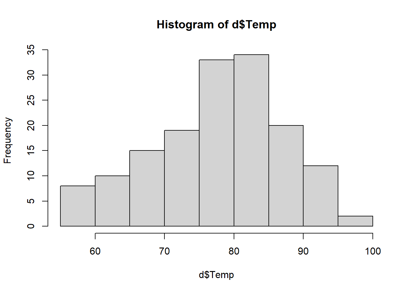
library(ggplot2)
ggplot(d, aes(Temp)) +
        geom_histogram(colour = "black", fill = "white") +
        geom_vline(aes(xintercept = mean(Temp)), color = "red", linetype = "dashed")
## `stat_bin()` using `bins = 30`. Pick better value with `binwidth`.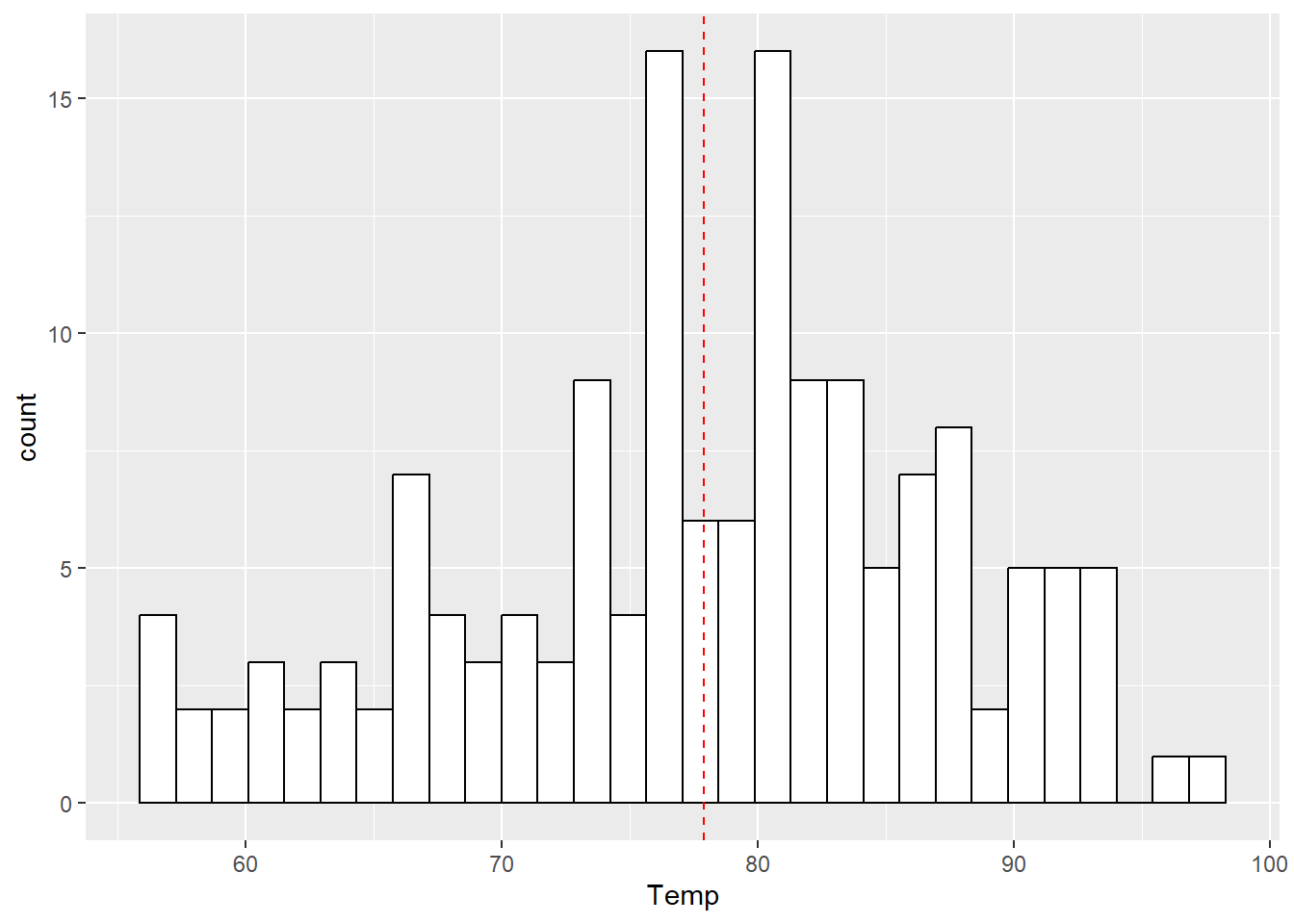
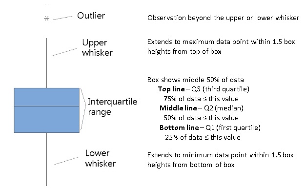
Boxplots are an alternative way to illustrate the distribution of a variable and is a concise way to illustrate the standard quantiles, shape, and outliers of data. The box itself extends from the first quartile to the third quartile. This means that it contains the middle half of the data. The line inside the box is positioned at the median. The lines (whiskers) coming out either side of the box extend to 1.5 interquartlie ranges (IQRs) from the quartlies. These generally include most of the data outside the box. More distant values, called outliers, are denoted separately by individual points.
boxplot(d$Temp, horizontal = TRUE)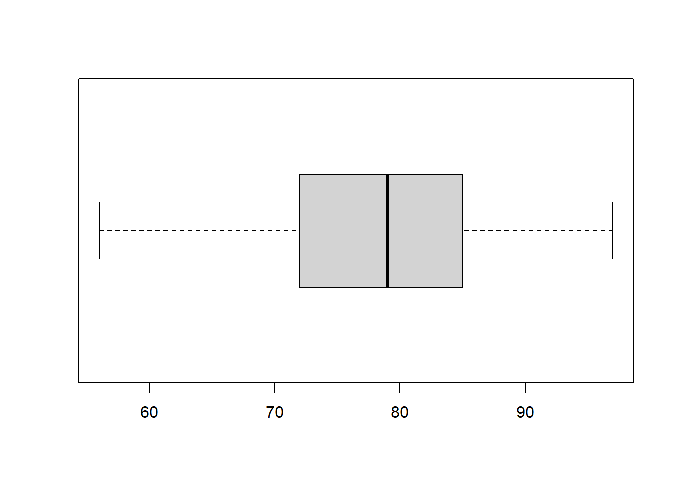
ggplot(d, aes(x = factor(0), y = Temp)) +
        geom_boxplot() +
        xlab("") +
        scale_x_discrete(breaks = NULL) +
        coord_flip() +
        stat_summary(fun = mean, geom = "point", shape = 23, size = 4, fill = "blue")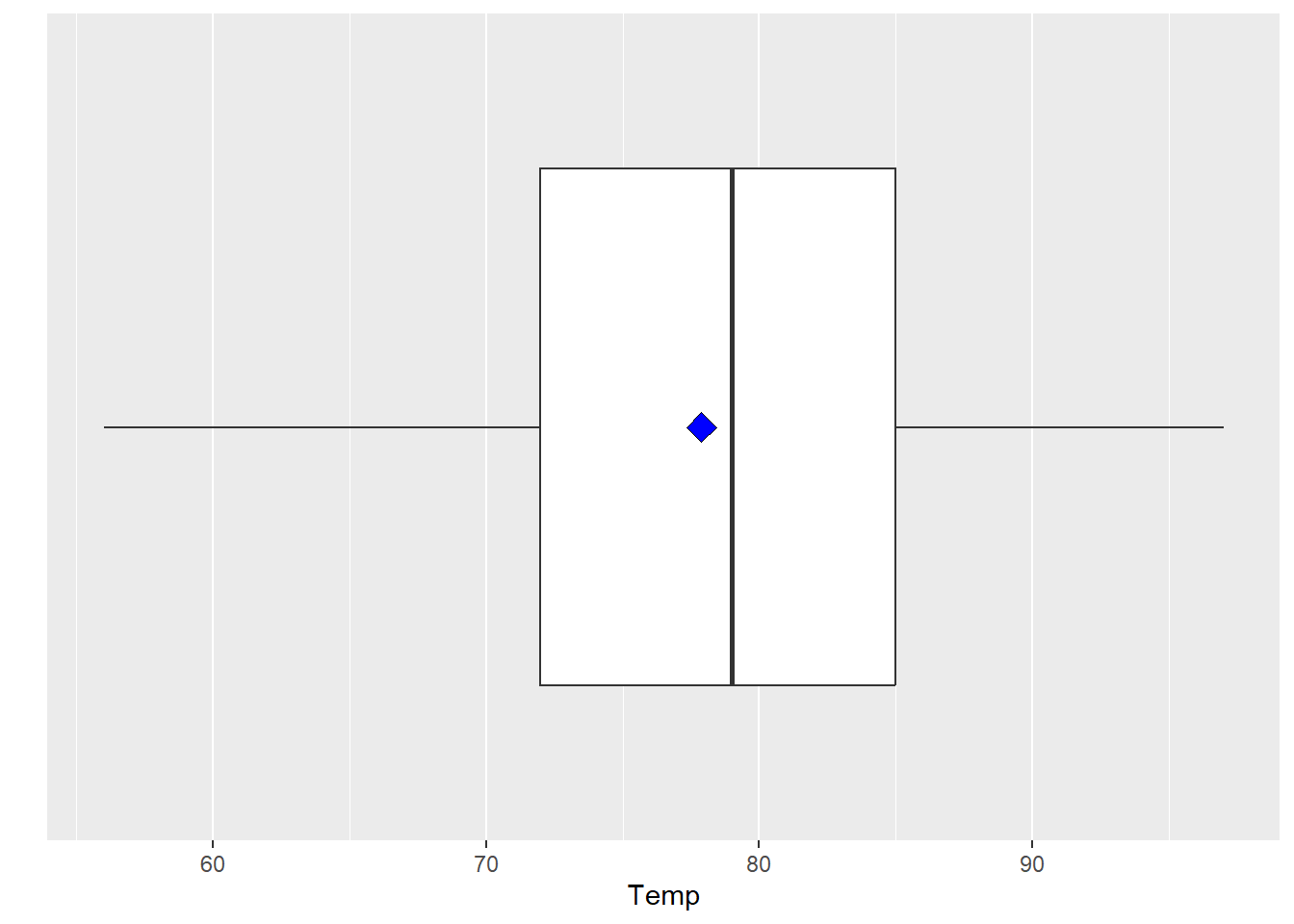
3 Descriptive statistics for discrete variables
Fuel economy data from 1999 to 2008 for 38 popular models of cars.
?ggplot2::mpg.
library(ggplot2)
d <- mpg
head(d)
Frequencies and proportions for categorical variables
# counts for manufacturer categories
table(d$manufacturer)
##
## audi chevrolet dodge ford honda hyundai jeep
## 18 19 37 25 9 14 8
## land rover lincoln mercury nissan pontiac subaru toyota
## 4 3 4 13 5 14 34
## volkswagen
## 27# percentages of manufacturer categories
table2 <- table(d$manufacturer)
prop.table(table2)##
## audi chevrolet dodge ford honda hyundai jeep
## 0.07692308 0.08119658 0.15811966 0.10683761 0.03846154 0.05982906 0.03418803
## land rover lincoln mercury nissan pontiac subaru toyota
## 0.01709402 0.01282051 0.01709402 0.05555556 0.02136752 0.05982906 0.14529915
## volkswagen
## 0.11538462Visualization
Bar charts are most often used to visualize categorical variables. Here we can assess the count of customers by location:
barplot(table(d$manufacturer))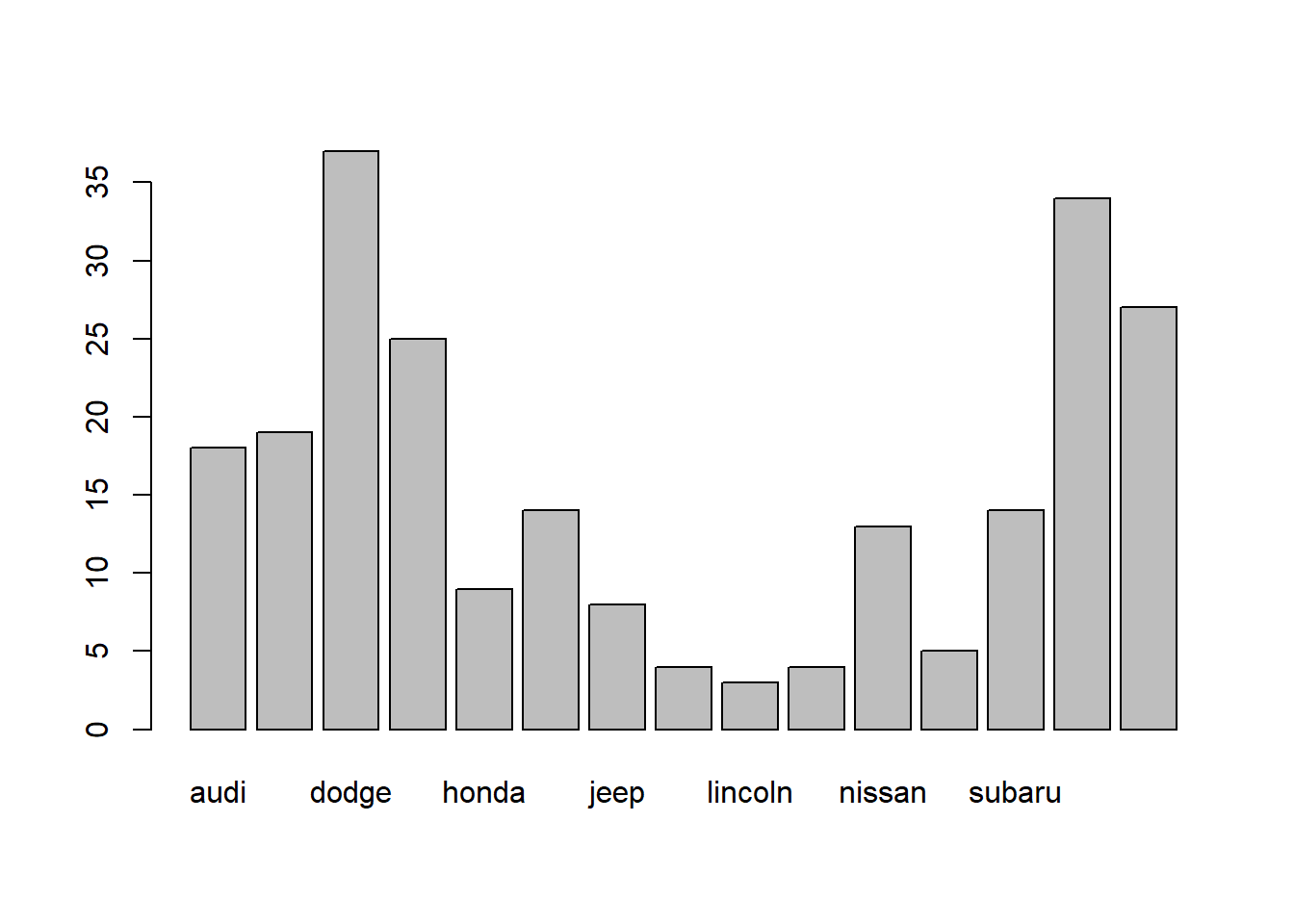
ggplot(d, aes(x = manufacturer)) +
        geom_bar() +
        theme(axis.text.x = element_text(angle = 45, hjust = 1))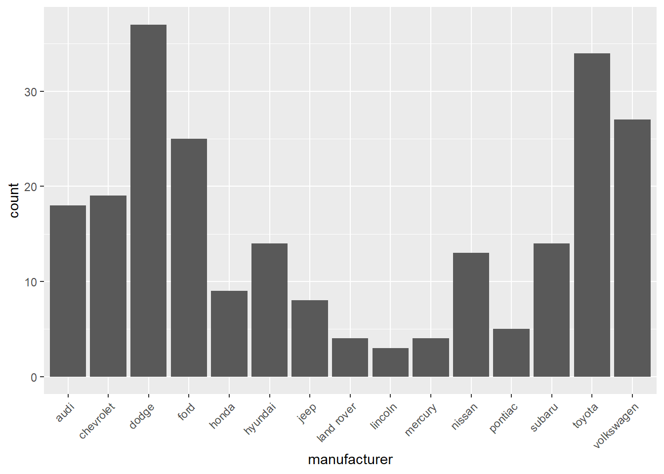
To make the bar chart easier to examine we can reorder the bars in descending order.
# re-order levels
reorder_size <- function(x) {
        factor(x, levels = names(sort(table(x), decreasing = TRUE)))
}

ggplot(d, aes(x = reorder_size(manufacturer))) +
        geom_bar() +
        xlab("Manufacturer") +
        theme(axis.text.x = element_text(angle = 45, hjust = 1))
We can also produce a proportions bar chart where the y-axis now provides the percentage of the total that that category makes up.
# Proportions bar charts
ggplot(d, aes(x = reorder_size(manufacturer))) +
        geom_bar(aes(y = (..count..)/sum(..count..))) +
        xlab("Manufacturer") +
        scale_y_continuous(labels = scales::percent, name = "Proportion") +
        theme(axis.text.x = element_text(angle = 45, hjust = 1))
## Warning: The dot-dot notation (`..count..`) was deprecated in ggplot2 3.4.0.
## ℹ Please use `after_stat(count)` instead.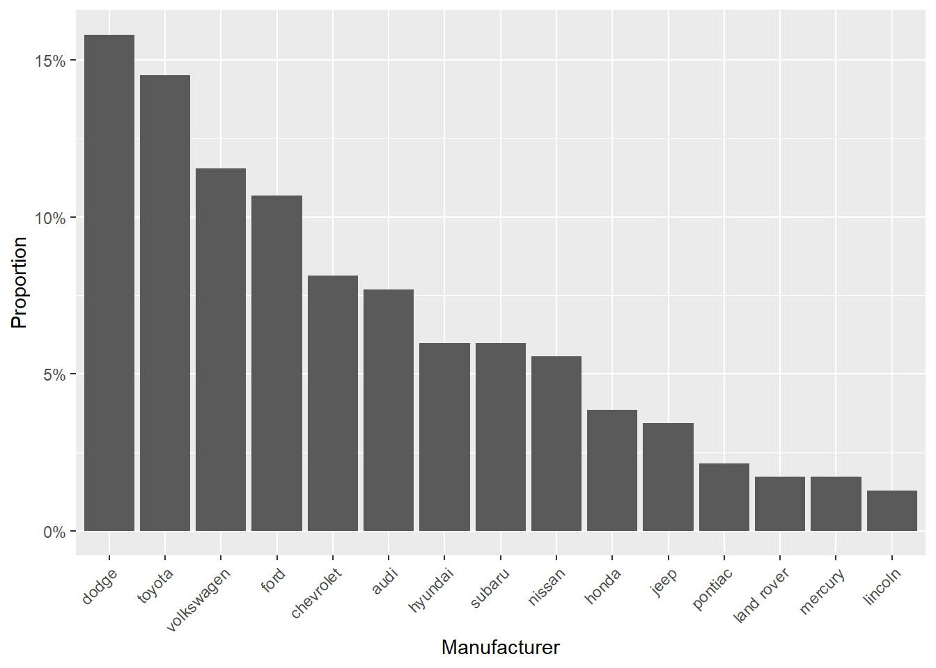
4 Pairs of continuous variables
Motor trend car road tests. mtcars.
?mtcars
head(mtcars)Data frame with 32 observations on 11 variables.
- mpg Miles/(US) gallon
- cyl Number of cylinders
- disp Displacement (cu.in.)
- hp Gross horsepower
- drat Rear axle ratio
- wt Weight (1000 lbs)
- qsec 1/4 mile time
- vs Engine (0 = V-shaped, 1 = straight)
- am Transmission (0 = automatic, 1 = manual)
- gear Number of forward gears
- carb Number of carburetors
Scatterplot
plot(x = mtcars$wt, y = mtcars$mpg)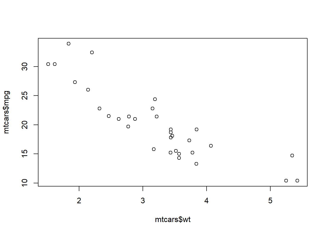
ggplot(data = mtcars, aes(x = wt, y = mpg)) +
        geom_point()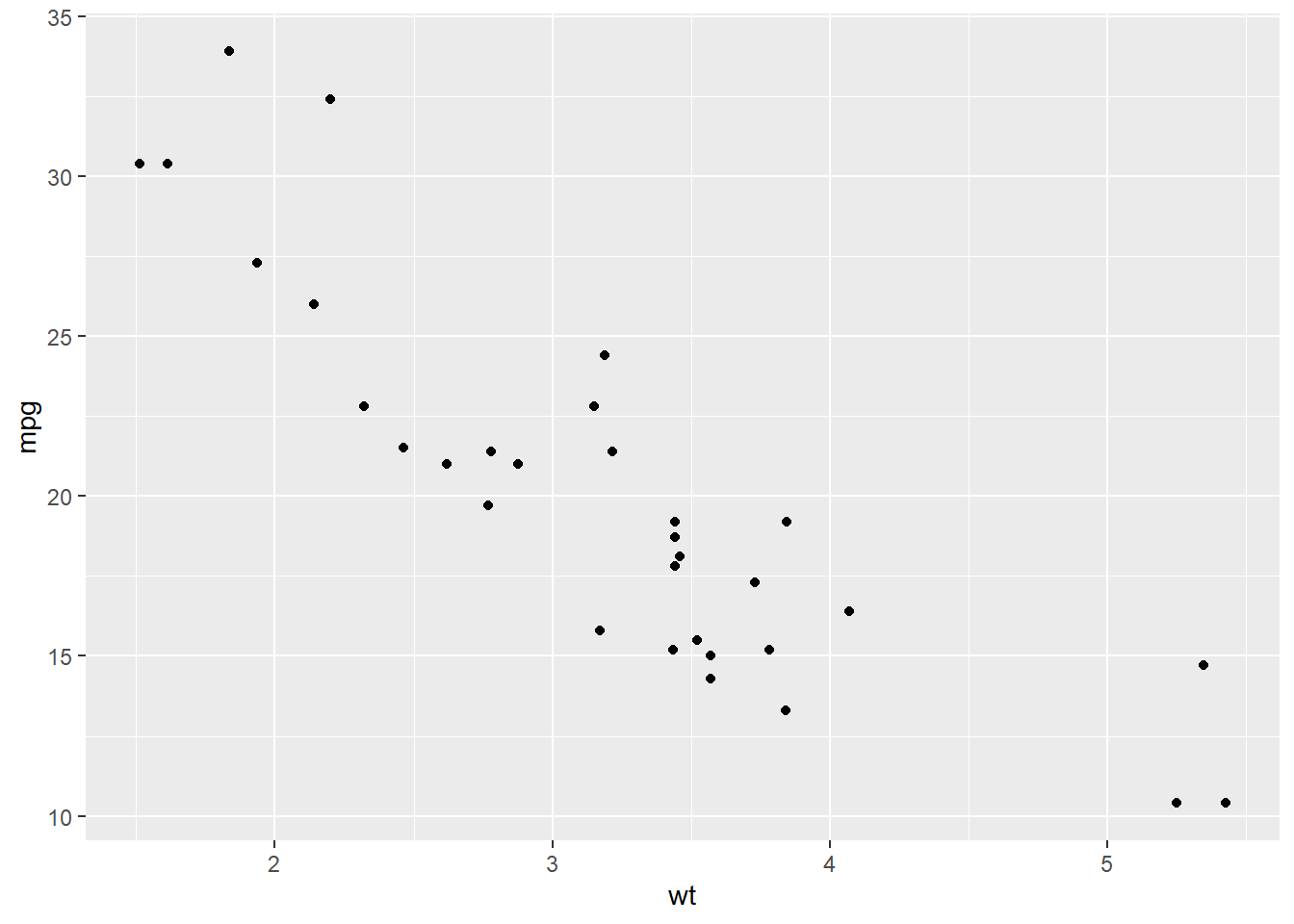
We can also get a scatter plot matrix to observe several plots at once.
# passing multiple variables to plot
plot(mtcars[, 4:6])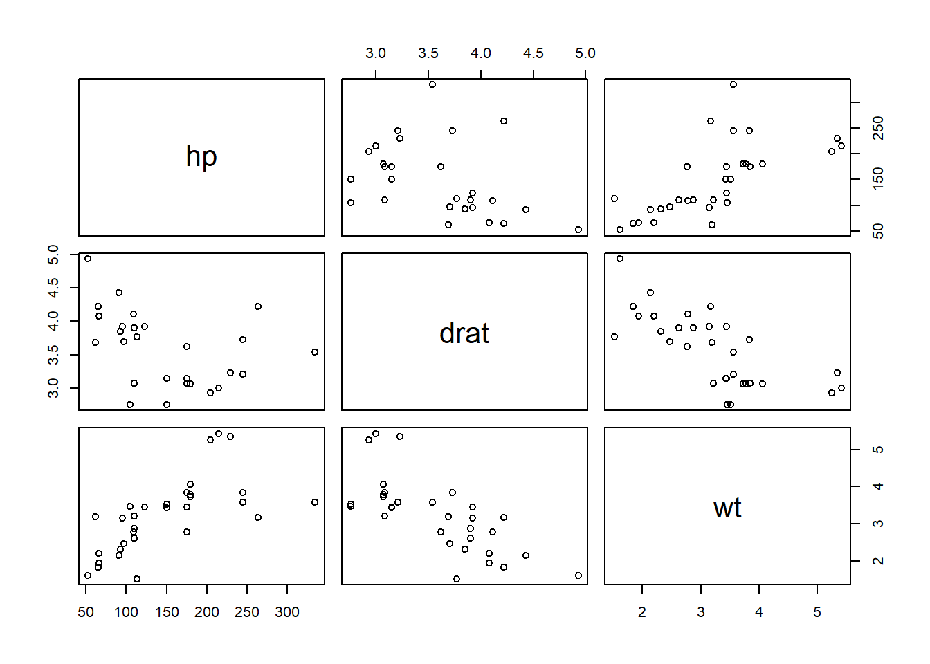
5 Continuous and categorical variables
# if x is a factor it will produce a box plot
plot(as.factor(mtcars$cyl), mtcars$mpg)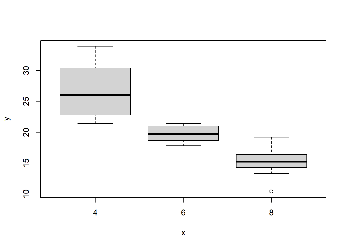
# boxplot of mpg by cyl
boxplot(mpg ~ cyl, data = mtcars)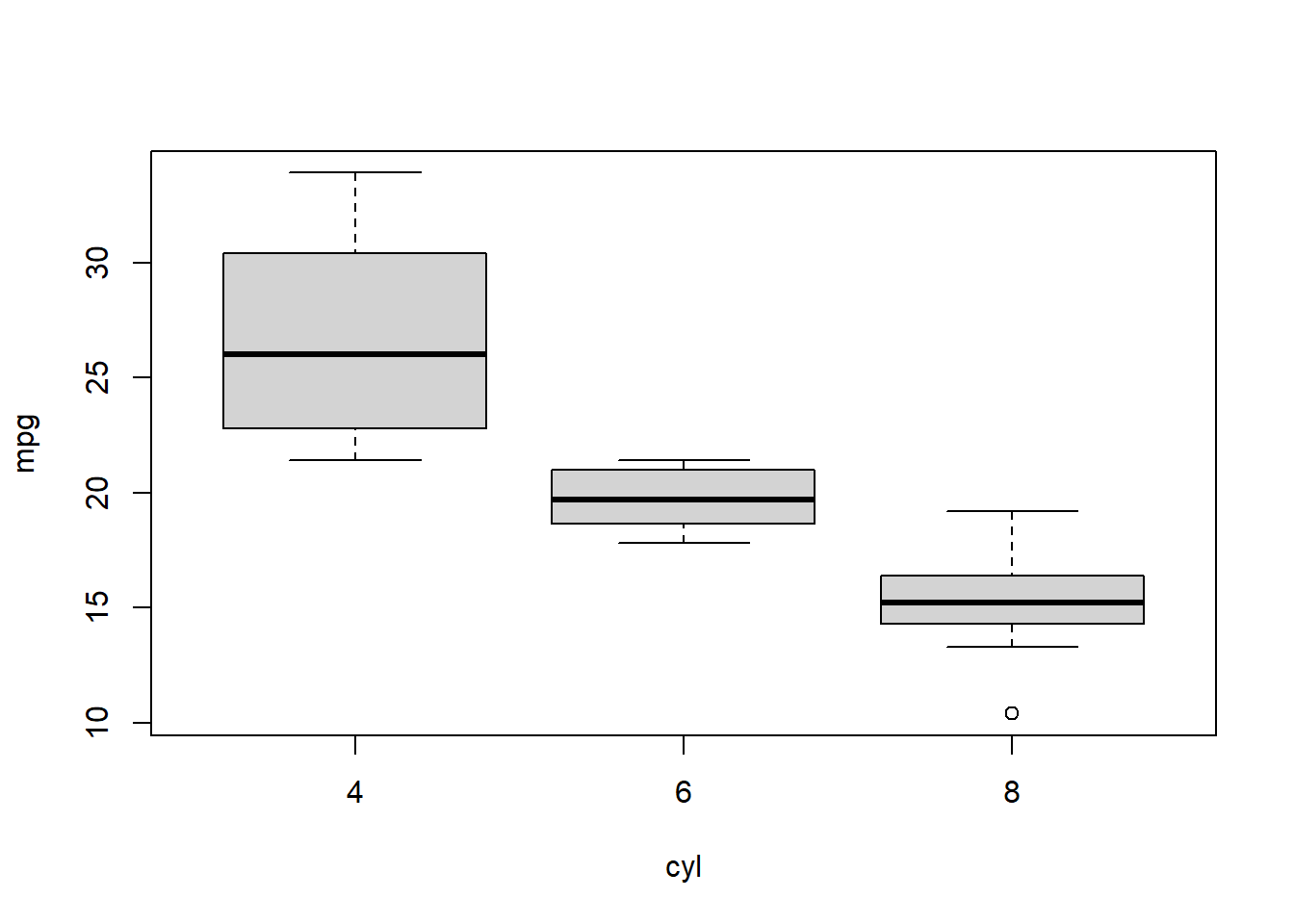
6 Probability distributions
Normal distribution:
https://www.paulamoraga.com/book-stats/01-probability-distributions.html#16_Normal_distribution
7 Regression
Linear regression: