10 Disease risk modeling
Areal data is common in disease mapping applications where often, for confidentiality reasons, individual incidence or mortality information is only available as the number of disease cases aggregated in areas. Disease data can be used to construct atlases that show the geographic distribution of aggregated outcomes to understand spatial patterns, identify high-risk areas, and reveal inequalities (Moraga 2021a). For example, Bayesian spatial models have been used to understand geographic patterns and risk factors of childhood overweight and obesity prevalence in Costa Rica (Gómez et al. 2023), and mosquito-borne diseases in Brazil (Pavani, Bastos, and Moraga 2023). Spatial methods can also be extended to analyze areal data that are both spatially and temporally referenced. For example, Moraga and Kulldorff (2016) proposes a scan statistics method to detect spatial variations of temporal trends. Moraga and Ozonoff (2013) develop a spatio-temporal model-based imputation approach to produce more accurate estimates of all-cause and pneumonia and influenza mortality burden in the USA.
Disease risk can be estimated using Standardized Mortality Ratios (SMR) computed as the ratios of the observed to the expected number of mortality cases. Standardized Incidence Ratios (SIR) can be used when cases represent incidence data. However, these values may be extreme and unreliable in small populations and/or when dealing with rare diseases. Bayesian hierarchical models can instead be used to obtain smoothed relative risks by incorporating risk factors and borrowing information from neighboring areas (Moraga 2019).
In this chapter, we demonstrate how to specify, fit, and interpret a Bayesian spatial model to estimate the risk of lung cancer and assess its relationship with smoking in Pennsylvania, USA, in 2002. Specifically, we show how to calculate the expected number of counts and SMR values, and how to obtain disease risk estimates and quantify risk factors using R-INLA (Rue, Lindgren, and Teixeira Krainski 2022). We also show how to make interactive maps of disease risk estimates using mapview (Appelhans et al. 2022). Moraga (2019) provides additional examples on how to fit both spatial and spatio-temporal models using R-INLA to understand geographic and temporal patterns of diseases, and assess their relationships with potential risk factors.
10.1 Spatial disease risk models
Bayesian hierarchical models enable to obtain smoothed disease relative risks by including covariates and random effects to borrow information from neighboring areas. Spatial disease risk models are commonly specified using a Poisson distribution for the observed number of cases (\(Y_i\)) with mean equal to the expected number of cases (\(E_i\)) times the relative risk (\(\theta_i\)) corresponding to area \(i\), \(i = 1, \ldots, n\),
\[Y_i \sim Poisson(E_i \times \theta_i),\ i = 1,\ldots,n,\]
\[\log(\theta_i) = \boldsymbol{z_i \beta} + u_i + v_i.\]
Here, the logarithm of \(\theta_i\) is expressed as a sum of fixed effects to quantify the effects of the covariates on the disease risk, and random effects that represent residual variation that is not explained by the available covariates. The fixed effects \(\boldsymbol{z_i \beta}\) are expressed using a vector of intercept and \(p\) covariates corresponding to area \(i\), \(\boldsymbol{z_i} = (1, z_{i1}, \ldots, z_{ip})\), and a coefficient vector \(\boldsymbol{\beta} = (\beta_0, \ldots, \beta_p)'\).
Spatial random effects \(u_i\) that smooth data according to a neighborhood structure are included to acknowledge that data may be spatially correlated, and relative risks in neighboring areas may be more similar than relative risks in areas that are further away (Moraga and Lawson 2012; Lawson et al. 2015). Unstructured exchangeable components \(v_i\) are also included to model uncorrelated noise.
The relative risk \(\theta_i\) quantifies whether an area \(i\) has higher (\(\theta_i > 1\)) or lower (\(\theta_i < 1\)) risk than the average risk in the standard population (e.g., the whole population of the study region). For example, \(\theta_i = 2\) indicates the risk of area \(i\) is two times the average risk in the standard population.
10.2 Modeling of lung cancer risk in Pennsylvania
10.2.1 Data and map
Data with the number of lung cancer cases, population, as well as the smoking proportions in the counties of Pennsylvania, USA, in 2002 can be obtained from the SpatialEpi package (Kim, Wakefield, and Moise 2021).
We load the SpatialEpi package and attach the pennLC data.
Reading the pennLC information with ?pennLC, we see pennLC is a list object with several elements.
library(SpatialEpi)
data(pennLC)
class(pennLC)
[1] "list"
names(pennLC)[1] "geo" "data"
[3] "smoking" "spatial.polygon"pennLC$data contains the number of lung cancer cases and the population at county level, stratified in race (white and non-white), gender (female and male) and age (under 40, 40-59, 60-69, and 70+).
head(pennLC$data) county cases population race gender age
1 adams 0 1492 o f Under.40
2 adams 0 365 o f 40.59
3 adams 1 68 o f 60.69
4 adams 0 73 o f 70+
5 adams 0 23351 w f Under.40
6 adams 5 12136 w f 40.59pennLC$smoking contains the proportion of smokers in each county.
head(pennLC$smoking) county smoking
1 adams 0.234
2 allegheny 0.245
3 armstrong 0.250
4 beaver 0.276
5 bedford 0.228
6 berks 0.249pennLC$spatial.polygon is a SpatialPolygons object (sp object) with the map of Pennsylvania counties. We create a map of class sf by converting the SpatialPolygons object to a sf object with the st_as_sf() function of sf (Pebesma 2022a). We also add a column with the county names which corresponds to the polygons ID slot values of pennLC$spatial.polygon.
library(sf)
map <- st_as_sf(pennLC$spatial.polygon)
countynames <- sapply(slot(pennLC$spatial.polygon, "polygons"),
                      function(x){slot(x, "ID")})
map$county <- countynames
head(map)
Simple feature collection with 6 features and 1 field
Geometry type: POLYGON
Dimension: XY
Bounding box: xmin: -80.52 ymin: 39.73 xmax: -75.53 ymax: 41.14
Geodetic CRS: +proj=longlat
geometry county
1 POLYGON ((-77.45 39.97, -77... adams
2 POLYGON ((-80.15 40.67, -79... allegheny
3 POLYGON ((-79.21 40.91, -79... armstrong
4 POLYGON ((-80.16 40.85, -80... beaver
5 POLYGON ((-78.38 39.73, -78... bedford
6 POLYGON ((-75.53 40.45, -75... berksNow, we create a data frame called d with columns containing, for each of the counties, the county id (county), observed number of cases (Y), expected number of cases (E), smoking proportion (smoking), and SMR (SMR).
10.2.2 Observed cases
pennLC$data contains the cases in each county stratified by race, gender and age.
We obtain the number of cases in each county, Y, by using the group_by() function of dplyr (Wickham, Francois, et al. 2022) to aggregate the rows of pennLC$data by county, and add up the observed number of cases.
# A tibble: 6 × 2
  county        Y
  <fct>     <int>
1 adams        55
2 allegheny  1275
3 armstrong    49
4 beaver      172
5 bedford      37
6 berks       308
10.2.3 Expected cases
The expected number of cases of a given area \(i\) represents the total number of cases that one would expect if the population in area \(i\) behaves in the same way as the standard population behaves (Moraga 2018a). Typically, the standard population is considered as the whole population of all areas in the study region, and it is stratified in a number of groups. In this case, the standard population is considered as the whole population of Pennsylvania putting all counties together, and it is stratified in race, gender, and age groups.
The expected number of cases \(E_i\) in each county \(i\) can be calculated using indirect standardization as
\[E_i=\sum_{j=1}^m r_j^{(s)} n_j^{(i)},\] where
\[r_j^{(s)} =
\frac{\mbox{number of cases in group } j \mbox{ in standard population}}
{\mbox{population in group } j \mbox{ in standard population}}\]
is the rate in group \(j\) in the standard population (Pennsylvania), and \(n_j^{(i)}\) is the population in group \(j\) of county \(i\).
The number of expected counts can be easily obtained using the expected() function of SpatialEpi passing the following arguments:
-
population: a vector of population counts for each group in each area, -
cases: a vector with the number of cases for each group in each area, -
n.strata: number of groups considered.
In expected(), vectors population and cases have to be sorted by area first and then, within each area, the counts for all groups need to be listed in the same order. The vectors need to include all groups so elements for groups with no cases need to be included as 0.
Here, we use order() to sort the data by county, race, gender, and finally age.
pennLC$data <- pennLC$data[order(pennLC$data$county,
pennLC$data$race, pennLC$data$gender, pennLC$data$age), ]
Then, we obtain the expected counts E in each county using the expected() function passing the population pennLC$data$population and cases pennLC$data$cases.
The number of groups is set to 16 since for each county
there are 2 races, 2 genders, and 4 age groups (2 \(\times\) 2 \(\times\) 4 = 16).
E <- expected(population = pennLC$data$population,
              cases = pennLC$data$cases, n.strata = 16)
Finally, the vector with the expected counts E is included in the data frame d that contains the counties ids (county) and the observed counts (Y).
d$E <- E
head(d)
# A tibble: 6 × 3
county Y E
<fct> <int> <dbl>
1 adams 55 69.6
2 allegheny 1275 1182.
3 armstrong 49 67.6
4 beaver 172 173.
5 bedford 37 44.2
6 berks 308 301. 10.2.4 Smokers proportions
In the spatial model, we will include the proportion of smokers as a covariate to be able to quantify the effect of this factor.
This variable is given by pennLC$smoking, and we can add it to the data frame d that contains the rest of the data as follows:
d <- dplyr::left_join(d, pennLC$smoking, by = "county")10.2.5 Standardized Mortality Ratios
Let \(Y_i\) and \(E_i\) be the observed and expected number of cases, respectively, in area \(i, i=1,\ldots,n\). The \(\mbox{SMR}\) in area \(i\) is defined as the ratio of the observed to the expected number of cases,
\[\mbox{SMR}_i = \frac{Y_i}{E_i}, i = 1, \ldots, n.\] If \(\mbox{SMR}_i > 1\), this indicates there are more cases observed than expected which corresponds to a high risk area. Similarly, a \(\mbox{SMR}_i < 1\) indicates there are fewer cases observed than expected. This corresponds to a low risk area. In our example, SMRs are easily computed as the ratios of the observed to the expected counts as follows:
d$SMR <- d$Y/d$EThe final data frame d contains the observed and expected disease counts, the smokers proportions, and the SMR for each of the counties.
head(d)# A tibble: 6 × 5
county Y E smoking SMR
<fct> <int> <dbl> <dbl> <dbl>
1 adams 55 69.6 0.234 0.790
2 allegheny 1275 1182. 0.245 1.08
3 armstrong 49 67.6 0.25 0.725
4 beaver 172 173. 0.276 0.997
5 bedford 37 44.2 0.228 0.837
6 berks 308 301. 0.249 1.02 10.2.6 Mapping SMR
To be able to make maps of the variables in d, we join the map and the data using the left_join() function of dplyr joining by the county id (by = "county"). Note that we could specify two different column names (by = c(name1, name2)) in case the column names were different in each of the objects to be joined.
map <- dplyr::left_join(map, d, by = "county")We create an interactive choropleth map with the SMR values using the mapview package specifying the column name to plot in zcol.
This map can be customized in several ways.
For example, we can change the color border of the polygons with color, the opacity of the polygons with alpha.regions, and the legend title with layer.name.
We can also add a color palette with col.regions and change the default base map with map.types
using some of the options provided at https://leaflet-extras.github.io/leaflet-providers/preview/.
Figure 10.1 shows the map of SMR values created using opacity equal to a value less than 1 to be able to see the background map,
and colors from the palette "YLOrRd" using the brewer.pal() function of the RColorBrewer package (Neuwirth 2022).
library(mapview)
library(RColorBrewer)
pal <- colorRampPalette(brewer.pal(9, "YlOrRd"))
mapview(map, zcol = "SMR", color = "gray", alpha.regions = 0.8,
        layer.name = "SMR", col.regions = pal,
        map.types = "CartoDB.Positron")
FIGURE 10.1: SMRs of the counties of Pennsylvania, USA.
We can also highlight the counties when the mouse hovers over using leaflet::highlightOptions(),
and setting mapviewOptions(fgb = FALSE).
In addition, we can customize the popups with tables showing information for each of the counties. This information that can be inspected by clicking each of the map polygons.
For example, here we use popups to show the values of the observed and expected counts, SMRs, and smoking proportions.
To do that, we use the popupTable() function from leafpop (Appelhans and Detsch 2021) which creates HTML strings to be used as popup tables in mapview (Appelhans et al. 2022) and leaflet (Cheng, Karambelkar, and Xie 2022).
We create the popup table by passing the spatial object map with the numeric values rounded to two digits,
the vector zcol indicating the columns to be included in the table, and setting row.numbers = FALSE and feature.id = FALSE to hide row numbers and feature ids, respectively.
library(mapview)
library(RColorBrewer)
library(leafpop)

pal <- colorRampPalette(brewer.pal(9, "YlOrRd"))
mapviewOptions(fgb = FALSE)

popuptable <- leafpop::popupTable(dplyr::mutate_if(map,
is.numeric, round, digits = 2),
zcol = c("county", "Y", "E", "smoking", "SMR"),
row.numbers = FALSE, feature.id = FALSE)

mapview(map, zcol = "SMR", color = "gray", col.regions = pal,
highlight = leaflet::highlightOptions(weight = 4),
popup = popuptable)
The map with the SMR values allows us to understand the spatial pattern of lung cancer risk across Pennsylvania, and identify areas that have SMR higher (or lower) than 1 indicating the observed cases are higher (or lower) than expected from the standard population. As we have seen, SMR values can be easily calculated as the ratio of observed to expected counts. However, these values may be extreme and unreliable for reporting in areas with small populations or rare diseases. To overcome these limitations, we use Bayesian hierarchical models that enable to incorporate covariates known to affect disease risk and borrow information from neighboring areas to obtain smoothed relative risks. Below, we show how to specify, fit, and interpret a spatial model to estimate the risk of lung cancer.
10.2.7 Model
Let \(Y_i\) and \(E_i\) be the observed and expected number of disease cases, respectively, and let \(\theta_i\) be the relative risk for county \(i=1,\ldots,n\). The model is specified as follows:
\[Y_i|\theta_i \sim Poisson(E_i \times \theta_i),\ i=1,\ldots,n,\]
\[\log(\theta_i) = \beta_0 + \beta_1 \times smoking_i + u_i + v_i.\]
Here, \(\beta_0\) is the intercept and \(\beta_1\) is the coefficient of the covariate smokers proportion. \(u_i\) is a structured spatial effect modeled with an intrinsic conditionally autoregressive model (CAR), \(u_i|\mathbf{u_{-i}} \sim N(\bar{u}_{\delta_i} \frac{1}{\tau_u n_{\delta_i}})\). Finally, \(v_i\) is an unstructured effect, \(v_i \sim N(0, 1/\tau_v)\).
10.2.8 Neighborhood matrix
The spatial random effect \(u_i\) needs the specification of the neighborhood matrix.
Here, we assume two areas are neighbors if they share a common boundary.
We can obtain the neighbourhood list using the poly2nb() function of the spdep package (Bivand 2022).
Then, we use the nb2INLA() and inla.read.graph() functions to create an object g with the neighborhood matrix in the format required by R-INLA.
10.2.9 Model formula and inla() call
The model formula is specified by writing the outcome variable, the ~ symbol, and the covariates and random effects. An intercept is included in the model by default.
In the formula, random effects are set using the f() function with arguments equal to indices vectors of the variables, and the model name.
The indices for the random effects are given by indices vectors re_u and re_v created for the random effects \(u_i\) and \(v_i\), respectively. These vectors are equal to \(1,\ldots,n\), where \(n\) is the number of counties. Here, number of counties \(n\)=67 can be obtained with the number of rows in the data (nrow(map)).
For the spatial random effect \(u_i\), we use model = "besag" with neighborhood matrix given by g. For the unstructured effect \(v_i\) we choose model = "iid".
formula <- Y ~ smoking +
  f(re_u, model = "besag", graph = g, scale.model = TRUE) +
  f(re_v, model = "iid")
Then, we fit the model using the inla() function with the default priors in R-INLA. We specify the formula, family, data, and the expected counts, and set control.predictor = list(compute = TRUE) and control.compute = list(return.marginals.predictor = TRUE) to compute and return the posterior means of the predictors.
10.2.10 Results
The inla() function returns an object res with the fit of the model that can be inspected with using summary(res).
Objects res$summary.fixed, res$summary.random, and res$summary.hyperpar
contain, respectively, summaries of the fixed effects, random effects, and the hyperparameters.
res$summary.fixed mean sd 0.025quant 0.5quant
(Intercept) -0.3235 0.1498 -0.61925 -0.3233
smoking 1.1546 0.6226 -0.07569 1.1560
0.975quant mode kld
(Intercept) -0.02877 -0.3234 3.534e-08
smoking 2.37845 1.1563 3.545e-08We see the intercept \(\hat \beta_0=\) –0.323 with a 95% credible interval equal to (–0.619, –0.029), and the coefficient of smoking is \(\hat \beta_1=\) 1.155 with a 95% credible interval equal to (–0.076, 2.378) This indicates a non-significant effect of smoking.
res$summary.fitted.values contains the posterior mean and quantiles of the relative risk of each of the counties, \(\theta_i\), \(i=1,\ldots,n\). We add to map the disease relative risk estimates which are given by the posterior mean (column mean of res$summary.fitted.values).
We also add to map the 2.5 and 97.5 percentiles of the posterior distribution which are given by columns 0.025quant and 0.975quant of res$summary.fitted.values.
These percentiles represent the lower and upper limits of 95% credible intervals of the risks representing the uncertainty of the risks estimated.
res$summary.fitted.values[1:3, ] mean sd 0.025quant 0.5quant
fitted.Predictor.01 0.8781 0.05808 0.7648 0.8778
fitted.Predictor.02 1.0597 0.02750 1.0072 1.0592
fitted.Predictor.03 0.9646 0.05089 0.8604 0.9657
0.975quant mode
fitted.Predictor.01 0.9936 0.8778
fitted.Predictor.02 1.1150 1.0582
fitted.Predictor.03 1.0622 0.9681
# relative risk
map$RR <- res$summary.fitted.values[, "mean"]
# lower and upper limits 95% CI
map$LL <- res$summary.fitted.values[, "0.025quant"]
map$UL <- res$summary.fitted.values[, "0.975quant"]
10.2.11 Mapping disease risk
Figure 10.2 shows the estimated relative risks (RRs) in an interactive map using mapview. In the map, we add popups showing information on the observed and expected counts, SMRs, smokers proportions, RRs, and limits of 95% credible intervals. We observe counties with greater RR are located in the west and south-east of Pennsylvania, and counties with lower RR are located in the center. The 95% credible intervals indicate the uncertainty in the RRs.
library(mapview)
library(RColorBrewer)
library(leafpop)
pal <- colorRampPalette(brewer.pal(9, "YlOrRd"))
mapviewOptions(fgb = FALSE)
mapview(map, zcol = "RR", color = "gray", col.regions = pal,
highlight = leaflet::highlightOptions(weight = 4),
popup = leafpop::popupTable(dplyr::mutate_if(map, is.numeric,
                                             round, digits = 2),
zcol = c("county", "Y", "E", "smoking", "SMR", "RR", "LL", "UL"),
row.numbers = FALSE, feature.id = FALSE))
FIGURE 10.2: Relative risks of the counties of Pennsylvania, USA.
10.2.12 Comparing SMR and RR maps
We compare the maps of SMRs and RRs using side-by-side synchronized maps with the same scale created with the leafsync package (Appelhans and Russell 2019). We see RR values are shrunk towards 1 compared to the SMR values (Figure ??).
at <- seq(min(map$SMR), max(map$SMR), length.out = 8)

m1 <- mapview(map, zcol = "SMR", color = "gray",
              col.regions = pal, at = at)
m2 <- mapview(map, zcol = "RR", color = "gray",
              col.regions = pal, at = at)

leafsync::sync(m1, m2)
10.2.13 Exceedance probabilities
In addition to the relative risks, we can also calculate exceedance probabilities that allow us to assess unusual elevation of disease risk.
Exceedance probabilities are defined as the
probabilities of relative risk being greater than a given threshold value \(c\).
For example, we can calculate the probability that the relative risk of the 51st county (Philadelphia) exceeds \(c = 1.2\) as
\(P(\theta_{51} > c) = 1 - P(\theta_{51} \leq c)\).
We can calculate this exceedance probability using the inla.pmarginal() function passing the marginal distribution of \(\theta_{51}\) and the threshold value \(c = 1.2\) as follows:
c <- 1.2
marg <- res$marginals.fitted.values[[51]]
1 - inla.pmarginal(q = c, marginal = marg)
[1] 0.05616We can plot the posterior distribution of \(\theta_{51}\) by first calculating a smoothing of the marginal distribution with inla.smarginal(), and then using ggplot2 (Figure 10.3).
\(P(\theta_{51} > c)\) is the area under the curve to the right of the threshold value \(c\).
library(ggplot2)
marginal <- inla.smarginal(res$marginals.fitted.values[[51]])
marginal <- data.frame(marginal)
ggplot(marginal, aes(x = x, y = y)) + geom_line() +
  labs(x = expression(theta[51]), y = "Density") +
  geom_vline(xintercept = 1.2, col = "black") +
  theme_bw(base_size = 20)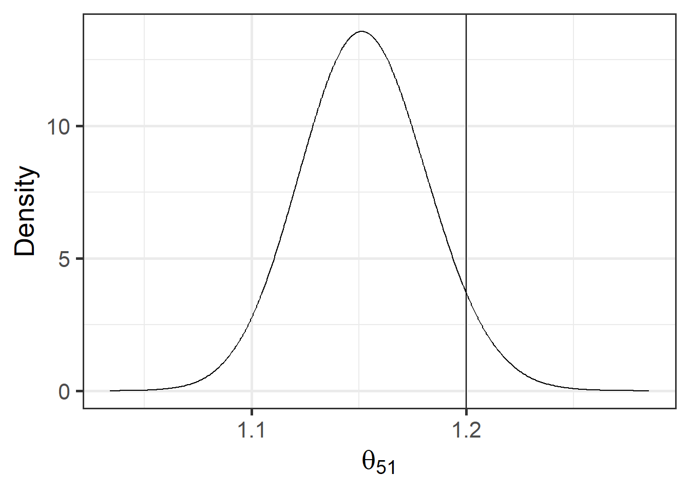
FIGURE 10.3: Posterior distribution of the relative risk of area 51 exceeds the threshold value 1.2. Vertical line indicates the threshold value.
To calculate the exceedance probabilities for all counties, we can use the sapply() function as follows:
c <- 1.2
map$exc <- sapply(res$marginals.fitted.values,
FUN = function(marg){1 - inla.pmarginal(q = c, marginal = marg)})
Figure 10.4 shows a map with the exceedance probabilities created with mapview. The map provides evidence of excess risk within individual areas. In areas with probabilities close to 1, it is very likely that the relative risk exceeds the threshold value \(c\), and areas with probabilities close to 0 correspond to areas where it is very unlikely that the relative risk exceeds \(c\). Areas with probabilities around 0.5 have the highest uncertainty, and they correspond to areas where the relative risk is below or above \(c\) with equal probability. In the map depicting the exceedance probabilities, we observe all probabilities are close to 0 and it is very unlikely the relative risk exceeds the threshold value \(c\) in any of the counties.
pal <- colorRampPalette(brewer.pal(9, "YlOrRd"))
mapview(map, zcol = "exc", color = "gray", col.regions = pal,
        map.types = "CartoDB.Positron")
FIGURE 10.4: Probabilities that the relative risks of counties exceed 1.2.