1 Types of spatial data
Spatial data are used across a wide range of fields to support decision-making, including environment, public health, ecology, agriculture, urban planning, economy, and society. These data arise from various sources and are available in multiple formats (Moraga and Baker 2022). For instance, remote sensing data such as land use and environmental phenomena can be obtained through satellites orbiting the Earth and other distance-capturing platforms. Monitoring stations located at specific sites provide detailed information on various environmental and climatic variables such as temperature, rainfall, and air pollution. Surveys are employed to gather data on different social, economic, and health-related topics. Spatial data can also be derived from mobile phone usage and social media which can provide information on the location and activities of individuals.
Spatial data can be thought of as resulting from observations of a stochastic process
\[\{Z(\boldsymbol{s}): \boldsymbol{s} \in D \subset \mathbb{R}^d\},\]
where \(D\) is a set of \(\mathbb{R}^d\), \(d=2\), and \(Z(\boldsymbol{s})\) denotes the attribute we observe at \(\boldsymbol{s}\). Three types of spatial data are distinguished through the characteristics of the domain \(D\), namely, areal (or lattice) data, geostatistical data, and point patterns (Cressie 1993). Below we describe each of the data types, and give examples of these data in different settings.
1.1 Areal data
In areal or lattice data, the domain \(D\) is a fixed countable collection of (regular or irregular) areal units at which variables are observed. Areal data usually arise when the number of events corresponding to some variable of interest are aggregated in areas. For example, in spatial epidemiology, locations of individuals with a given disease are often aggregated in administrative areas. These data can be analyzed to understand geographic patterns and identify factors of disease risk, taking into account the neighborhood configuration and other factors known to affect disease risk (Moraga 2018a). Areal data may also arise in remote sensing applications where satellites provide information on a number of variables such as temperature, precipitation, and vegetation indices at cells of a regular grid that covers the study region.
Examples
Figure 1.1 shows the number of sudden infant deaths in each of the counties of North Carolina, USA, in 1974 from the sf package (Pebesma 2022a).
library(sf)
library(mapview)
d <- st_read(system.file("shape/nc.shp", package = "sf"),
             quiet = TRUE)
mapview(d, zcol = "SID74")
FIGURE 1.1: Example of areal data. Number of sudden infant deaths in counties of North Carolina, USA, in 1974.
The map in Figure 1.2 depicts household income in $1000 USD in neighborhoods in Columbus, Ohio, in 1980 contained in the spData package (Bivand, Nowosad, and Lovelace 2022).
library(spData)
library(ggplot2)
d <- st_read(system.file("shapes/columbus.shp",
                         package = "spData"), quiet = TRUE)
ggplot(d) + geom_sf(aes(fill = INC))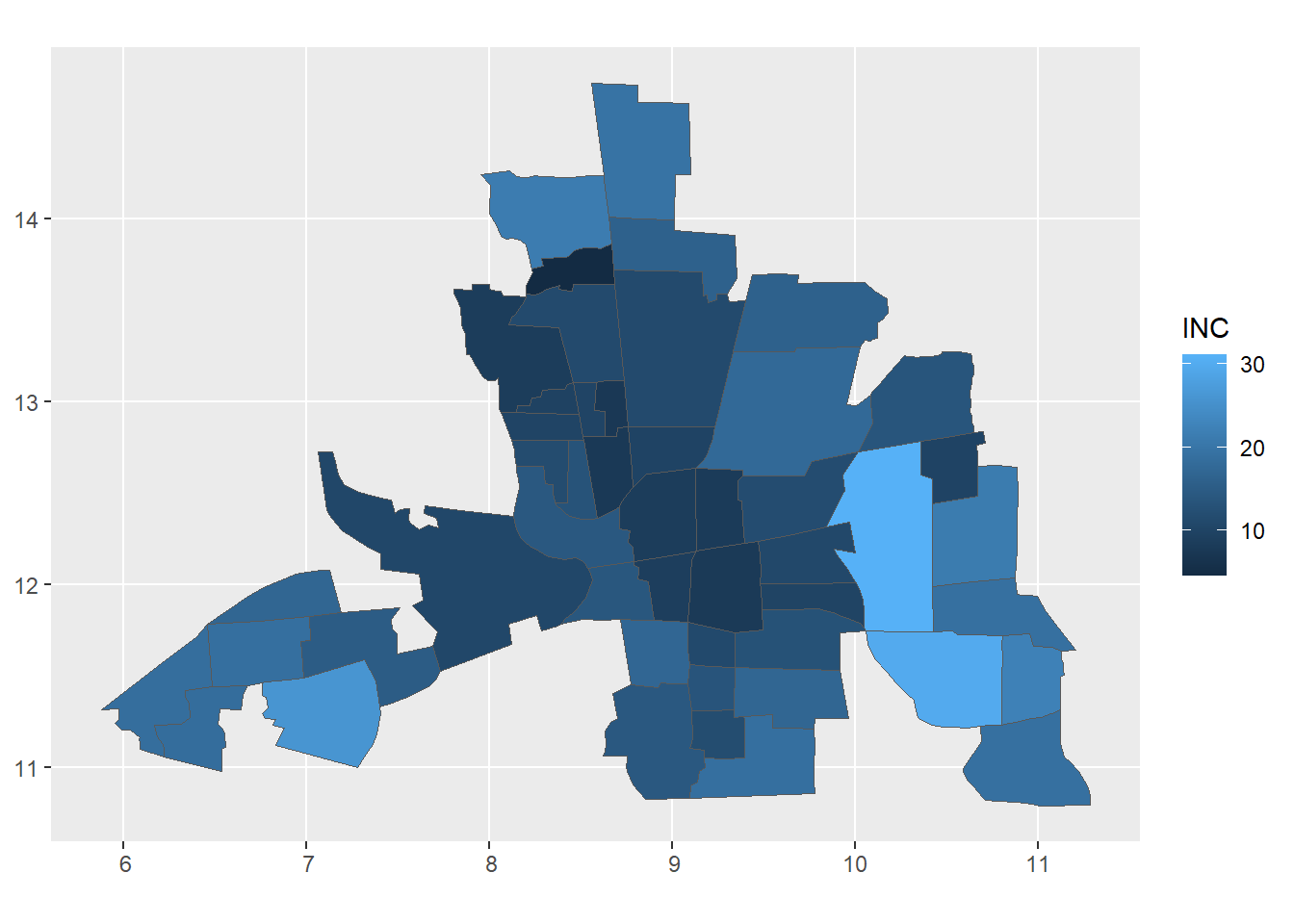
FIGURE 1.2: Example of areal data. Household income in $1000 USD in neighborhoods in Columbus, Ohio, in 1980.
Figure 1.3 shows elevation at raster grid cells covering Luxembourg from terra (Hijmans 2022). In this case, areas are all of the same size equal to the cells of a raster grid.
library(terra)
d <- rast(system.file("ex/elev.tif", package = "terra"))
plot(d)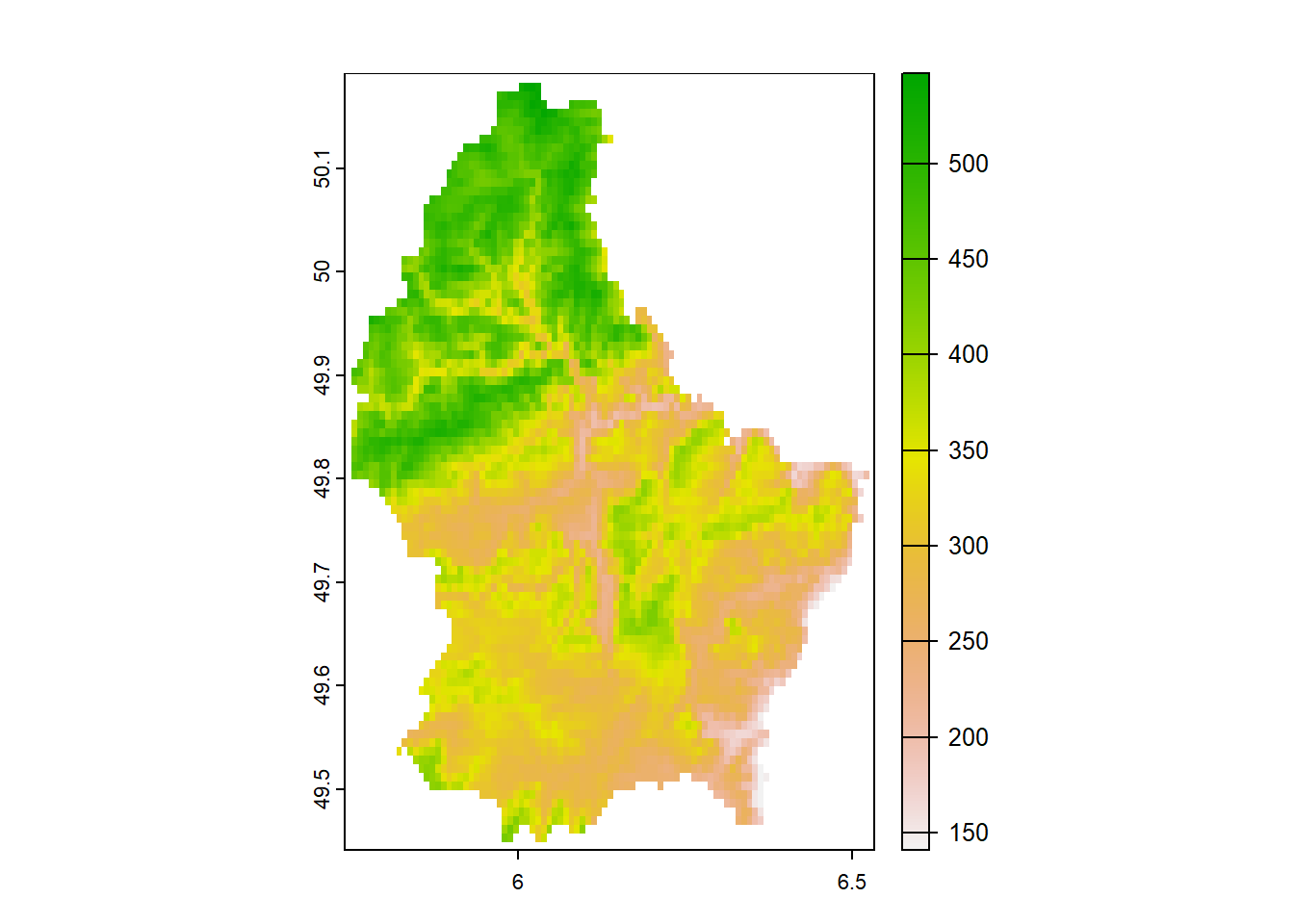
FIGURE 1.3: Example of areal data. Elevation at raster grid cells covering Luxembourg.
1.2 Geostatistical data
In geostatistical data, \(D\) is a continuous fixed subset of \(\mathbb{R}^d\). The spatial index \(\boldsymbol{s}\) varies continuously in space and therefore \(Z(\boldsymbol{s})\) can be observed everywhere within \(D\). Usually, we use data \(\{Z(\boldsymbol{s}_1), \ldots, Z(\boldsymbol{s}_n)\}\) observed at known spatial locations \(\{\boldsymbol{s}_1,\ldots,\boldsymbol{s}_n\}\) to predict the values of the variable of interest at unsampled locations. For example, we can use air pollution measurements at a number of monitoring stations to predict air pollution at other locations taking into account spatial autocorrelation and other factors that are known to predict the outcome of interest (Cameletti et al. 2013).
Examples
Figure 1.4 shows topsoil lead concentrations (mg per kg of soil) at several locations sampled in a flood plain of the river Meuse, near Stein, The Netherlands, obtained from the sp package (Pebesma and Bivand 2022).
library(sp)
library(sf)
library(mapview)

data(meuse)
meuse <- st_as_sf(meuse, coords = c("x", "y"), crs = 28992)
mapview(meuse, zcol = "lead",  map.types = "CartoDB.Voyager")
FIGURE 1.4: Example of geostatistical data. Topsoil lead concentrations at locations sampled in a flood plain of the river Meuse, The Netherlands.
The map in Figure 1.5 shows the price per square meter (Euros per square meter) of a specific set of apartments in Athens, Greece, in 2017 from spData (Bivand, Nowosad, and Lovelace 2022).
FIGURE 1.5: Example of geostatistical data. Price per square meter of a set of apartments in Athens, Greece, in 2017.
Figure 1.6 shows malaria prevalence at specific locations in Zimbabwe from the malariaAtlas package (Pfeffer et al. 2020). Prevalence is calculated as the number of individuals positive for malaria divided by the number of examined individuals at each of the locations.
library(malariaAtlas)
d <- getPR(country = "Zimbabwe", species = "BOTH")
ggplot2::autoplot(d)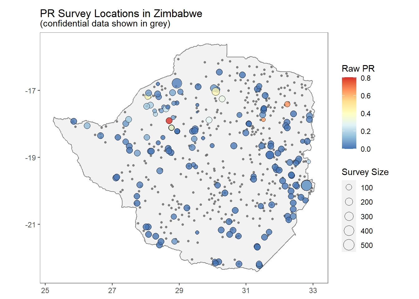
FIGURE 1.6: Example of geostatistical data. Malaria prevalence at specific locations in Zimbabwe.
1.3 Point patterns
Finally, in point patterns, the domain \(D\) is random. Its index set gives the locations of random events of the spatial point pattern, and \(Z(\boldsymbol{s})\) may be equal to 1 \(\forall \boldsymbol{s} \in D\), indicating occurrence of the event, or random, giving some additional information.
Point patterns arise when the variable to be analyzed corresponds to the location of events. For example, patterns may include the locations of fires in a forest (González and Moraga 2022) or the residential addresses of people with a disease (Moraga and Montes 2011). Often, we are interested in understanding the underlying spatial process that originates the point pattern, and assessing whether the spatial pattern exhibits randomness, clustering, or regularity.
Examples
An example of spatial point pattern is the
fires in Castilla-La Mancha, Spain, between 1998 and 2007 contained in the clmfires data of the spatstat package (Baddeley, Turner, and Rubak 2022).
Data clmfires is a marked point pattern containing information of each fire. Figure 1.7 depicts the location of the fires without the mark.
This figure also shows the positions of cell nuclei in a histological section of a tissue from a lymphoma in the kidney of a hamster from spatstat. The nuclei are classified as either “pyknotic” (corresponding to dying cells) or “dividing” (corresponding to cells arrested in the act of dividing).
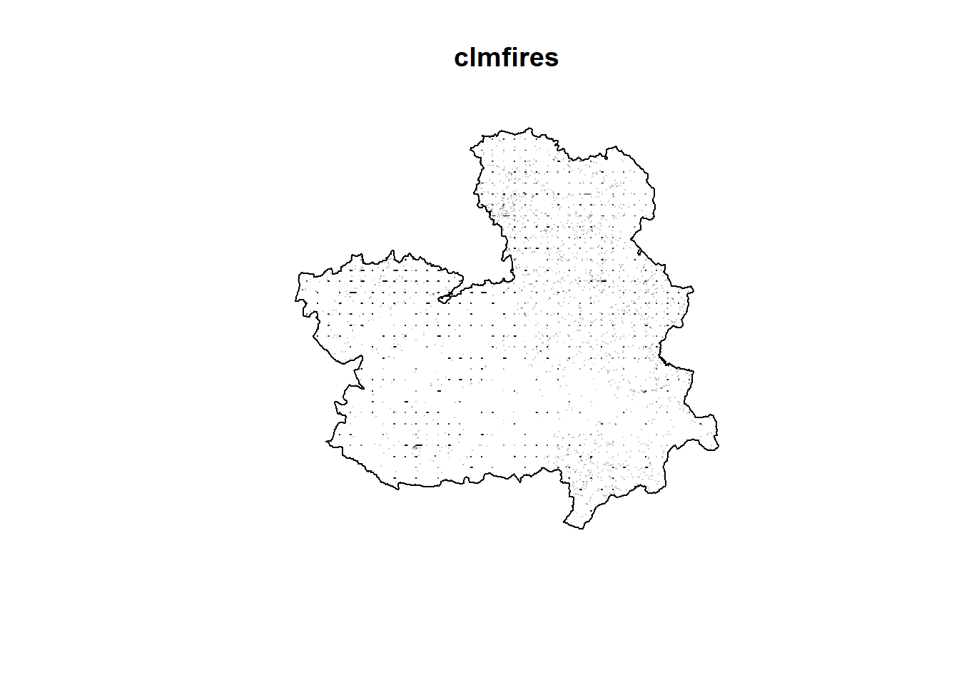
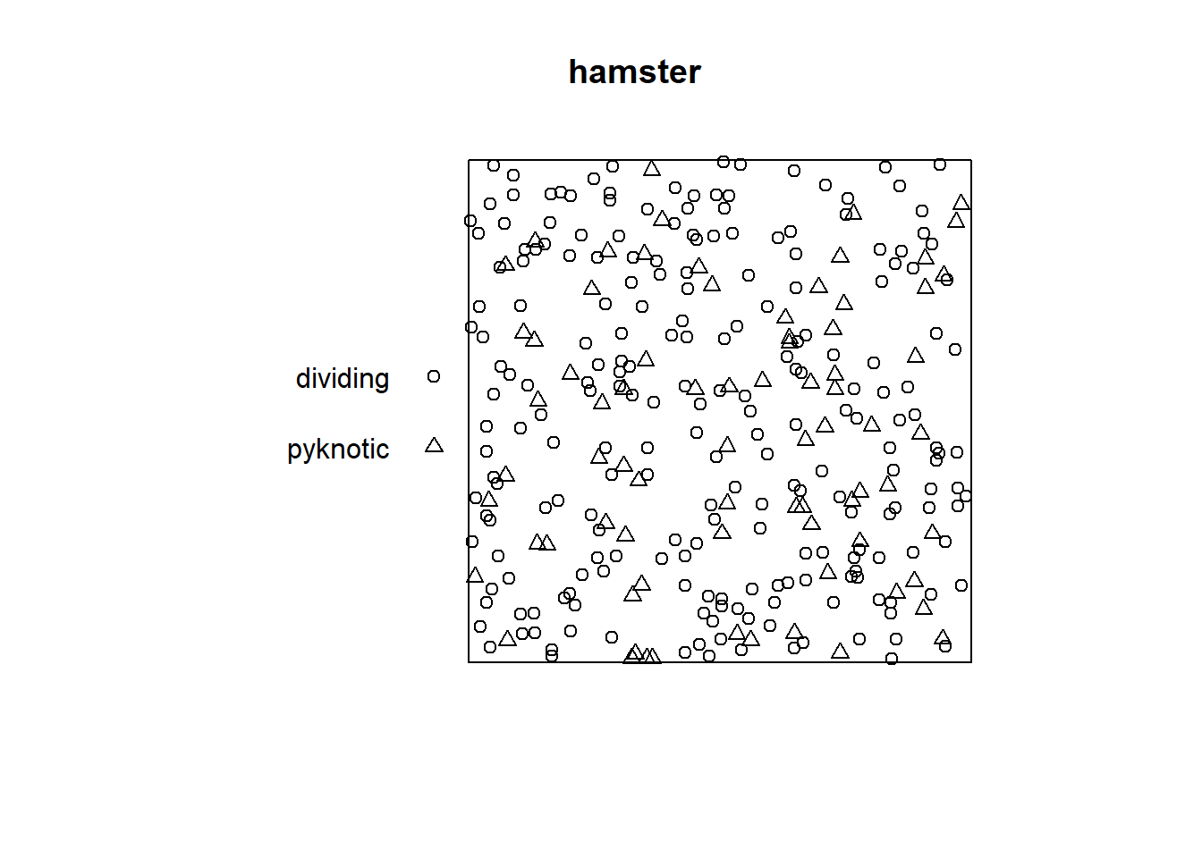
FIGURE 1.7: Examples of point patterns. Top: Locations of fires in Castilla-La Mancha, Spain, between 1998 and 2007. Bottom: Locations and types of cells in a tissue.
Figure 1.8 shows the spatial locations of 761 cases of primary biliary cirrhosis and 30210 controls representing at-risk population in north-eastern England collected between 1987 and 1994. This information is contained in the pbc data from the sparr package (Davies and Marshall 2023).
library(sparr)
data(pbc)
plot(unmark(pbc[which(pbc$marks == "case"), ]), main = "cases")
axis(1)
axis(2)
title(xlab = "Easting", ylab = "Northing")
plot(unmark(pbc[which(pbc$marks == "control"), ]),
     pch = 3, main = "controls")
axis(1)
axis(2)
title(xlab = "Easting", ylab = "Northing")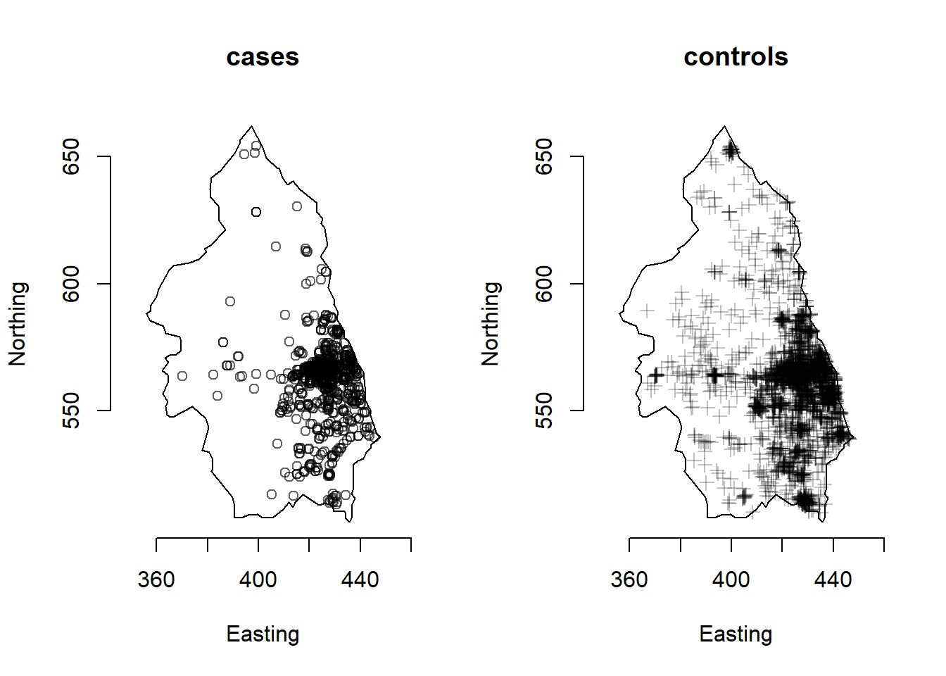
FIGURE 1.8: Example of point pattern. Locations of cases and controls of primary biliary cirrhosis in north-eastern England between 1987 and 1994.
1.4 Spatio-temporal data
Spatio-temporal data arise when information is both spatially and temporally referenced. Thus, we can consider spatial data as temporal aggregations or temporal snapshots of a spatio-temporal process. Examples of spatio-temporal data include the number of car accidents in each of the US states in each of the months of 2020 (areal data), air pollution levels measured at 100 monitoring stations located in Germany each hour of a given day (geostatistical data), and the locations of earthquakes occurring in the world in each of the years from 2000 to 2020 (point pattern). Figure 1.9 shows a spatio-temporal dataset representing the population of the counties of Ohio, USA, from 1968 to 1988 obtained from the SpatialEpiApp package (Moraga 2017).
# devtools::install_github("Paula-Moraga/SpatialEpiApp")
library(SpatialEpiApp)
library(sf)
library(ggplot2)
library(viridis)

# map
f <- file.path("SpatialEpiApp/data/Ohio/fe_2007_39_county/",
               "fe_2007_39_county.shp")
pathshp <- system.file(f, package = "SpatialEpiApp")
map <- st_read(pathshp, quiet = TRUE)

# data
namecsv <- "SpatialEpiApp/data/Ohio/dataohiocomplete.csv"
d <- read.csv(system.file(namecsv, package = "SpatialEpiApp"))

# data are disaggregated by gender and race
# aggregate to get population in each county and year
d <- aggregate(x = d$n, by = list(county = d$NAME, year = d$year),
               FUN = sum)
names(d) <- c("county", "year", "population")

# join map and data
mapst <- dplyr::left_join(map, d, by = c("NAME" = "county"))

# map population by year
# facet_wrap() splits data into subsets and create multiple plots
ggplot(mapst, aes(fill = log(population))) + geom_sf() +
  facet_wrap(~ year, ncol = 7) +
  scale_fill_viridis("log(population)") +
  theme(axis.text.x = element_blank(),
        axis.text.y = element_blank(),
        axis.ticks = element_blank())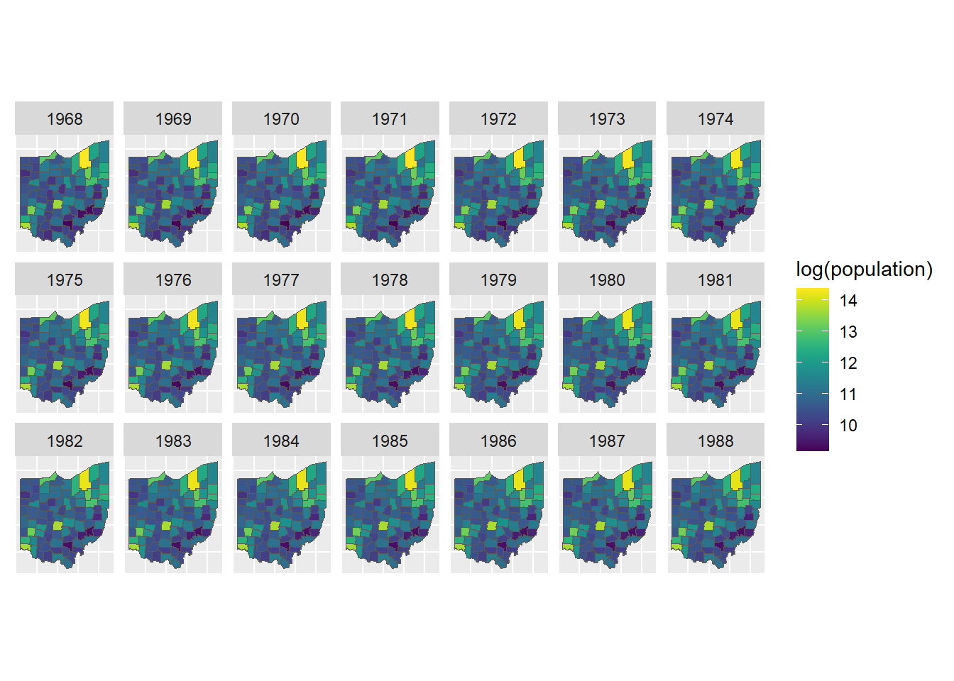
FIGURE 1.9: Example of spatio-temporal data. Population of the counties of Ohio, USA, from 1968 to 1988.
1.5 Spatial functional data
Spatial functional data arise when the three types of spatial data (areal, geostatistical, and point patterns) are combined with random functions. Thus, a spatial functional process can be defined as
\[\{\boldsymbol{\chi_s}: \boldsymbol{s} \in D \subset \mathbb{R}^d \},\]
where \(\boldsymbol{\chi_s}\) is a functional random variable taking values in an infinite dimensional space observed at \(\boldsymbol{s}\) in the spatial domain \(D\). Typically, \(\boldsymbol{\chi_s}\) is a real function from \([a, b] \subset \mathbb{R}\) to \(\mathbb{R}\).
The spatial domain \(D\) can be fixed or random and allows us to classify spatial functional data as functional areal data when the functions correspond to areas, functional geostatistical data when functions are observed at a fixed subset of locations, and functional point patterns when functions are observed at each of the locations of a point process.
Example
The example below shows functional geostatistical data from the geoFourierFDA package (Sassi 2021) representing the daily temperature averaged over 30 years at 35 Canadian weather stations, \(\{\boldsymbol{\chi_{s_i}}: i =1,\ldots,35 \}\). Figure 1.10 shows the locations of the Canadian weather stations, and Figure 1.11 the daily temperature measured in each of the stations. One of the objectives when analyzing this data could be the prediction of the daily temperature function \(\boldsymbol{\chi_{s_0}}: [0, 365) \rightarrow \mathbb{R}\) at one specific unsampled location \(\boldsymbol{s_0}\) in Canada.
library(sf)
library(geoFourierFDA)
library(rnaturalearth)

# Map Canada
map <- rnaturalearth::ne_states("Canada", returnclass = "sf")

# Coordinates of stations
d <- data.frame(canada$m_coord)
d$location <- attr(canada$m_coord, "dimnames")[[1]]
d <- st_as_sf(d, coords = c("W.longitude", "N.latitude"))
st_crs(d) <- 4326

# Plot Canada map and location of stations
ggplot(map) + geom_sf() + geom_sf(data = d, size = 6) +
  geom_sf_label(data = d, aes(label = location), nudge_y = 2)
# Temperature of each station over time
d <- data.frame(canada$m_data)
d$time <- 1:nrow(d)

# Pivot data d from wide to long
# cols: columns to pivot in longer format
# names_to: name of new column with column names of original data
# values_to: name of new column with values of original data
df <- tidyr::pivot_longer(data = d,
cols = names(d)[-which(names(d) == "time")],
names_to = "variable", values_to = "value")

# Plot temperature of each station over time
ggplot(df, aes(x = time, y = value)) +
  geom_line(aes(color = variable))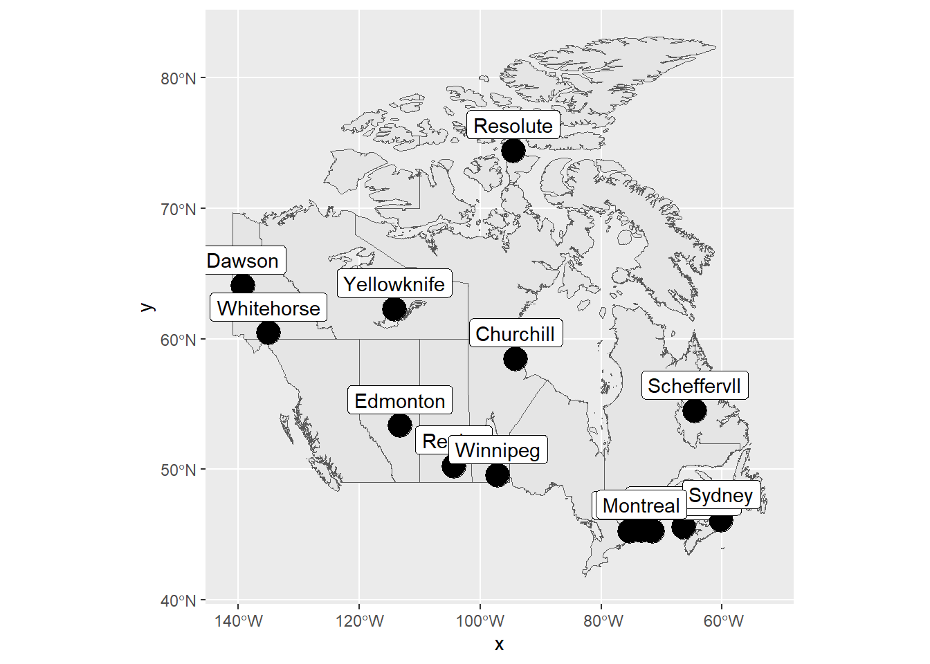
FIGURE 1.10: Locations of Canadian weather stations where daily temperature is measured.
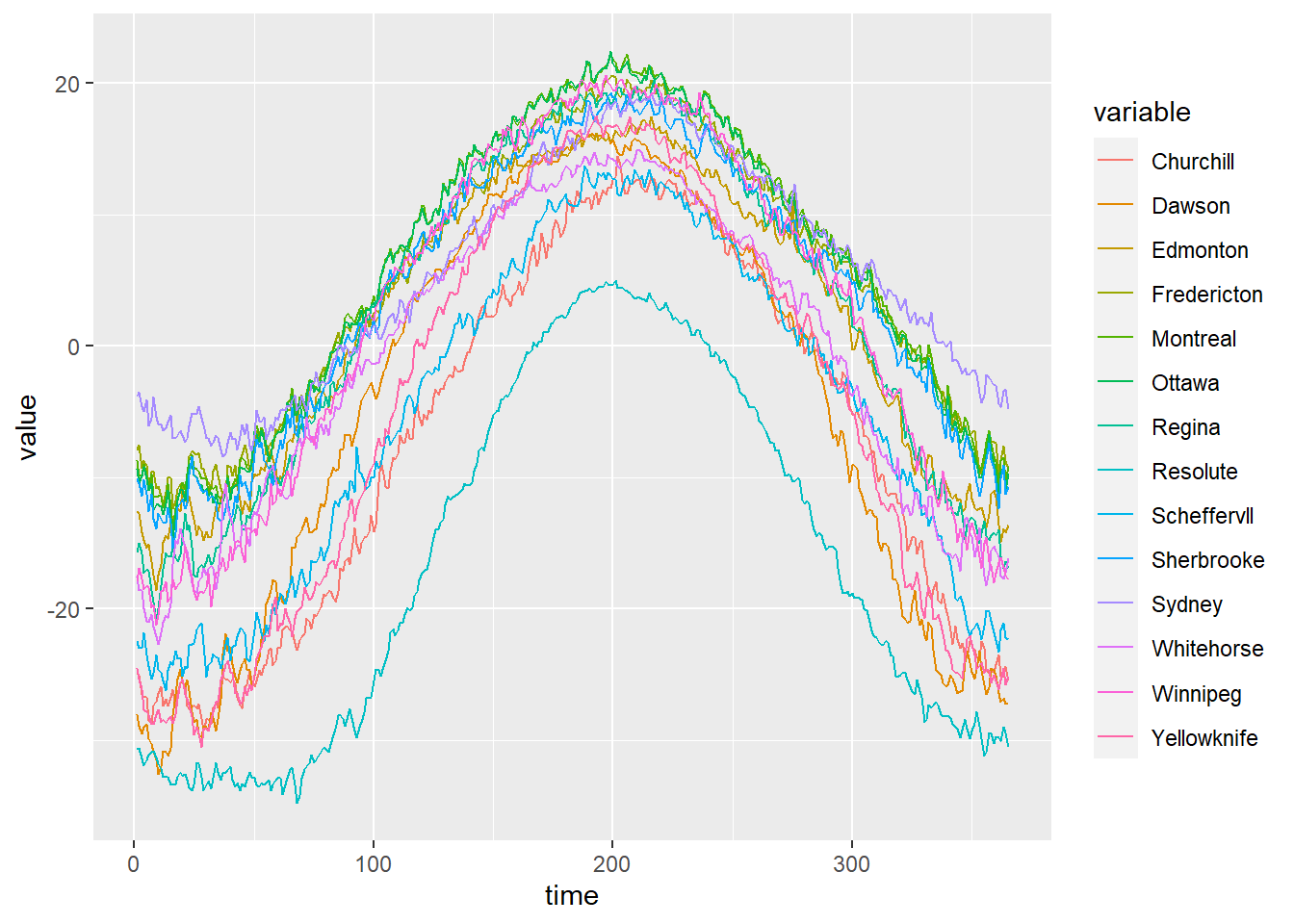
FIGURE 1.11: Example of spatial functional data. Daily temperature averaged over 30 years measured at 35 Canadian weather stations.
1.6 Mobility data
Besides the three classical types of spatial data (i.e., areal, geostatistical, and point patterns), we can also consider other spatial data such as flows containing the number of individuals or other elements moving between locations (Mahmood et al. 2022).
Here, we see an example of flows data from the
epiflows package (Piatkowski et al. 2018; Moraga et al. 2019). This package allows us to predict and visualize the spread of infectious diseases based on flows between geographical locations.
The package contains the Brazil_epiflows data with the number of travelers between Brazilian states and other locations. We can use this data to create an epiflows object called ef that allows us to use the prediction and visualization functions.
Then, we can visualize the population flows with vis_epiflows(ef) using a dynamic network, and map_epiflows(ef) using an interactive map.
library("epiflows")
data("Brazil_epiflows")

loc <- merge(x = YF_locations, y = YF_coordinates,
by.x = "location_code", by.y = "id", sort = FALSE)

ef <- make_epiflows(flows = YF_flows, locations = loc,
                    coordinates = c("lon", "lat"),
                    pop_size = "location_population",
                    duration_stay = "length_of_stay",
                    num_cases = "num_cases_time_window",
                    first_date = "first_date_cases",
                    last_date = "last_date_cases")
vis_epiflows(ef)
map_epiflows(ef)