5 Making maps with R
Maps allow us to easily convey spatial information. Here, we show how to create both static and interactive maps by using several mapping packages including ggplot2 (Wickham, Chang, et al. 2022), leaflet (Cheng, Karambelkar, and Xie 2022), mapview (Appelhans et al. 2022), and tmap (Tennekes 2022). We create maps of areal data using several functions and parameters of the mapping packages. We also briefly describe how to plot point and raster data. Then, we show how to create maps of flows between locations with the flowmapblue package (Boyandin 2023).
The areal data we map correspond to sudden infant deaths in the counties of North Carolina, USA, in 1974 and 1979 which are in the sf package (Pebesma 2022a).
The path of the data can be obtained with system.file() specifying the directory of the data ("shape/nc.shp") and the package ("sf").
Then, the data can be read with the st_read() function of sf by specifying the path of the data.
We call this data d, and create variables vble and vble2 that we wish to map with the values of the sudden infant deaths in 1974 and 1979, respectively.
library(sf)
nameshp <- system.file("shape/nc.shp", package = "sf")
d <- st_read(nameshp, quiet = TRUE)
d$vble <- d$SID74
d$vble2 <- d$SID79
5.1 ggplot2
The ggplot2 package (Wickham, Chang, et al. 2022) allows us to create graphics based on the grammar of graphics that defines the rules of structuring mathematic and aesthetic elements to build graphs layer-by-layer.
To create a plot with ggplot2, we call ggplot() specifying arguments data which is a data frame with the variables to plot, and mapping = aes() which are aesthetic mappings between variables in the data and visual properties of the objects in the graph such as position and color of points or lines.
Then, we use + to add layers of graphical components to the graph. Layers consist of geometries, stats, scales, coordinates, facets, and themes. For example, we add objects to the graph with geom_*() functions (e.g, geom_point() for points, geom_line() for lines). We can also add color scales (e.g., scale_colour_brewer()), faceting specifications (e.g., facet_wrap() splits data into subsets to create multiple plots), and coordinate systems (e.g., coord_flip()).
We can create maps by using the geom_sf() function and providing a simple feature (sf) object.
Figure 5.1 shows the map of sudden infant deaths in North Carolina in 1974 (vble) created with ggplot2 with viridis scale from the viridis package (Garnier 2021).
library(ggplot2)
library(viridis)
ggplot(d) + geom_sf(aes(fill = vble)) +
  scale_fill_viridis() + theme_bw()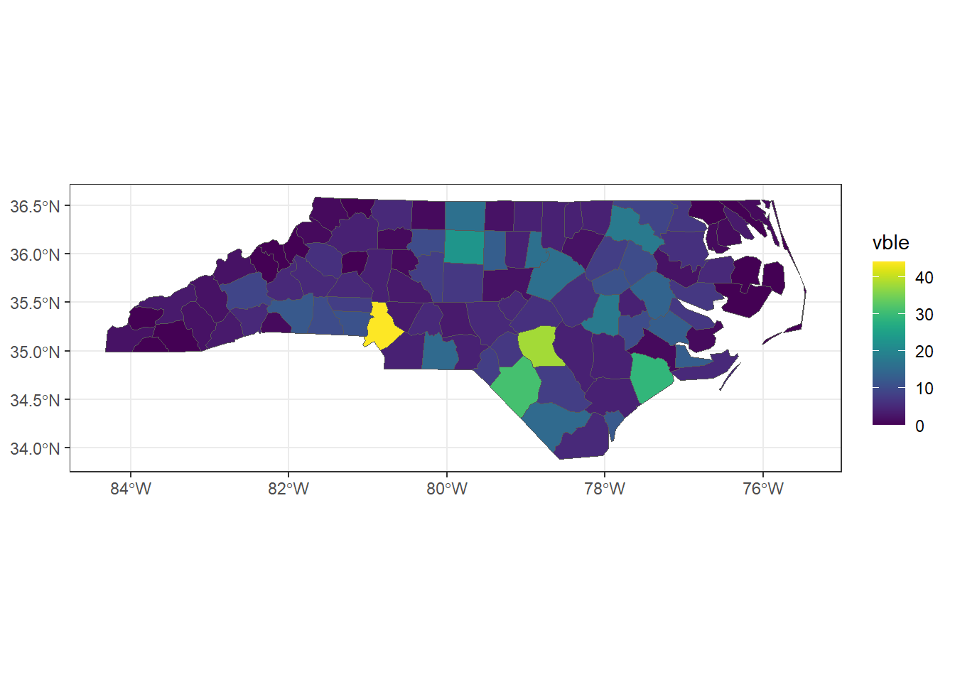
FIGURE 5.1: Map of areal data created with ggplot2.
Plots created with ggplot2 can be saved with the ggsave() function.
Alternatively, we can specify a device driver (e.g., png, pdf), print the plot, and then shut down the device with dev.off():
Moreover, the plotly package (Sievert, Parmer, et al. 2022) can be used in combination with ggplot2 to create an interactive plot.
Specifically, we can turn a static ggplot object to an interactive plotly object by calling the ggplotly() function of plotly providing the ggplot object (Figure 5.2).
FIGURE 5.2: Interactive map of areal data created with plotly.
The gganimate package (Pedersen and Robinson 2022) can also be used to create animated plots. The syntax of this package is similar to that of ggplot2 and has additional functions to define how data should change in the animation.
5.2 leaflet
The leaflet package (Cheng, Karambelkar, and Xie 2022) makes it easy to create maps using Leaflet which is a very popular open-source JavaScript library for interactive maps.
We can create a leaflet map by calling the leaflet() function passing the spatial object, and adding layers such as polygons and legends using a number of functions.
The sf object that we pass to leaflet() needs to have a geographic coordinate reference system (CRS) indicating latitude and longitude (EPSG code 4326).
Here, we use the st_transform() function of sf to transform the data d which has CRS given by EPSG code 4267 to CRS with EPSG code 4326.
st_crs(d)$epsg[1] 4267
d <- st_transform(d, 4326)We create a color palette using the colorNumeric() function of leaflet specifying the color palette "YlOrRd" of the RColorBrewer package (Neuwirth 2022), and the domain with the possible values that can be mapped (d$vble).
Then, we create the map using leaflet() and addTiles() to add a background map to put data into context.
Then, we use addPolygons() to add the polygons representing counties specifying the color of the border (color), interior (fillColor) and opacity (fillOpacity).
Finally, we add a legend with addLegend() (Figure 5.3).
library(leaflet)
pal <- colorNumeric(palette = "YlOrRd", domain = d$vble)
l <- leaflet(d) %>% addTiles() %>%
  addPolygons(color = "white", fillColor = ~ pal(vble),
              fillOpacity = 0.8) %>%
  addLegend(pal = pal, values = ~vble, opacity = 0.8)
l
FIGURE 5.3: Map of areal data created with leaflet.
Note that the default background map added with addTiles() can be changed by another map with addProviderTiles() specifying another tile layer.
Examples of tile layers can be seen at the leaflet providers’ website.
We can also use the addMiniMap() function to add an inset map (Figure 5.4).
l %>% addMiniMap()FIGURE 5.4: Map of areal data with inset map created with leaflet.
The saveWidget() function of htmlwidgets (Vaidyanathan et al. 2023) allows us to save the map created to an HTML file.
If we wish to save an image file, we can first save the leaflet map as an HTML file with saveWidget(), and then capture a static version of the HTML using the webshot() function of the webshot package (Chang 2022a).
The use of webshot requires the installation of the external program PhantomJS which can be installed with webshot::install_phantomjs().
For example, to save the leaflet map l as .png we can proceed as follows:
# Saves map.html
library(htmlwidgets)
saveWidget(widget = l, file = "map.html")

# Takes a screenshot of the map.html created
# and saves it as map.png
library(webshot)
# webshot::install_phantomjs()
webshot(url = "map.html", file = "map.png")
Note we can use getwd() and setwd() to get and set, respectively, the current working directory.
This allows us to see where the files were saved.
Moreover, if in saveWidget() we specify the path where to save map.html as file = "directory/map.html",
the same path needs to be specified in the argument url of webshot() as url = "directory/map.html".
The package webshot2 (Chang 2022b) is meant to be a replacement for webshot.
The webshot2 package uses headless Chrome via the chromote package (Chang and Schloerke 2022), whereas webshot uses PhantomJS.
5.3 mapview
The mapview package (Appelhans et al. 2022) allows us to very quickly create similar interactive maps as leaflet.
Specifically, we just need to use the mapview() function passing as arguments the spatial object and the variable we want to plot (zcol).
Figure 5.5 shows the map created with mapview. This map is interactive and by clicking each of the areas we can see popups with the data information.
FIGURE 5.5: Map of areal data created with mapview.
Maps created with
mapview can also be customized to add elements such as legends and background maps.
For example, we can choose another background map by using the argument map.types, change the color palette with col.regions, and put a title for the legend with layer.name as follows:
library(RColorBrewer)
pal <- colorRampPalette(brewer.pal(9, "YlOrRd"))
mapview(d, zcol = "vble", map.types = "CartoDB.DarkMatter",
        col.regions = pal, layer.name = "SDI")
An inset map can also be added by using the addMiniMap() function of leaflet.
map1 <- mapview(d, zcol = "vble")
leaflet::addMiniMap(map1@map)
We can save maps created with mapview by using the mapshot() function of mapview
as an HTML file or as a PNG, PDF, or JPEG image.
5.4 Side-by-side plots with mapview
We can create a side-by-side plot of maps obtained with mapview separated with a slider by using the | operator. To use the | operator, we need to install the leaflet.extras2 package (Sebastian 2023). When creating the individual maps with mapview(), we use a common legend by specifying the same color palette (col.regions) and breaks (at) so in both maps colors correspond to the same intervals of values (Figure 5.6).
library(leaflet.extras2)
library(RColorBrewer)
pal <- colorRampPalette(brewer.pal(9, "YlOrRd"))

# common legend
at <- seq(min(c(d$vble, d$vble2)), max(c(d$vble, d$vble2)),
          length.out = 8)

m1 <- mapview(d, zcol = "vble", map.types = "CartoDB.Positron",
              col.regions = pal, at = at)
m2 <- mapview(d, zcol = "vble2", map.types = "CartoDB.Positron",
              col.regions = pal, at = at)

m1 | m2
FIGURE 5.6: Side-by-side maps created with mapview and the | operator of leaflet.extras2.
5.5 Synchronized maps with leafsync
The leafsync package (Appelhans and Russell 2019) can be used to produce a lattice-like view of multiple synchronized maps created with mapview or leaflet.
Here, we show how to create maps of sudden infant deaths in 1974 (vble) and 1979 (vble2) with synchronized zoom and pan.
First, we use mapview() to create maps of the variables vble and vble2.
Then, we use the sync() function of leafsync passing the maps created.
library(RColorBrewer)
pal <- colorRampPalette(brewer.pal(9, "YlOrRd"))

# common legend
at <- seq(min(c(d$vble, d$vble2)), max(c(d$vble, d$vble2)),
          length.out = 8)

m1 <- mapview(d, zcol = "vble", map.types = "CartoDB.Positron",
              col.regions = pal, at = at)
m2 <- mapview(d, zcol = "vble2", map.types = "CartoDB.Positron",
              col.regions = pal, at = at)
m <- leafsync::sync(m1, m2)
m
This synchronized map can be saved by using the save_html() function of the htmltools package (Cheng et al. 2022).
htmltools::save_html(m, "m.html")5.6 tmap
The tmap package (Tennekes 2022) allows us to create static and interactive maps composed of multiple shapes and layers, and with different styles.
Maps are created with tm_shape() specifying the sf object. Then, layers are added with a tm_*() function.
For example, tm_polygons() draws polygons, tm_dots() draws dots, and tm_text() adds text.
Functions tmap_mode("plot") and tmap_mode("view") can be used to set the static and interactive modes of the maps, respectively.
Figure 5.7 shows a static map created with tmap with the values corresponding to areal data.
library(tmap)
tmap_mode("plot")
tm_shape(d) + tm_polygons("vble")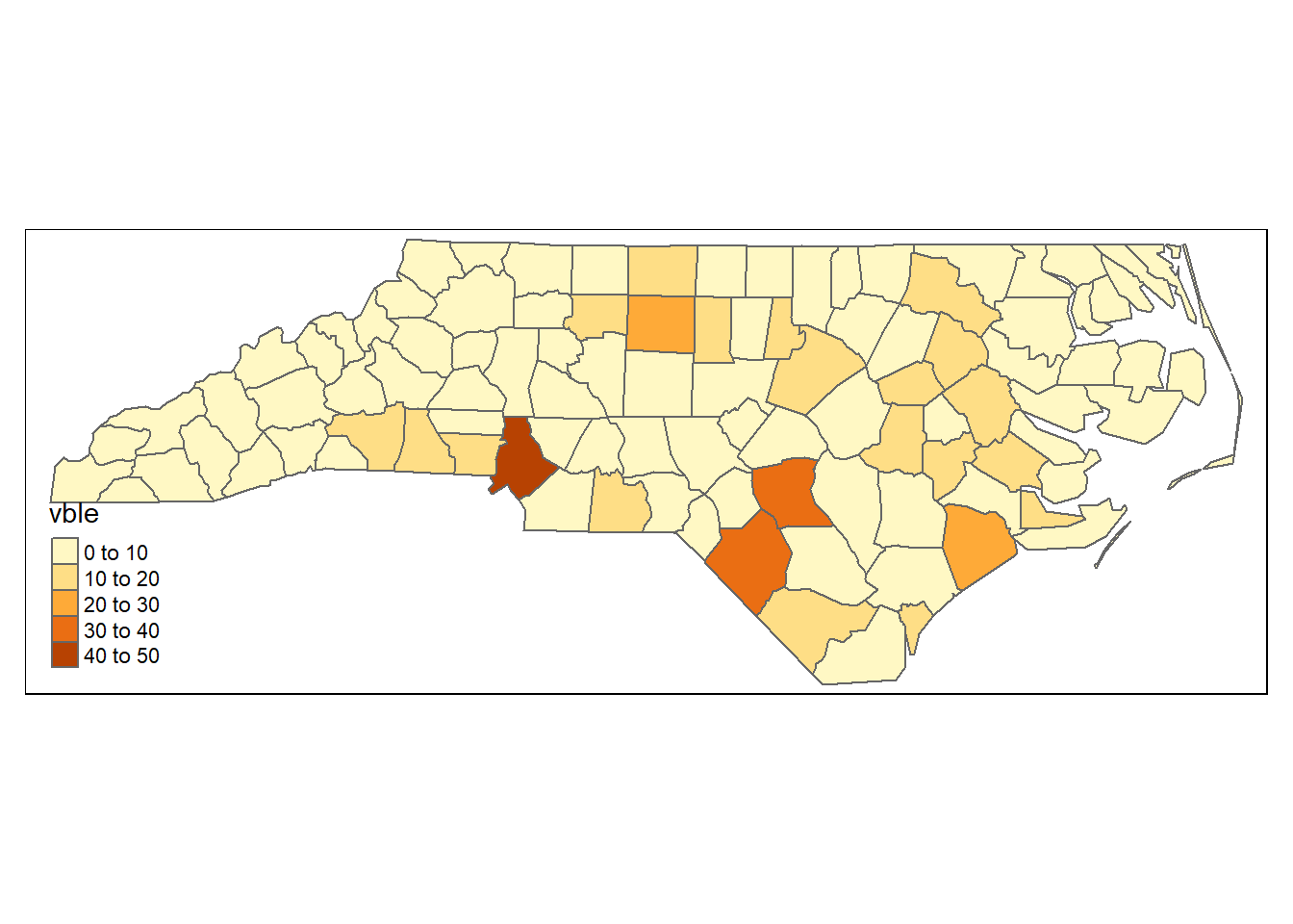
FIGURE 5.7: Map of areal data created with tmap.
The function tmap_save() can be used to save maps by specifying the name of the HTML file (if view mode) or image (if plot mode).
5.7 Maps of point data
In addition to mapping areal data, the ggplot2, leaflet, mapview and tmap packages can also be used to create maps of point and raster data.
Here, we show how to use these packages to represent the locations and population sizes of South African cities using points with different colors and sizes.
These data are obtained from the world.cities data from the maps package (Brownrigg 2022).
library(maps)
d <- world.cities
# Select South Africa
d <- d[which(d$country.etc == "South Africa"), ]
# Transform data to sf object
d <- st_as_sf(d, coords = c("long", "lat"))
# Assign CRS
st_crs(d) <- 4326
We create the variables vble with the population, and size with a transformation of the population that will be used to plot the points.
d$vble <- d$pop
d$size <- sqrt(d$vble)/100
Figure 5.8 shows a map created with ggplot2 by setting the points color with col = vble and their size with size = size.
ggplot(d) + geom_sf(aes(col = vble, size = size)) +
  scale_color_viridis()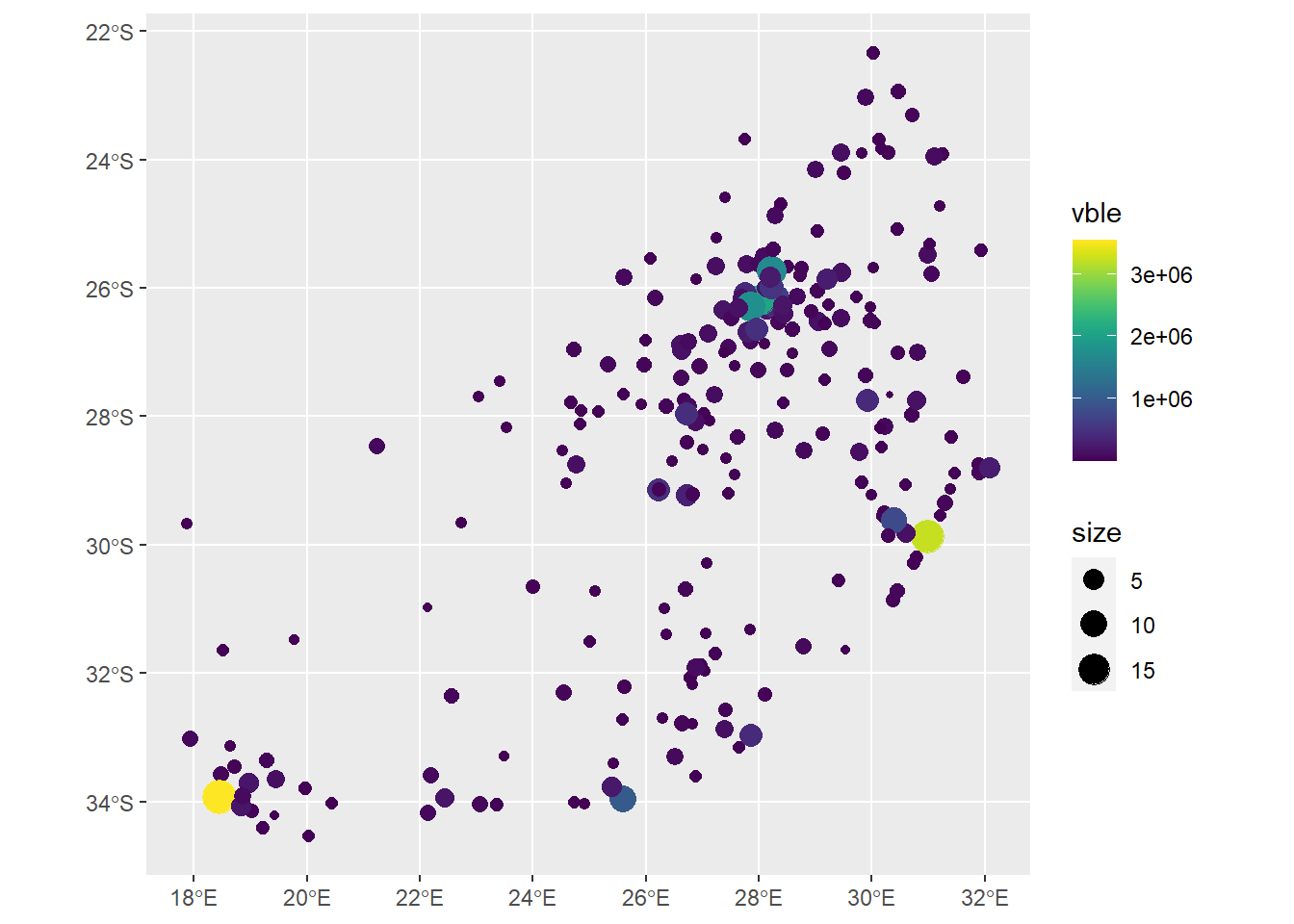
FIGURE 5.8: Map of point data created with ggplot2.
A leaflet map can be created using addCircles() specifying the radius and color of the points (Figure 5.9).
pal <- colorNumeric(palette = "viridis", domain = d$vble)
leaflet(d) %>% addTiles() %>%
  addCircles(lng = st_coordinates(d)[, 1],
             lat = st_coordinates(d)[, 2],
             radius = ~sqrt(vble)*10,
             color = ~pal(vble), popup = ~name) %>%
  addLegend(pal = pal, values = ~vble, position = "bottomright")
FIGURE 5.9: Map of point data created with leaflet.
To create a map with mapview, we set the size of the points with cex = "size".
Finally, we use tm_dots() to create a map with tmap.
5.8 Maps of raster data
These packages can also be used to plot raster data. Here, we plot the raster data representing elevation in Luxembourg obtained from the terra package (Hijmans 2022).
library(terra)
filename <- system.file("ex/elev.tif", package = "terra")
r <- rast(filename)
To create a map using ggplot2, we transform the data to a data frame and pass it to geom_raster() (Figure 5.10).
# Transform data to sf object
d <- st_as_sf(as.data.frame(r, xy = TRUE), coords = c("x", "y"))
# Assign CRS
st_crs(d) <- 4326
# Plot
ggplot(d) + geom_sf() +
  geom_raster(data = as.data.frame(r, xy = TRUE),
              aes(x = x, y = y, fill = elevation))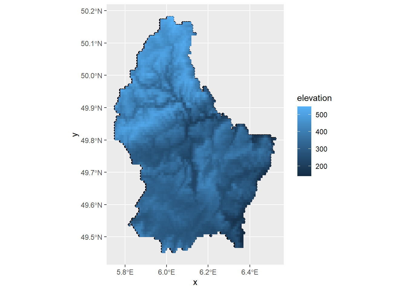
FIGURE 5.10: Map of raster data created with ggplot2.
To use the leaflet and mapview packages, we transform the data from class terra to RasterLayer with the raster::brick() function.
Figure 5.11 shows the map of raster data created with leaflet.
library(raster)
rb <- raster::brick(r)

pal <- colorNumeric("YlOrRd", values(r),
                    na.color = "transparent")
leaflet() %>% addTiles() %>%
  addRasterImage(rb, colors = pal, opacity = 0.8) %>%
  addLegend(pal = pal, values = values(r), title = "elevation")
FIGURE 5.11: Map of raster data created with leaflet.
We create a map with mapview setting the title with the argument layer as follows:
mapview(rb, layer = "elevation")We create a map with tmap by using tm_raster().
5.9 Mobility flows with flowmapblue
The flowmapblue package (Boyandin 2023) is a FlowmapBlue widget for R that can be used to easily map mobility data between locations. An example on the use of flowmapblue showing population flows in Spain derived from cellphone location data can be seen at this blog post. Flow data can also be depicted with the visualization functions of the epiflows package for the prediction of the spread of infectious diseases (Piatkowski et al. 2018; Moraga et al. 2019).
To use flowmapblue, we need to create a token at https://account.mapbox.com/. We can create an interactive mobility map by using just a few lines of code. First, we need to install the package from GitHub as follows:
devtools::install_github("FlowmapBlue/flowmapblue.R")
library(flowmapblue)
Then, we need to create two data frames containing the locations and the flows between locations.
The data frame locations contains the ids, names, and coordinates of each of the locations. For example:
locations <- data.frame(
id = c(1, 2, 3),
name = c("New York", "London", "Rio de Janeiro"),
lat = c(40.713543, 51.507425, -22.906241),
lon = c(-74.011219, -0.127738, -43.180244)
)
The data frame flows has the number of people moving between origin and destination locations. For example:
flows <- data.frame(
origin = c(1, 2, 3, 2, 1, 3),
dest = c(2, 1, 1, 3, 3 , 2),
count = c(42, 51, 50, 40, 22, 42)
)
Finally, we call the flowmapblue() function passing the data frames locations and flows, the mapbox access token and specifying several options such as clustering or animation. Note that by setting mapboxAccessToken = NULL, we will obtain a visualization of the flows between locations but without a background map.
flowmapblue(locations, flows, mapboxAccessToken,
            clustering = TRUE, darkMode = TRUE, animation = FALSE)
Figure 5.12 shows a screenshot of an interactive mobility map created with flowmapblue. This map can be explored by moving the map, zooming in and out, and clicking the arrows to see the movement associated to each flow. We can also click the bottom right corner to open the map in full screen mode.
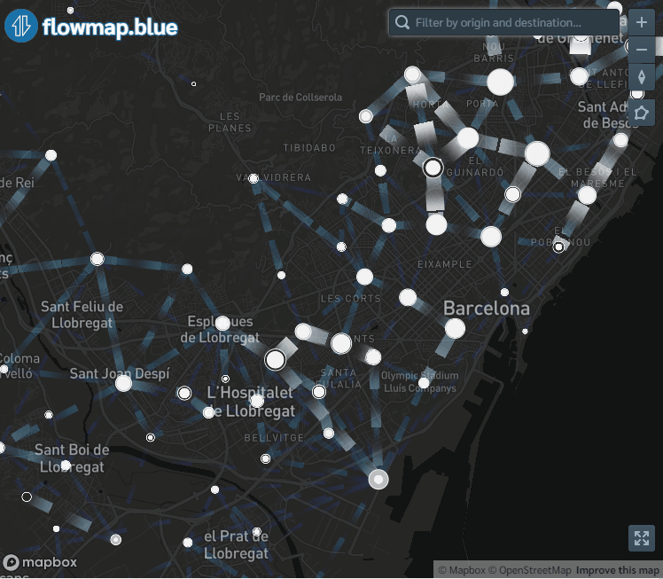
FIGURE 5.12: Map of population flows created with flowmapblue.