24 Classification
Learning objectives
- Classification
- Sensitivity and specificiy
- Area under the ROC curve
We may use the logistic regression model as a technique for classification. For example:
- To predict whether a loan will be returned (1) or not (0)
- To predict whether an email is spam (1) or not (0)
- To predict whether a tumor is malignant (1) or not (0)
Let us suppose we want to build a model to classify loan applicants as eligible or not eligible for a loan.
We have a dataset with information of past applicants with the following information. A response variable loan returned (1 if loan returned and 0 if not), and covariates income, loan amount, loan term, credit history, gender, married, dependents, education, self-employed and property area.
Let \(Y=1\) if loan is returned and 0 otherwise, and let \(x_1, \ldots, x_p\) be covariates to predict the probability \(\pi\) of returning the loan. We can fit a logistic model to predict the probability \(\pi\) of returning the loan using information of the covariates.
\[Y \sim Binomial(1 ,\pi)\] \[logit(\pi) = \beta_0 + \beta_1 x_1, \ldots + \beta_p x_p\]
Then, we can fit the model using the data of past applicants and obtain \(\hat \beta_0, \ldots \hat \beta_p\) and have a model to predict probabilities of returning the loan for new applicants.
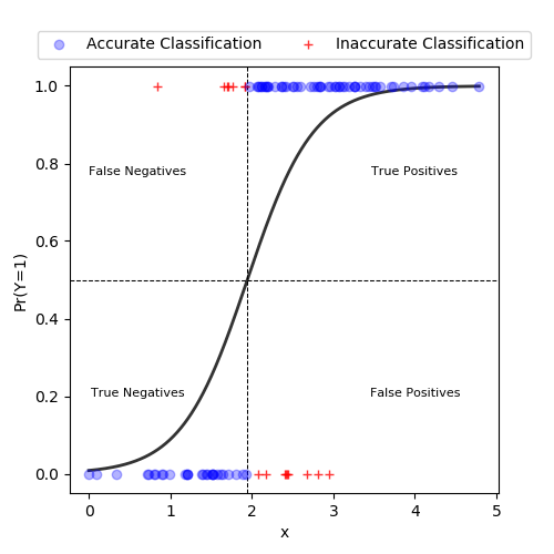
Then, we can use a probability threshold \(c\) to classify individuals as \(\hat Y = 1\) if \(\hat \pi > c\) and \(\hat Y = 0\) if \(\hat \pi \leq c\).
We would like our model to have high discrimination ability. This means that observations with \(Y=1\) should be predicted high probabilities, and those with \(Y=0\) should be assigned low probabilities.
In this example with a single predictor x, observations are classified as 1 if predicted probabilities \(\geq 0.5\). In this example, we see the predicted probability curve crosses the horizontal line at 0.5 at an x value of 1.95. Thus, any data point with an x value at or above 1.95 will have a predicted probability greater than or equal to 0.5 and be classified as a 1. Conversely, data points with x values below 1.95 will be classified as 0s.
24.1 Sensitivity and specificity
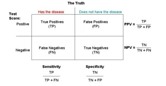
Sensitivity (True Positive rate/Recall) measures the proportion of positives that are correctly identified (i.e. the proportion of those who have some condition (affected, Y=1) who are correctly identified as having the condition).
Specificity (True Negative rate) measures the proportion of negatives that are correctly identified (i.e. the proportion of those who do not have the condition (unaffected, Y=0) who are correctly identified as not having the condition).
Sensitivity = TP/(TP + FN) = (Number of true positive assessment)/(Number of all positives)
Specificity = TN/(TN + FP) = (Number of true negative assessment)/(Number of all negatives)
(1 - specificity = FP/(TN + FP) ) called False Positive Rate
PPV: positive predictive value (or precision) = proportion of those with a POSITIVE test that have the condition
NPV: negative predictive value = proportion of those with a NEGATIVE test that do not have the condition
Accuracy = (TN + TP)/(TN+TP+FN+FP) = (Number of correct assessments)/Number of all assessments)
Our model is perfect at classifying observations if it has 100% sensitivity and 100% specificity. Unfortunately in practice this is (usually) not attainable.
We want our model to have high sensitivity and low values of (1 - specificity).
24.2 Exercise
For our data set picking a threshold of 0.75 gives us the following results:
FN = 340, TP = 27
TN = 3545, FP = 9
What are the sensitivity and specificity for this particular decision rule?
Sensitivity = TP/(TP + FN) = 27/(27 + 340) = 0.073
Specificity = TN/(FP + TN) = 3545/(9 + 3545) = 0.997
24.3 Example
PDF https://uk.cochrane.org/news/sensitivity-and-specificity-explained-cochrane-uk-trainees-blog
Sensitivity includes all individuals with disease so it is not affected by the prevalence of the disease.
Specificity includes all individuals without disease so it is not affected by the prevalence of the disease.
The calculation of PPV and NPV includes observations with \(Y=1\) and \(Y=0\). Therefore, it is affected by the prevalence of the disease. Therefore, we need to ensure that the same population is used (or incidence is the same between populations) when comparing PPV and NPV for different tests.
24.4 Classification rule
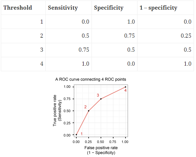
We can create classification rule by choosing a threshold value \(c\), and classify those observations with a fitted probability above \(c\) as positive and those at or below \(c\) as negative.
For a particular threshold value \(c\), we can estimate the sensitivity by the proportion of observations with Y=1 which have a predicted probability above \(c\), and similarly we can estimate specificity by the proportion of Y=0 observations with a predicted probability at or below \(c\).
If we increase the threshold value \(c\), fewer observations will be predicted as positive. This will mean that fewer of the Y=1 observations will be predicted as positive (reduced sensitivity), but more of the Y=0 observations will be predicted as negative (increased specificity). In picking the threshold value, there is thus an intrinsic trade off between sensitivity and specificity.
If we increase threshold \(c\), fewer observations will be classified as positive. Sensitivity = TP/(TP+FN) decreases. Numerator TP decreases as we classify fewer observations as positive. Denominator TP+FN is total of positive observations and stays as it is (TP decreases and FN increases).
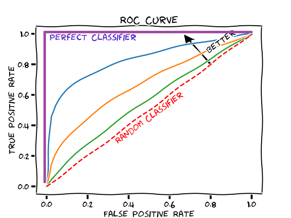
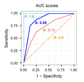
24.5 The receiver operating characteristic (ROC) curve
The ROC curve, is a plot of the values of sensitivity (y-axis) against 1-specificity (x-axis), evaluated at values of the threshold value \(c\) from 0 to 1.
A model with high discrimination ability will have high sensitivity and specificity, leading to an ROC curve which goes close to the top left corner of the plot. A model with no discrimination ability (random classifier) will have an ROC curve which is the 45 degree diagonal line.
A perfect classifier has Sensitivity = 1, Specificity = 1, 1-Specificity = 0 for all thresholds.
A poor model will have a ROC curve close to the bottom right corner (AUC near 0). This has the worst measure of discrimination as is predicting 0s as 1s and 1s as 0s.
24.6 Area under the ROC curve
A way of summarizing the discrimination ability of a model is to report the area under the ROC curve.
AUC provides an aggregate measure of performance of a model across all possible classification thresholds.
The area under the curve ranges from 1, corresponding to perfect discrimination (ROC curve to the top left hand corner), to 0.5, corresponding to a model with no discrimination ability (ROC curve which is the 45 degree diagonal line).
The higher the AUC, the better the performance of the model at distinguishing between the positive and negative classes.
24.7 Multiclass classification
ROC curves are for binary classification problems (0/1).
This can be extended to a multiclass classification problem by using the one-versus-rest technique.
For example, if we have three classes 0/1/2. The ROC for class 0 will be generated as classifying 0 against not 0 (i.e., 1 or 2). The ROC for class 1 will be generated as classifying 1 against not 1 (i.e. 0 or 2) and so on.
By using this one-versus-rest technique for each class, we will have the same number of curves as classes. The AUC can also be calculated for each class individually.
25 Example 1
The data aSAH summarizes several clinical and one laboratory variable of 113 patients with an aneurysmal subarachnoid hemorrhage
library(pROC)
data(aSAH)
head(aSAH)
gos6 outcome gender age wfns s100b ndka
29 5 Good Female 42 1 0.13 3.01
30 5 Good Female 37 1 0.14 8.54
31 5 Good Female 42 1 0.10 8.09
32 5 Good Female 27 1 0.04 10.42
33 1 Poor Female 42 3 0.13 17.40
34 1 Poor Male 48 2 0.10 12.75res <- glm(outcome ~ gender + age + s100b + ndka, family = binomial(link = "logit"), data = aSAH)
summary(res)
Call:
glm(formula = outcome ~ gender + age + s100b + ndka, family = binomial(link = "logit"),
    data = aSAH)

Coefficients:
             Estimate Std. Error z value Pr(>|z|)
(Intercept)  -3.33222    1.01104  -3.296 0.000981 ***
genderFemale -1.10249    0.50492  -2.183 0.029001 *
age           0.03350    0.01826   1.834 0.066631 .
s100b         4.99552    1.27576   3.916 9.01e-05 ***
ndka          0.02904    0.01679   1.729 0.083739 .
---
Signif. codes:  0 '***' 0.001 '**' 0.01 '*' 0.05 '.' 0.1 ' ' 1

(Dispersion parameter for binomial family taken to be 1)

    Null deviance: 148.04  on 112  degrees of freedom
Residual deviance: 113.08  on 108  degrees of freedom
AIC: 123.08

Number of Fisher Scoring iterations: 5
resROC <- pROC::roc(aSAH$outcome ~ res$fitted)Sensitivity and specificity values for different threshold values. We see sensitivity decreases and specificity increases as the cutoff increases.
tt <- cbind(resROC$thresholds, resROC$sensitivities, resROC$specificities, 1-resROC$specificities)[c(5, 10, 45, 50, 100, 110),]
colnames(tt) <- c("threshold", "sensitivity", "specificiy", "1-specificity")
tt
threshold sensitivity specificiy 1-specificity
[1,] 0.08014323 1.00000000 0.05555556 0.94444444
[2,] 0.09506841 0.97560976 0.11111111 0.88888889
[3,] 0.21858875 0.85365854 0.52777778 0.47222222
[4,] 0.24394243 0.82926829 0.58333333 0.41666667
[5,] 0.76931946 0.31707317 0.98611111 0.01388889
[6,] 0.90552529 0.09756098 1.00000000 0.00000000plot(resROC, print.auc = TRUE, legacy.axes = TRUE)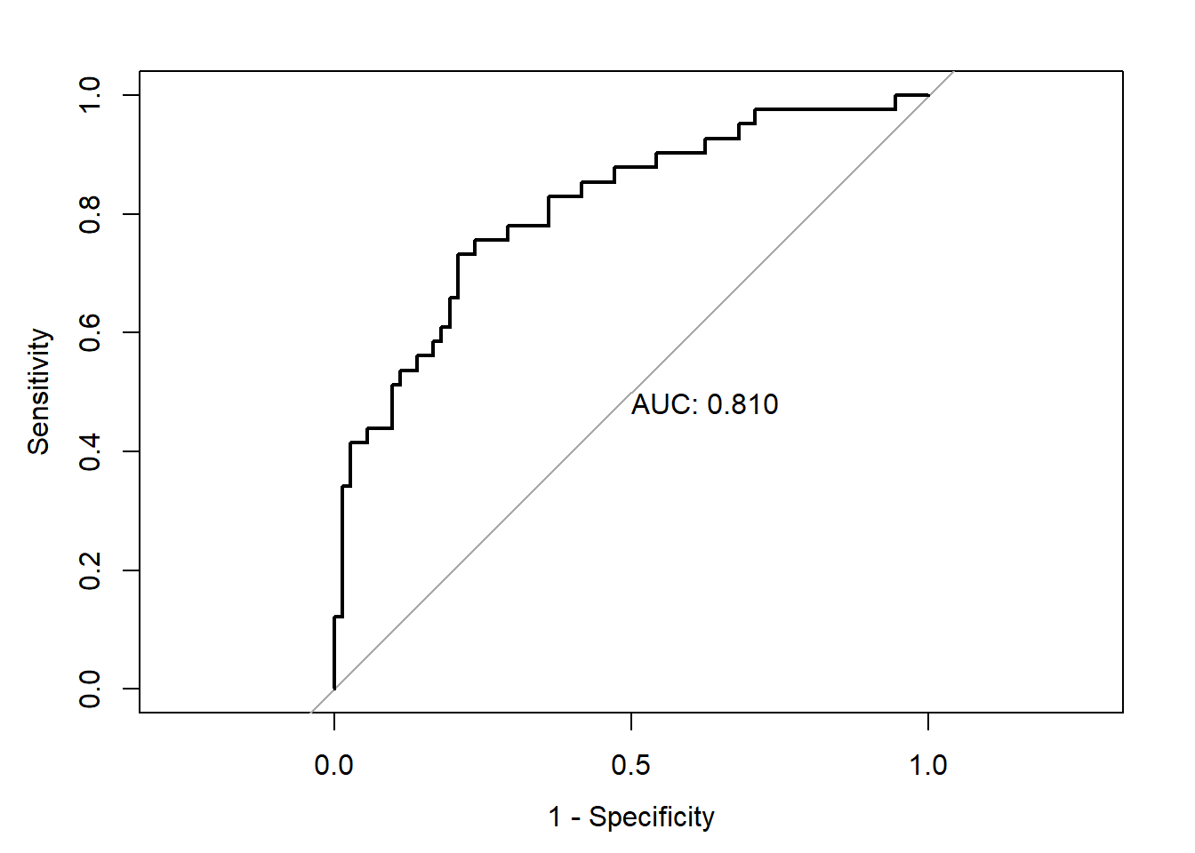
resROC$aucArea under the curve: 0.8096Optimal threshold. Wiki Youden’s J statistic
coords(resROC, "best") threshold specificity sensitivity
1 0.3242963 0.7916667 0.7317073coords(resROC, x = "best", input = "threshold", best.method = "youden") # Same than last line threshold specificity sensitivity
1 0.3242963 0.7916667 0.731707326 Example 2
Default data from the ISLR package. Goal is to classify individuals as defaulters based on student status, credit card balance, and income.
library(ISLR)
library(tibble)
as_tibble(Default)
# A tibble: 10,000 × 4
default student balance income
<fct> <fct> <dbl> <dbl>
1 No No 730. 44362.
2 No Yes 817. 12106.
3 No No 1074. 31767.
4 No No 529. 35704.
5 No No 786. 38463.
6 No Yes 920. 7492.
7 No No 826. 24905.
8 No Yes 809. 17600.
9 No No 1161. 37469.
10 No No 0 29275.
# ℹ 9,990 more rowsWe use cross-validation to avoid overfitting. We split our data in test and training datasets. We fit the model with the training data, and assess the predictive ability of the model with the validation data that we have not used to fit the model.
set.seed(42)
default_idx <- sample(nrow(Default), 5000)
default_trn <- Default[default_idx, ]
default_tst <- Default[-default_idx, ]
Write a function which allows use to make predictions based on different probability thresholds (cut).
get_logistic_pred <- function(mod, data, pos = 1, neg = 0, cut = 0.5) {
  probs <- predict(mod, newdata = data, type = "response")
  ifelse(probs > cut, pos, neg)
}
Let us use this to obtain predictions using a low, medium, and high thresholds (0.1, 0.5, and 0.9).
\(\hat C(x) = 1\) if \(\hat p(x) > c\) and \(\hat C(x) = 0\) if \(\hat p(x) \leq c\)
# Fit model with training data
model_glm <- glm(default ~ balance, data = default_trn, family = "binomial")

# Assess accuracy, sensitivity, and specificity with test data.
# Classify using three thresholds (0.1, 0.5, 0.9)
test_pred_10 <- get_logistic_pred(model_glm, data = default_tst, pos = "Yes", neg = "No", cut = 0.1)
test_pred_50 <- get_logistic_pred(model_glm, data = default_tst, pos = "Yes", neg = "No", cut = 0.5)
test_pred_90 <- get_logistic_pred(model_glm, data = default_tst, pos = "Yes", neg = "No", cut = 0.9)
Now we evaluate accuracy, sensitivity, and specificity for these classifiers.
test_tab_10 <- table(predicted = test_pred_10, actual = default_tst$default)
test_tab_50 <- table(predicted = test_pred_50, actual = default_tst$default)
test_tab_90 <- table(predicted = test_pred_90, actual = default_tst$default)
test_tab_10
actual
predicted No Yes
No 4547 46
Yes 290 117test_tab_50 actual
predicted No Yes
No 4814 112
Yes 23 51test_tab_90 actual
predicted No Yes
No 4837 156
Yes 0 7library(caret)
# confusionMatrix() calculates a cross-tabulation of observed and predicted classes with associated statistics.
test_con_mat_10 <- confusionMatrix(test_tab_10, positive = "Yes")
test_con_mat_50 <- confusionMatrix(test_tab_50, positive = "Yes")
test_con_mat_90 <- confusionMatrix(test_tab_90, positive = "Yes")metrics <- rbind(
c(test_con_mat_10$overall["Accuracy"],
test_con_mat_10$byClass["Sensitivity"],
test_con_mat_10$byClass["Specificity"]),
c(test_con_mat_50$overall["Accuracy"],
test_con_mat_50$byClass["Sensitivity"],
test_con_mat_50$byClass["Specificity"]),
c(test_con_mat_90$overall["Accuracy"],
test_con_mat_90$byClass["Sensitivity"],
test_con_mat_90$byClass["Specificity"])
)
rownames(metrics) <- c("c = 0.10", "c = 0.50", "c = 0.90")
metrics Accuracy Sensitivity Specificity
c = 0.10 0.9328 0.71779141 0.9400455
c = 0.50 0.9730 0.31288344 0.9952450
c = 0.90 0.9688 0.04294479 1.0000000We see sensitivity decreases as the cutoff is increased. Conversely, specificity increases as the cutoff increases.
library(pROC)
test_prob <- predict(model_glm, newdata = default_tst, type = "response")
roc(default_tst$default ~ test_prob, plot = TRUE, legacy.axes = TRUE, print.auc = TRUE)
Setting levels: control = No, case = YesSetting direction: controls < cases
Call:
roc.formula(formula = default_tst$default ~ test_prob, plot = TRUE,     legacy.axes = TRUE, print.auc = TRUE)

Data: test_prob in 4837 controls (default_tst$default No) < 163 cases (default_tst$default Yes).
Area under the curve: 0.9493
27 Exercise
Datasets
We will use cancer data found in wisc-trn.csv and wisc-tst.csv which contain train and test data respectively. This is a modification of the Breast Cancer Wisconsin (Diagnostic) dataset from the UCI Machine Learning Repository.
Consider an additive logistic regression that considers only two predictors, radius and symmetry to predict the probability of cancer.
Report test sensitivity, test specificity, and test accuracy for three classifiers, each using a different cutoff for predicted probability:
\(\hat C(x) =\) Malignant if \(\hat p(x) > c\) and \(\hat C(x) =\) Benign if \(\hat p(x) \leq c\)
\(c = 0.1, 0.5, 0.9\)
We will consider class M (malignant) to be the “positive” class when calculating sensitivity and specificity. Summarize these results using a single well-formatted table.
# import data
wisc_trn <- read.csv("data/wisc-trn.csv")
wisc_tst <- read.csv("data/wisc-tst.csv")
# coerce to factor
wisc_trn$class <- as.factor(wisc_trn$class)
wisc_tst$class <- as.factor(wisc_tst$class)
# fit model
wisc_glm <- glm(class ~ radius + symmetry, data = wisc_trn, family = "binomial")
# helper function, specific to glm function
get_pred_glm <- function(mod, data, pos = 1, neg = 0, cut = 0.5) {
  probs = predict(mod, newdata = data, type = "response")
  ifelse(probs > cut, pos, neg)
}
# get predicted values for each cutoff
pred_10 <- get_pred_glm(wisc_glm, wisc_tst, cut = 0.1, pos = "M", neg = "B")
pred_50 <- get_pred_glm(wisc_glm, wisc_tst, cut = 0.5, pos = "M", neg = "B")
pred_90 <- get_pred_glm(wisc_glm, wisc_tst, cut = 0.9, pos = "M", neg = "B")
# create table for each cutoff
tab_10 <- table(predicted = pred_10, actual = wisc_tst$class)
tab_50 <- table(predicted = pred_50, actual = wisc_tst$class)
tab_90 <- table(predicted = pred_90, actual = wisc_tst$class)
# coerce tables to be confusion matrices
con_mat_10 <- confusionMatrix(tab_10, positive = "M")
con_mat_50 <- confusionMatrix(tab_50, positive = "M")
con_mat_90 <- confusionMatrix(tab_90, positive = "M")
metrics = rbind(
c(con_mat_10$overall["Accuracy"],
con_mat_10$byClass["Sensitivity"],
con_mat_10$byClass["Specificity"]),
c(con_mat_50$overall["Accuracy"],
con_mat_50$byClass["Sensitivity"],
con_mat_50$byClass["Specificity"]),
c(con_mat_90$overall["Accuracy"],
con_mat_90$byClass["Sensitivity"],
con_mat_90$byClass["Specificity"])
)

rownames(metrics) <- c("c = 0.10", "c = 0.50", "c = 0.90")
metrics
Accuracy Sensitivity Specificity
c = 0.10 0.86 0.950 0.8000000
c = 0.50 0.91 0.825 0.9666667
c = 0.90 0.82 0.575 0.9833333