13 Assumptions
13.1 Model assumptions
After fitting the model it is crucial to check whether the model assumptions are valid before performing inference. If there is any assumption violation, subsequent inferential procedures may be invalid.
\[Y_i = \beta_0 + \beta_1 X_{i} + \epsilon_i,\ \ \epsilon_i \sim^{iid} N(0, \sigma^2),\ \ \ i = 1,\ldots,n.\]
Assumptions:
- Independency: errors are independent
- Normality: errors are normally distributed
- Constant variance: errors have constant variance. The variance, \(\sigma^2\), is the same for all values of \(x\)
- Linearity: the relationship between the response variable and the predictors is linear
We check normality of errors with a normal Q-Q plot of the residuals.
Constant variance and linearity are checked using plots of the residuals (\(y\)-axis) against each explanatory variable (\(x\)-axis) to assess the linearity between \(Y\) and each \(X\), and the constant variance of \(Y\) across each \(X\).
- Model diagnostic procedures involve residuals plots
- Residual plots are plots of the residuals against the values fitted or predicted from the model. These plots magnify deviations from the regression line to make patterns easier to see.
- Standardized residuals are residuals divided by their standard errors
13.1.1 Check independency
- Responses must be collected such that the response from one subject has no influence on the response of any other subject (e.g., via a random sampling). For example, participants in the sample are a random sample from the population.
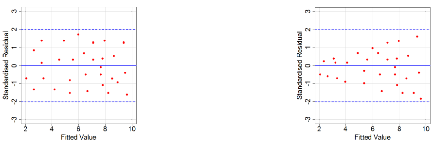
13.1.2 Check constant variance using residual plot
Check constant variance using a residual plot, i.e., a plot of the residuals (y-axis) against the values fitted/predicted from the model (x-axis).
In multiple regression models, constant variance should also be checked using plots of the residuals versus individual independent variables.
Points should be randomly scattered. The spread of the points should be the same across the x-axis.
If residuals are more spread out for larger fitted values than smaller ones, there is non-constant variance. Sometimes a log transformation of the response variable may also help.
13.1.3 Check linearity using residual plot
Check linearity using a residual plot, i.e., a plot of the residuals (y-axis) against the values fitted/predicted from the model (x-axis).
In multiple regression models, linearity should also be checked using plots of the residuals versus individual independent variables.
Points should be randomly scattered, i.e., an unstructured horizontal band of points centered at zero.
In particular, points should not form a pattern, e.g., a quadratic, or other type of curve, should not be apparent.
If the relationship is curved, the residuals versus fits will be curved.
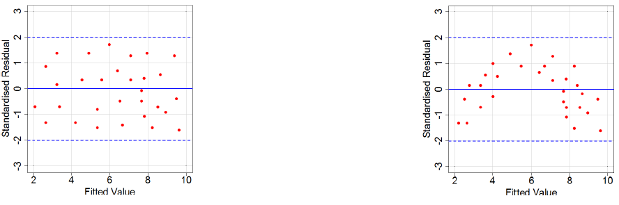
- If we see a curved residuals versus fits plot, the relationship is not linear. We should try a different model in \(X\). Sometimes we add an explanatory variable formed by squaring \(X\): \[\hat Y= \hat \beta_0 + \hat \beta_1 X + \hat \beta_2 X^2\]
13.1.4 Transforming variables
If one or more of the assumptions are violated, we can sometimes remedy this by transforming one or both of the variables.
However, transforming a variable to satisfy one assumption, e.g., to make the relationship linear, may harm the normality or constant variance assumptions. In this case, more sophisticated modelling is needed, such as non-linear regression.
13.1.5 Check normality with normal Q-Q plot of the residuals
We check normality of errors with a normal Q-Q plot of the residuals
A normal Q-Q plot compares the data with what to expect to get if the theoretical distribution from which the data come is normal
The Q-Q plot displays the value of observed quantiles in the standardized residual distribution on the y-axis versus the quantiles of the theoretical normal distribution on the x-axis
If data are normally distributed, we should see the plotted points lie close to the straight line
If we see a concave normal probability plot, log transforming the response variable may remove the problem
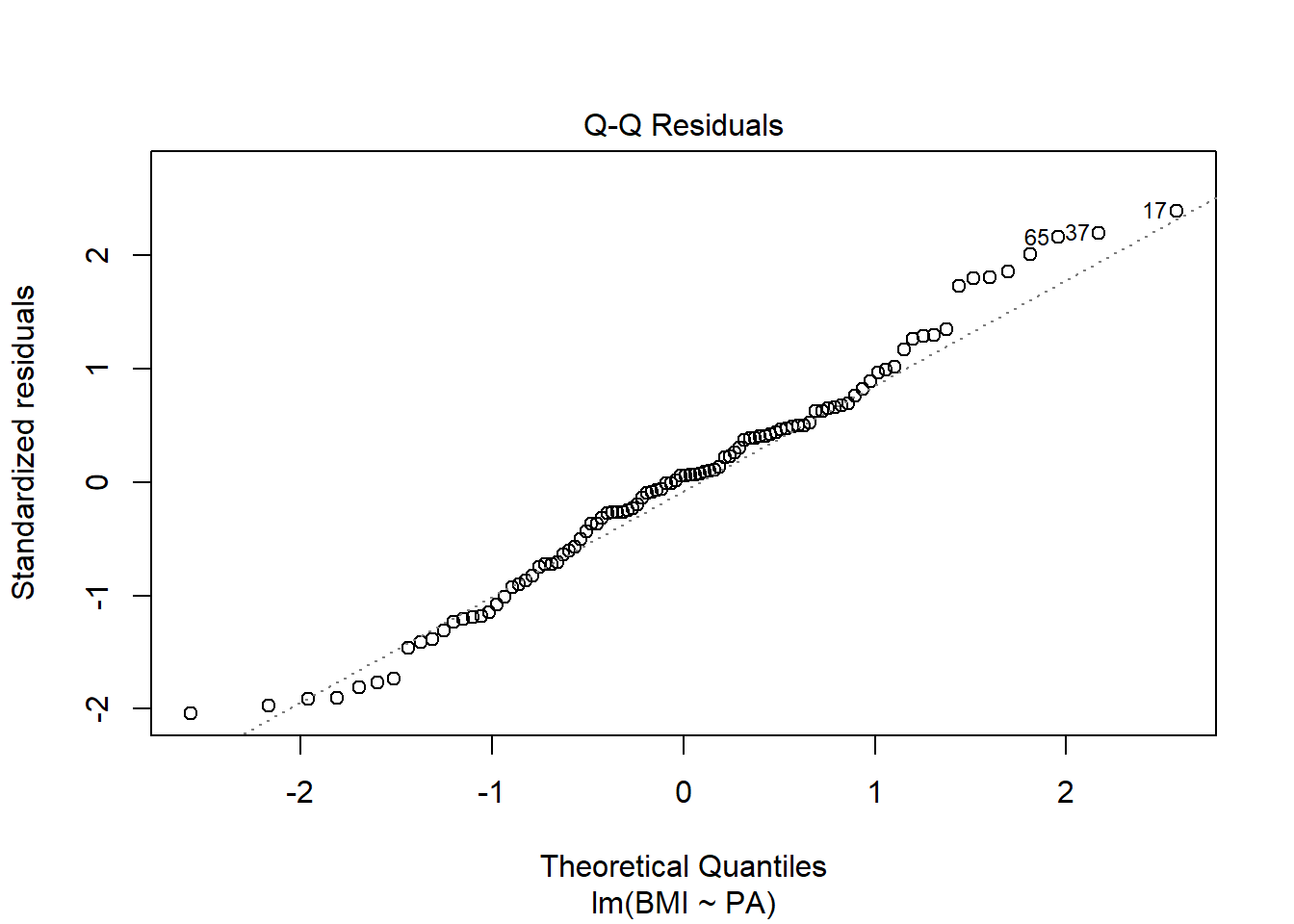
13.2 Normality assumption. Review Q-Q plot
The residuals from the model provide estimates of the random errors. If the normality assumption is met, then the residuals all-together should approximately follow a normal distribution.
We check normality of errors with a normal quantile-quantile (Q-Q) plot of the residuals.
The normal quantile-quantile (Q-Q) plot is a visual assessment of how well residuals match what we would expect from a normal distribution. Outliers, skew, heavy and light-tailed aspects of distributions (all violations of normality) will show up in this plot.
Q-Q plot
A quantile-quantile (Q-Q) plot is a graphical technique to determine if two data sets come from populations with a common distribution. A Q-Q plot is a plot of the quantiles of the first data set against the quantiles of the second data set.
A quantile is the value at which a given percent of points is below that value. That is, the 0.3 quantile is the value at which 30% percent of the data fall below and 70% fall above that value.
The Q-Q-plot is formed by:
Vertical axis: Estimated quantiles from data set 1
Horizontal axis: Estimated quantiles from data set 2
Both axes are in units of their respective data sets. That is, the actual quantile level is not plotted. For a given point on the Q-Q plot, we know that the quantile level is the same for both points, but not what that quantile level actually is.
Normal Q-Q plot
A Normal Q-Q plot shows the “match” of an observed distribution with the theoretical normal distribution.
The Q-Q plots display the value of observed quantiles in the standardized residual distribution on the y-axis versus the quantiles of the theoretical normal distribution on the x-axis.
If the observed distribution of the residuals matches the shape of the normal distribution, then the plotted points should follow a 1-1 relationship.
If the points follow the displayed straight line that suggests that the residuals have a similar shape to a normal distribution. Some variation is expected around the line and some patterns of deviation are worse than others for our models.
Examples
- Normal
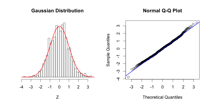
The blue line shows where the points would fall if the dataset were normally distributed.
The points in the Q-Q plot form a relatively straight line since the quantiles of the dataset nearly match what the quantiles of the dataset would theoretically be if the dataset was normally distributed
- Skewed right
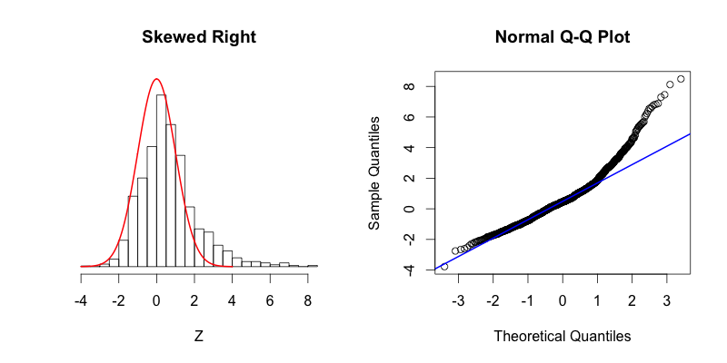
Skewed right, most of the data is distributed on the left side with a long tail of data extending out to the right.
The last two theoretical quantiles for this dataset should be around 3, when in fact those quantiles are greater than 8.
The point’s trend upward shows that the actual quantiles are much greater than the theoretical quantiles, meaning that there is a greater concentration of data beyond the right side of a Gaussian distribution.
- Skewed left
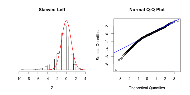
Skewed left, most of the data is distributed on the right side with a long tail of data extending out to the left.
There is more data to the left of the Gaussian distribution. The points appear below the blue line because those quantiles occur at much lower values (between -9 and -4) compared to where those quantiles would be in a Gaussian distribution (between -4 and -2).
- Fat tails
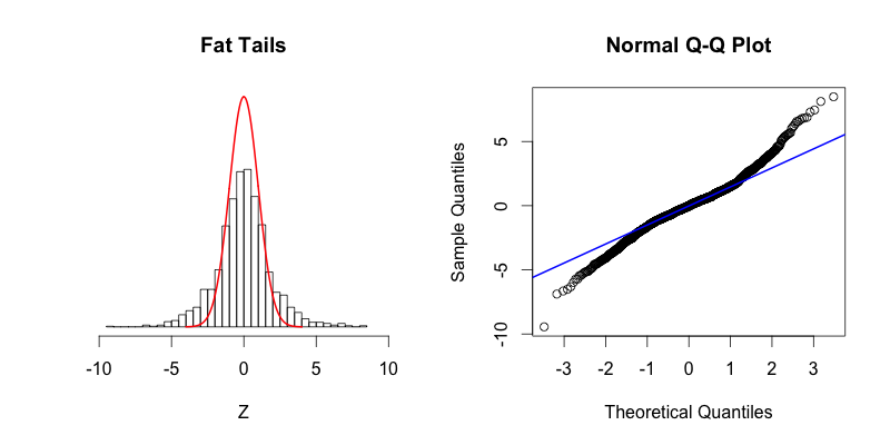
Fat tails, compared to the normal distribution there is more data located at the extremes of the distribution and less data in the center of the distribution.
In terms of quantiles this means that the first quantile is much less than the first theoretical quantile and the last quantile is greater than the last theoretical quantile.
- Thin tails

Thin tails, there is more data concentrated in the center of the distribution and less data in the tails. These thin tails correspond to the first quantiles occurring at larger than expected values and the last quantiles occurring at less than expected values.